Posts

Visible Storage: the Transparent Museum

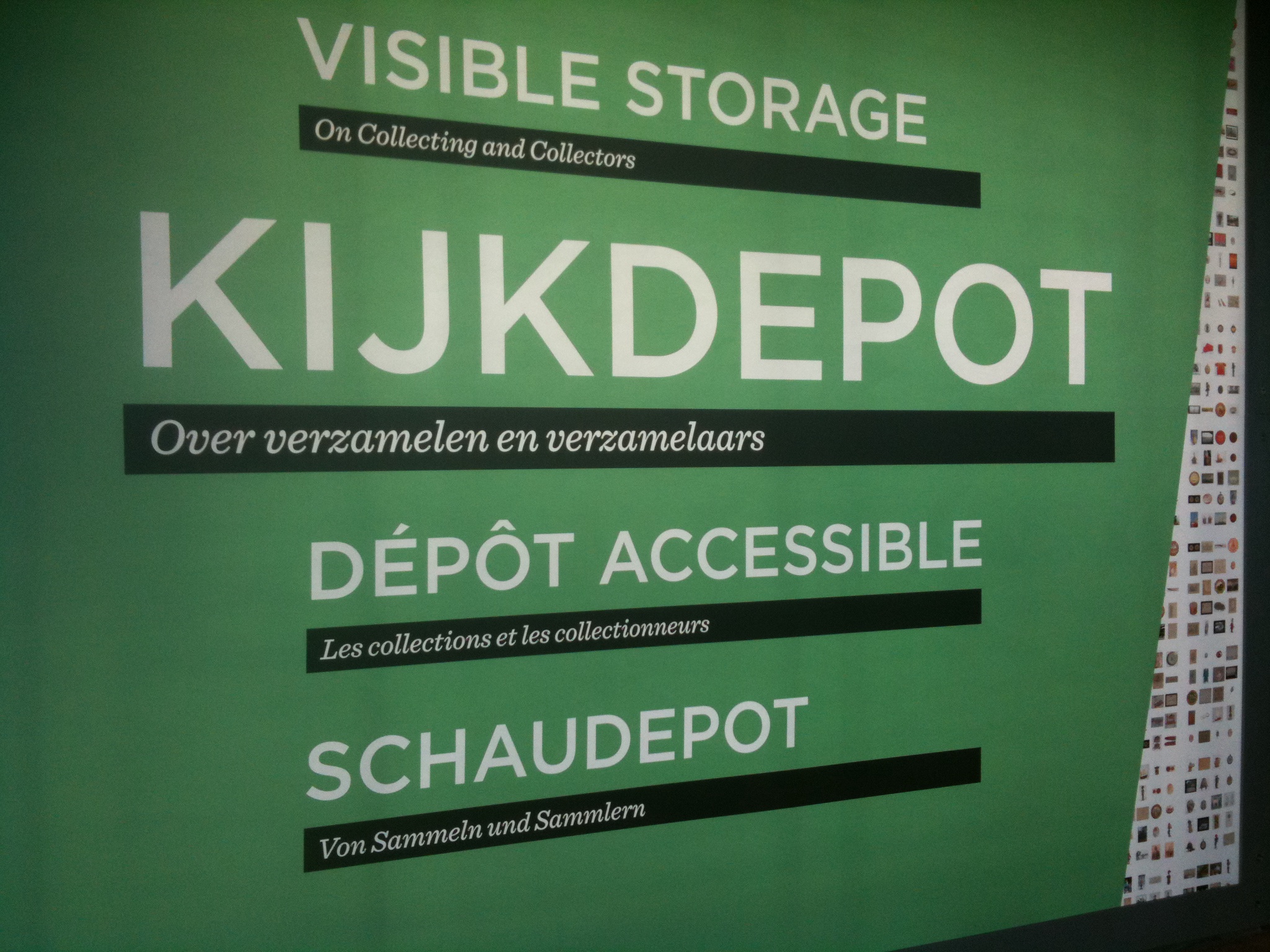
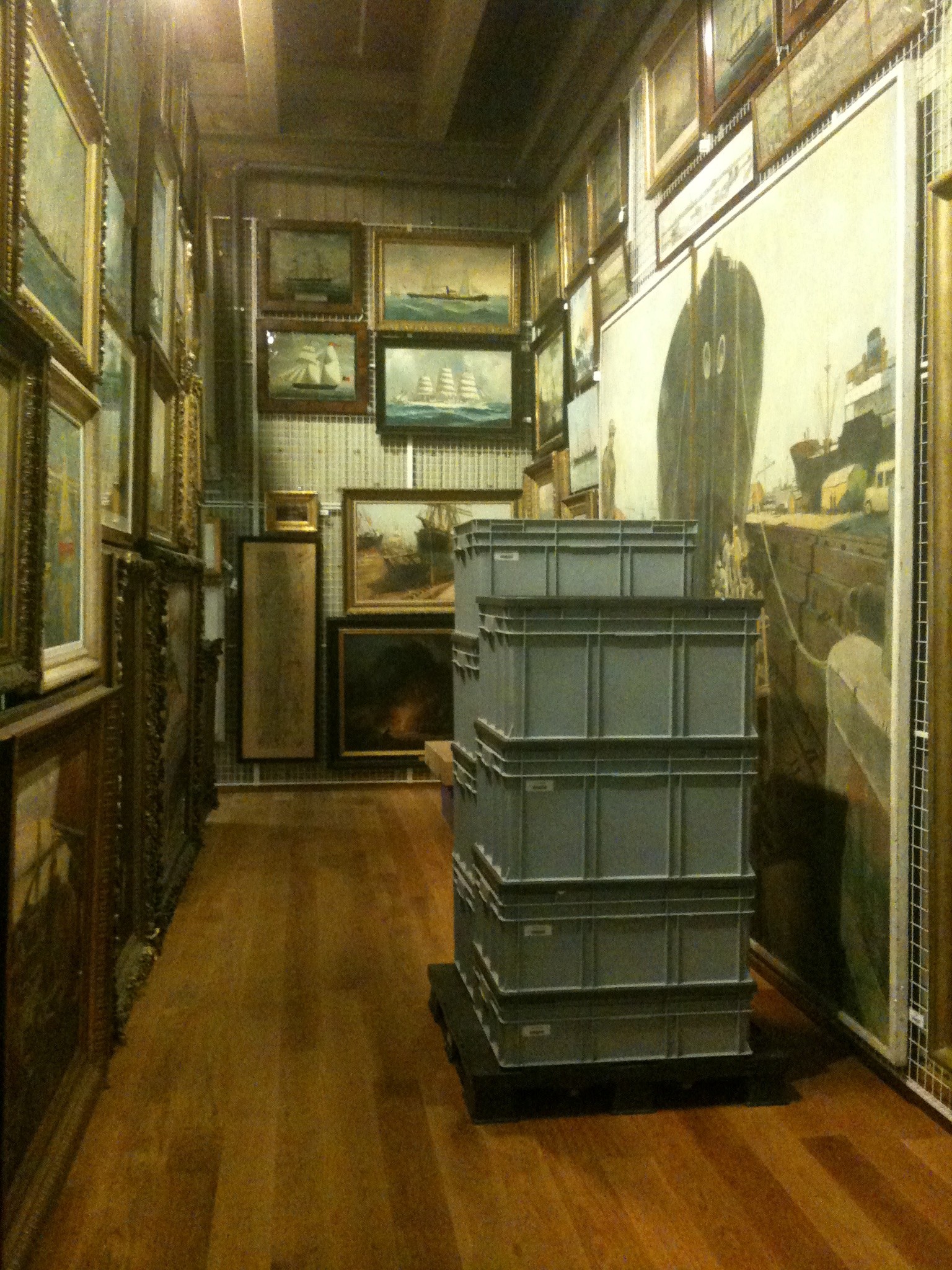
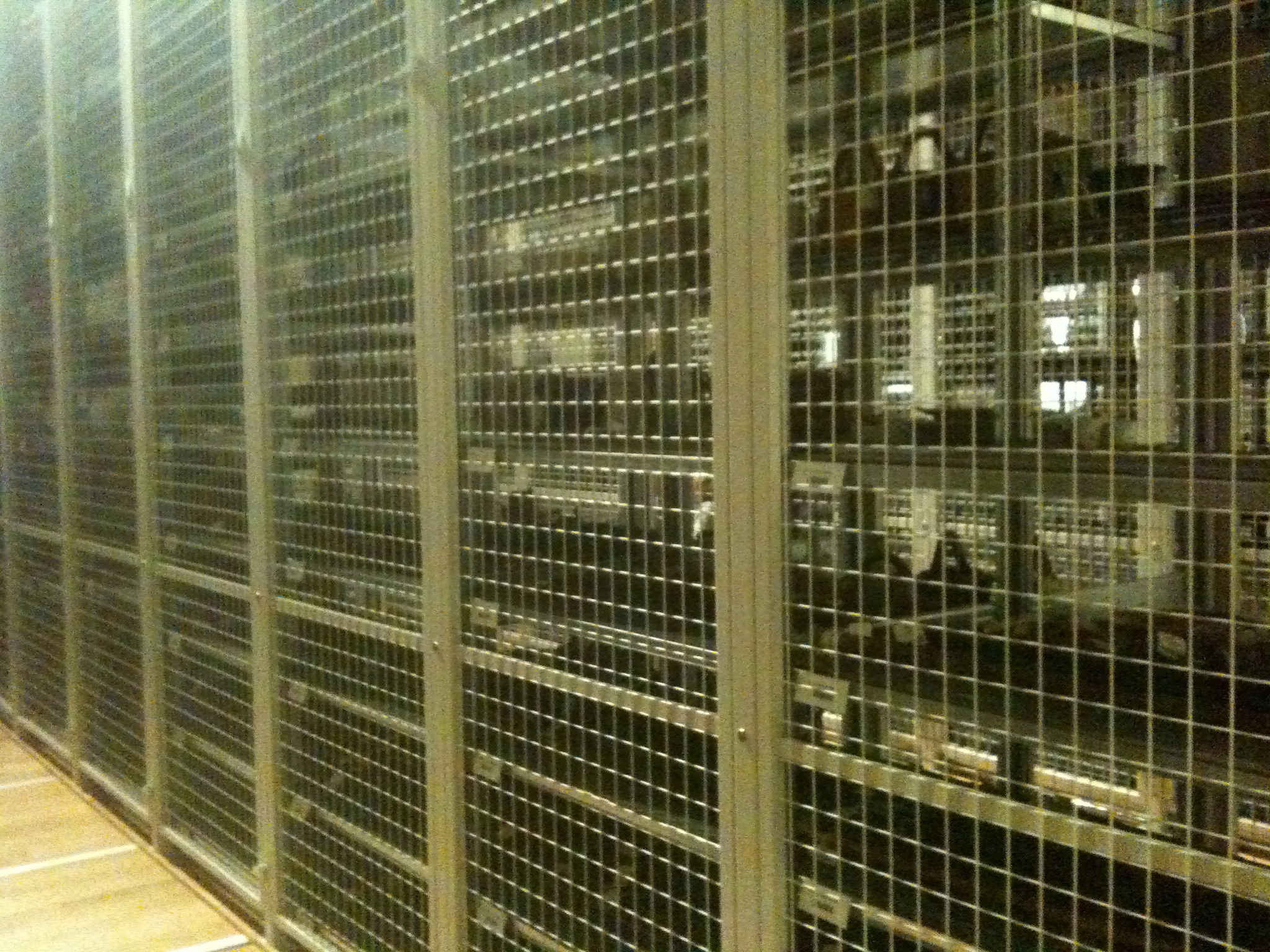
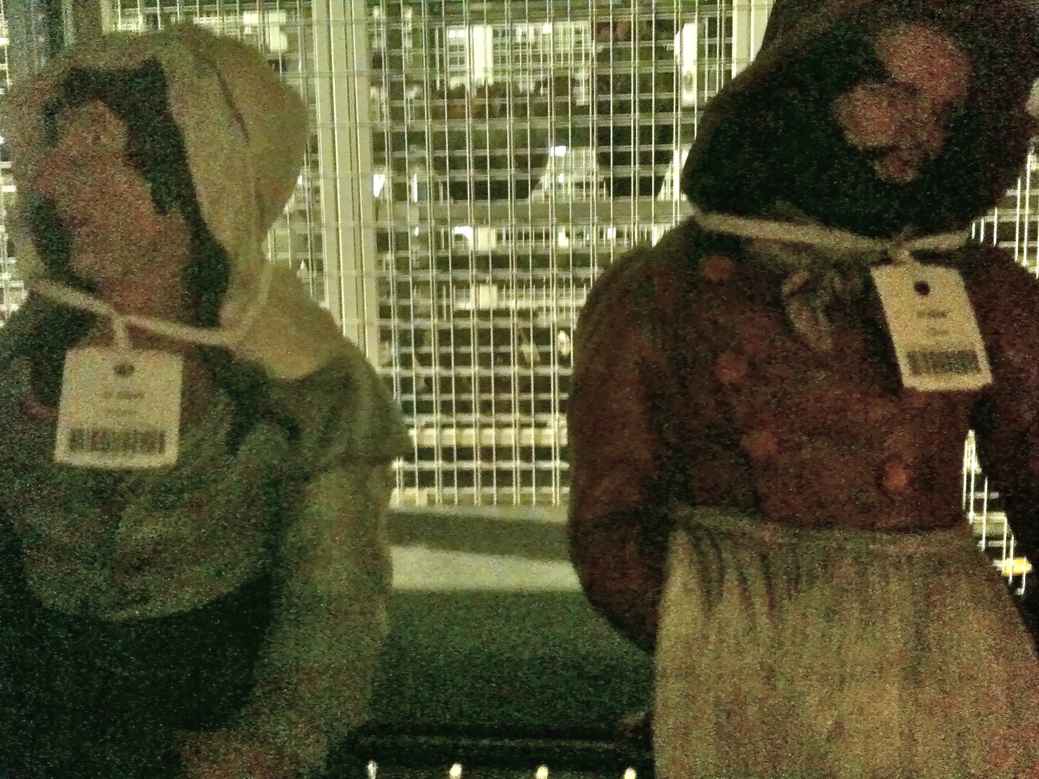
Antwerp’s latest museum, the MAS, opened its doors recently: and opened its storage room.

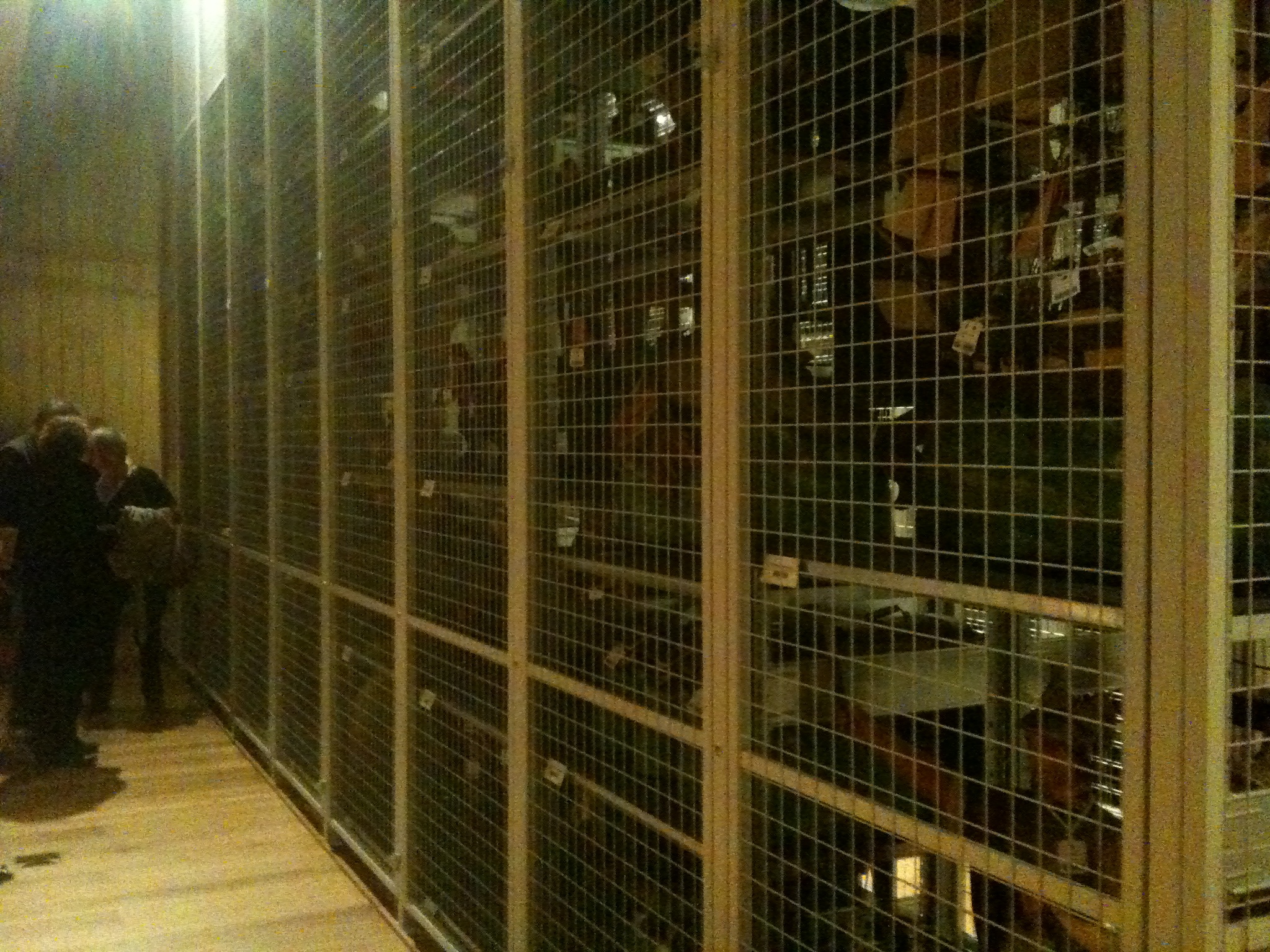
One of the more interesting features (aside from the iconic architecture) of the building is that the storage spaces are publicly viewable. One level of the towering 10-story building houses countless antiquities behind wire cages – It’s a fascinating peek into the behind-the-scenes of a museum’s collection. Transparency communicated through public space: Priceless artifacts are tagged and neatly stacked into impressively small spaces. An interesting contrast to the typical endless white walls of typical public-facing museum spaces.

The transparency of an organization begins with opening its ‘archives’.

The Inside Lives of Fruits and Vegetables

Less of a background story…but more of an internal story: the internal stories of fruits and vegetables. (So this is what MRI scan operators do on their lunch breaks!)

Magnetic resonance data made visual in a beautiful way. If only companies and political organizations were so transparent.

MRI scan

Year in Numbers

A local cafe has compiled a somewhat-visual depiction of their activities over the year. The focus is on communicating data as it relates to the sustainability initiatives of the cafe.
Read more

Linking Everyday Gestures with Digital Details

Pranav Mistry combines standard, everyday gestures with digital information. His solutions -which include the SixthSense wearable computer – have potential to bring real transparency into sustainability, and enable people to literally immerse themselves in their own ecological footprints. Read more

Carbon Footprinting Transit

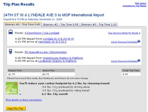
Twin Cities Metro Transit now links carbon footprint data with bus schedules when you plan a trip online.

Carbon Footprint Calculator

Carbon Footprint Calculator

Public transit reduces carbon footprint

Public transit reduces carbon footprint

The  website averages bus CO2 emissions over the distance of your journey to show the visitor what positive impact they can contribute (in terms of carbon saved) for each public-transit journey made.

This is a great tool to help consumers understand the impact they have as an individual – even if the results are a bit ambiguous (it’s highly doubtful that most consumers understand what 6.2 lbs of CO2 means – and unfortunately no comparison is provided to help them put it into context).

Tracing A Box’s Life

Colombia Sportswear is asking you to ‘Consider the box’ with their project: A Box Life. A Box Life brings awareness to an often-overlooked part of mail-order products’ life-cycles: the packaging.

Box life transparently tracks the back-stories of where boxes have traveled.

Box life transparently tracks the back-stories of where boxes have traveled.

Not only is it a clever way to encourage people to reuse packing materials, but telling the stories behind the travels of things also acts as a tool for transparency, and reminds consumers of how individual actions impact sustainability.

read more: Springwise

Sourcemap for product ingredients

Sourcemap, developed by an MIT-based team, uses Google Earth to map the origins of materials in products. A view inside the open-source application also showcases each ingredient’s carbon footprint – which I hope is an indication that it is only a matter of time until tools like this will expand to highlight other Life-Cycle Analysis data.

Computer components as mapped by a Sourcemap user.

Computer components as mapped by a Sourcemap user.

This tool does a great job communicating that ‘ingredients’ in our products are connected to the world around us. As a next step, it would be great to show the carbon impacts in terms that are relevant to consumers – ‘showing’ what the quantity means rather than just stating the number. And to tell more of a story to help consumers frame these big-picture ideas within their everyday experience.

Revealing Hidden Time

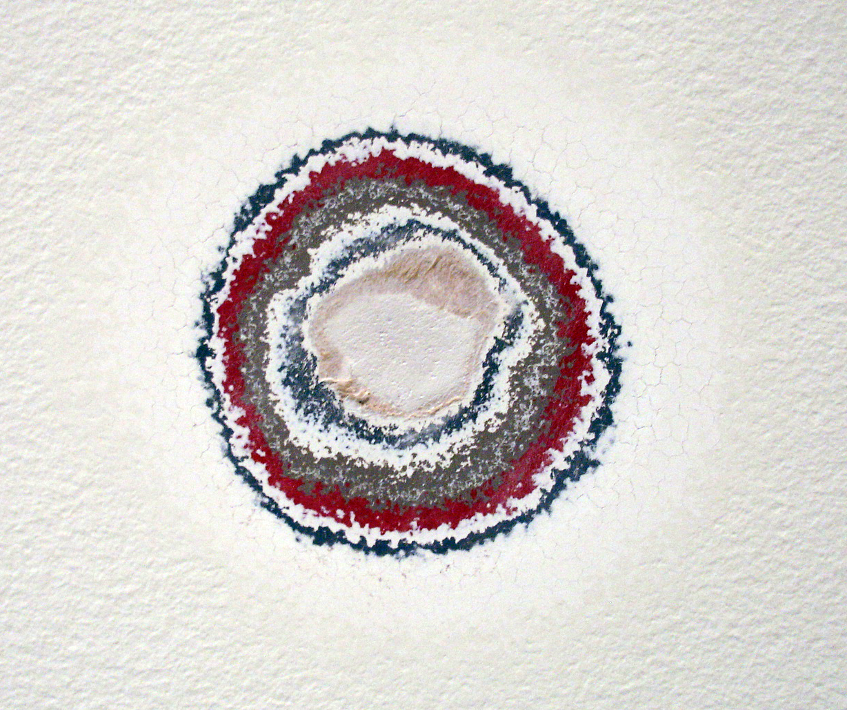
A work by artist Pierre Huyghe, entitled ‘Timekeeper’ uncovers a history of exhibits in this space at the Walker Art Center through sanding down layers of paint on the gallery walls.

Previous layers of gallery paint revealed through sanding.

Previous layers of gallery paint revealed through sanding.

This work is especially interesting in the context of a white-walled exhibition space: the walls are usually forced into the background in order to highlight the work hung on them. In this case, the very history of that back-drop is what’s highlighted.

The work is part of the Walker’s exhibition, The Quick and the Dead;

Surveying art that tries to reach beyond itself and the limits of our knowledge and experience, The Quick and the Dead seeks, in part, to ask what is alive and dead within the legacy of conceptual art.

Communication Design Recognized in Back-Story-Telling Project

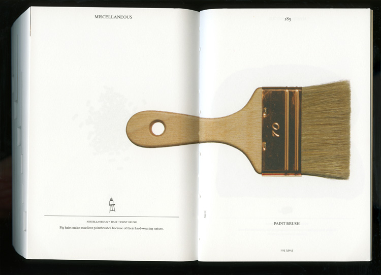
For the first time, the prestigious INDEX Design Award has a winner from the field of communication design. ‘PIG 05049’ is a primarily-visual book, designed and conceived by Christien Meindertsma, that traces all the products made from one pig.

Visual spread from the book 'Pig 05049'

Visual spread from the book

Meindertsma’s intent for the project:

Help people in a highly mechanized and “packaged” world understand how things are made and where they come from so that the resources involved can be cared for by enlightened, informed people.

It’s nice to see the role of communication design to build awareness being recognized within the design community.

Read a previous entry on Meindertsma’s project here.

GoodGuide coming to iPhones

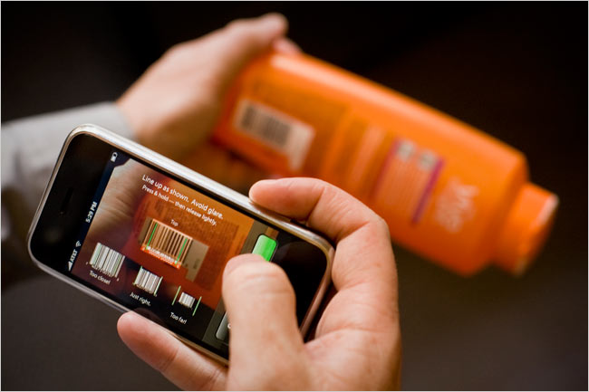
Via a New York Times article, barcode-reader iPhone apps will put product info in consumers hands at point-of-sale.

GoodGuide is already a beta database of info on products will help consumers know what is in the products they consider purchasing.

A Goodguide app on iPhone will let consumers access info via barcode.

A GoodGuide app on iPhone will let consumers access info via barcode. Image Credit: Peter DaSilva for The New York Times

The service reduces lots of complex info into a single number (the higher the number, the better the product overall). Though the purpose of the system is to create transparency on products, such a single-number approach lacks transparency. Consumers also need education on what’s behind the number. A more visual approach incorporating icons to reference each product’s background story could help.

Thanks Craig!