Putting Climate Data into the Context of Human Lifespan

We humans have a hard time comprehending our future.

Fortunately, there’s a lot of great science being done about our collective future. Unfortunately, this data is typically presented in a way that feels removed from our human experience. No matter how real data is — if we don’t perceive it as having a direct, tangible impact on our own lives (and those of our friends and family) it will continue to be viewed as abstract and removed from our life experience.

Creativity can help answer the call to connect seemingly abstract data to people’s emotions.

Arlene is exploring opportunities to annotate existing climate data to help people see themselves within the data. During a recent artist residency at MASS MoCA, Arlene worked on a series of projects to put our own life spans into climate data.
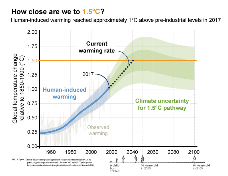
How Close Are We to 1.5˚C?ABOVE: A visual human lifespan is added to contextualize a series of future dates.

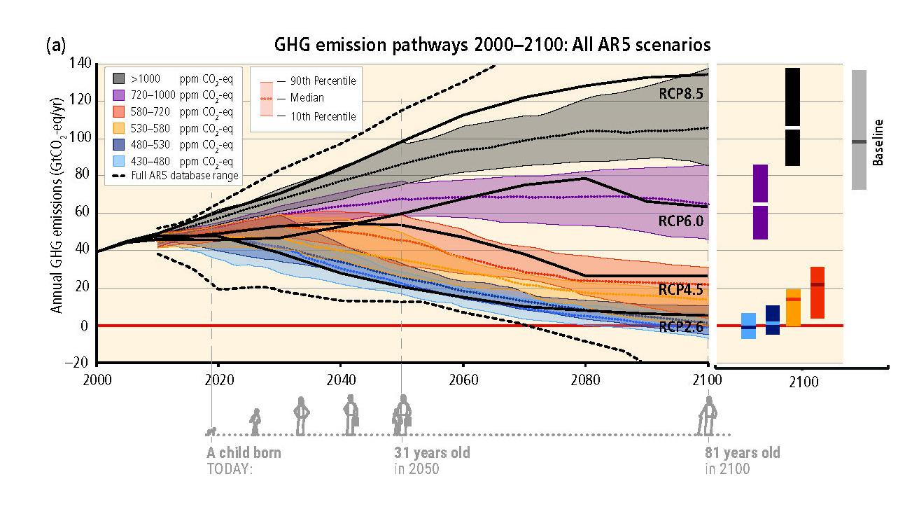
One project was to annotate graphs from Intergovernmental Panel on Climate Change (IPCC) reports that denote future climate trends. The graphs are annotated with a small illustration of an average human lifespan — starting with a child born today. The annotation shows how old the child will be in key years that are in the data. The inclusion of a human life span with this data helps remind us of the grand scale of the global changes that are being graphed, and how these changes will continue to impact our children, grandchildren, nieces and nephews long after we’re gone.

BELOW: Additional examples of human life spans visualized as part of a graph’s timeline.
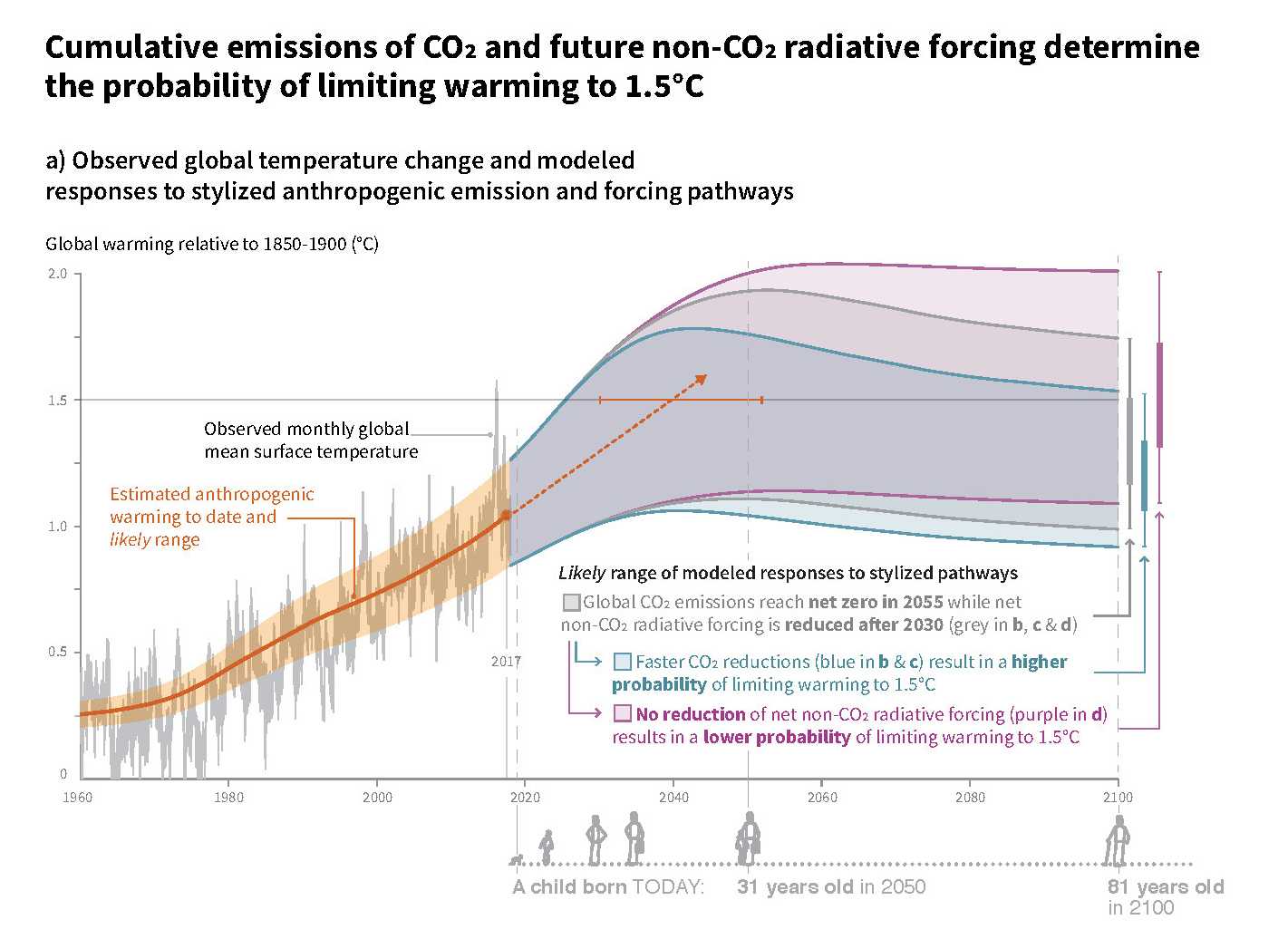
Cumulative Emissions of CO2

GHG Emission Pathways

BELOW: Detail of the timeline with life span.
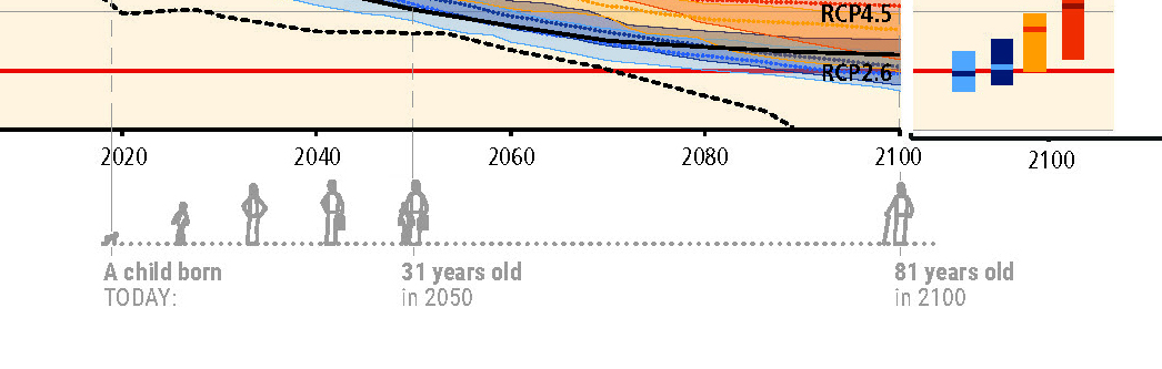
Detail of GHG Emission Pathways

Webinar: ‘Visual Storytelling: Putting Data into Context’

Pollinator-Friendly Solar at the Fair

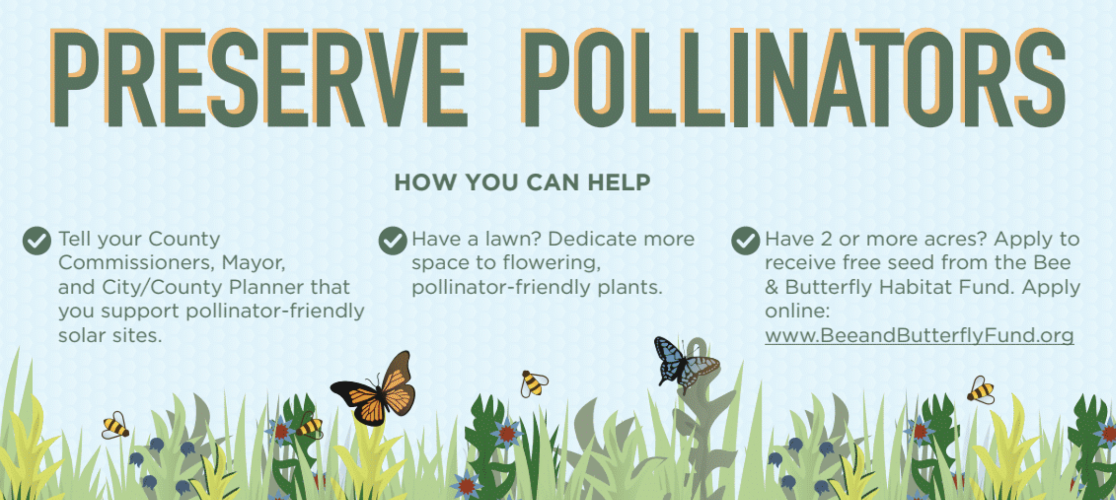
For this year’s Minnesota State Fair, we’ve teamed up with Fresh Energy and Connexus Energy to create a three-dimensional display to draw attention to a new way of thinking about renewable energy: Pollinator-friendly solar.

Preserve Pollinators

Infographic poster from the Minnesota State Fair display.

Our display, part of “The Common Table: Minnesota Eats” exhibit in the Agriculture Horticulture Building, highlights how our region is leading the way in policymaking and on-farm efforts to bring more pollinator habitat to otherwise underutilized land. You can see the exhibit in-person from August 23 through September 3, along with nearly two million other fair-goers (who famously flock to the event for all kinds of foods and creations “on a stick”). Of course, our sticks — a series of cutout landscape elements and hide-and-seek pollinators for you to find — will be glued down, but you’re sure to learn a lot about the powerful partnership of pollinators and solar energy!

Selecting the Right Graph

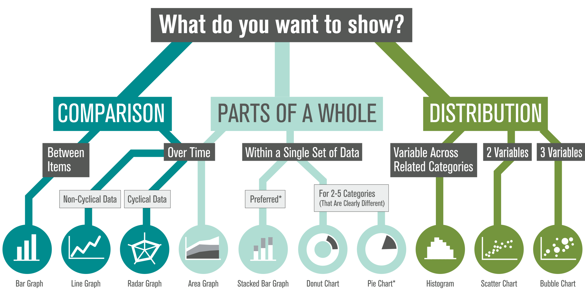
We’re often asked, “What type of graph should I use for this data?” We also see a lot of variety in how similar data sets are visualized (some working better than others). There’s plenty of debate out there, so how do you decide?

Selecting The Right Graph

*Stacked bar graphs show comparison most clearly — and are preferred over pie charts (which do not allow easy comparison). Donut charts are slightly better than pies. Hungry yet?

We’ve created this visual guide to recommend best practices, which starts with a clear understanding of your content — what are you trying to show? There are options within each category based on the type of data in your set (and ironically, many of the standard graph types tend to share food-based titles… by the time you decide between Pies, Bars, and Donuts, you might be tempted to hit the bakery!). Which graph will you apply to your next datavis project?

MEDEA Talk on ‘Visualizing Sustainability’

Arlene Birt presenting at MEDEA in Malmö, Sweden on Dec.10 (15:00-17:00 Central European time).

Arlene will present two projects that she’s done as artist-in-residence at MEDEA and a behind-the-scenes view on her work on how to visualize ‘background stories’. One project is a visual mapping of the sustainability-oriented systems at work within the Västra Hamnen area of the city through a collaboration with Unsworn Industries to show this information using the parascope technology they’ve developed. Another project visually communicates the benefits of bicycling – in terms of CO2 saved, money saved and calories burned.

Details on the talk here. There will also be a live-stream of the talk.

Chipotle Veggs Out Locally

Food retailer Chipotle has an online animated map showing the locality and seasonality of produce used in their menu items.

Though buried at the bottom of the page (click ‘integrity’, then scroll down), the graphic is a good educational tool: teaching about seasonality in produce.

From the perspective of informational design, it would be great to see it containing more specific data (rather than just being a visual description): I’d like to see what % of the onion used in Midwestern stores is local in the winter.

Regardless, it’s a good place to start communicating sustainability to consumers.

Seasonal Local Vegetables

SEASONAL LOCAL VEGETABLES ANIMATION

Year in Numbers

A local cafe has compiled a somewhat-visual depiction of their activities over the year. The focus is on communicating data as it relates to the sustainability initiatives of the cafe.
Read more

Communication Design Recognized in Back-Story-Telling Project

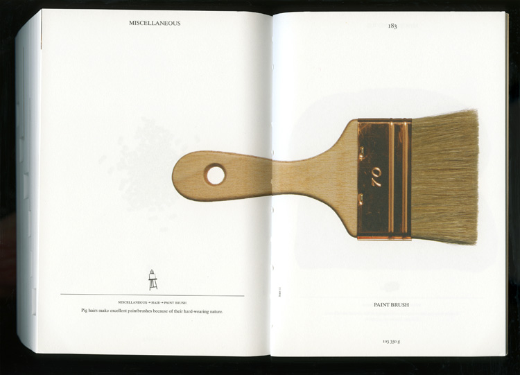
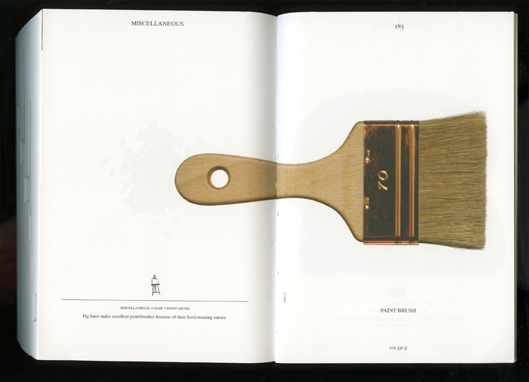
For the first time, the prestigious INDEX Design Award has a winner from the field of communication design. ‘PIG 05049’ is a primarily-visual book, designed and conceived by Christien Meindertsma, that traces all the products made from one pig.

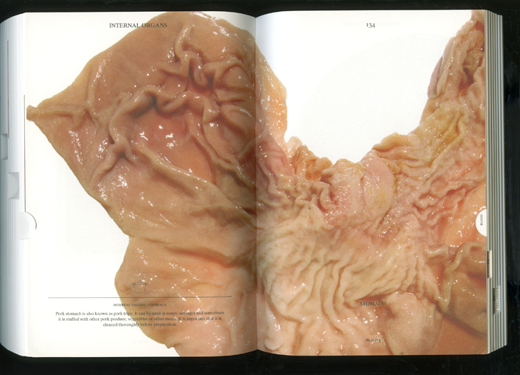
Visual spread from the book 'Pig 05049'

Visual spread from the book

Meindertsma’s intent for the project:

Help people in a highly mechanized and “packaged” world understand how things are made and where they come from so that the resources involved can be cared for by enlightened, informed people.

It’s nice to see the role of communication design to build awareness being recognized within the design community.

Read a previous entry on Meindertsma’s project here.

Car eco-label only inches forward despite potential

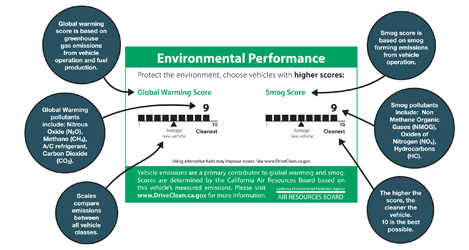
Environmental label for CA cars

Environmental label for CA cars

Effective since January 1st, California has launched a clean air label required on every new car produced and sold in California. The label rates ‘Smog’ and ‘Global Warming’ on a scale of 1-10 (5 being the average car, 10 being the cleanest). Though there has been a smog index label since 1998, this marks the first time such information has been available to the consumer at point-of-sale – though it seems you’ll have to pop the hood to find the label.

The best part is that the implementation of the label signifies a step toward transparency and ultimately sustainability: a system is now in place to transfer information from car producers, 3rd party reviewers, auto dealers and to communicate that to consumer.

However, the visual representation of the label leaves a lot to be desired. Very little actual information is communicated in these graphics – despite the seemingly substantial space allocated. A simple line makes up the ranking, but portrays very little detail about what the vague titles are all about. I’d like to see this label make use of the technique of layering: to call out the most basic important information (what’s already shown), while incorporating another level of supporting information to further educate viewers.

The ‘global warming’ score actually includes some interesting elements to touch on the larger life-cycle of the system – a stance not often acknowledged in products. But although this label touches on some issues related to sustainability, it leaves many questions in the viewer’s mind. For many audiences that already have a basic understanding of the principles of sustainability, the infographic neglects to transparently inform what the ‘smog’ and ‘global warming’ rankings actually include. [smog-producing emissions from use of the car for the former, and greenhouse gas emissions from fuel production, vehicle operation, and the car’s A/C system for the latter.] It’s also unclear whether average car score will adjust as cars are built cleaner in the coming years.

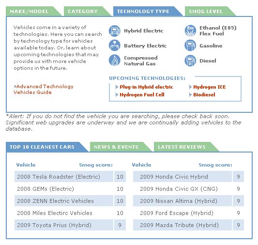
An online website clears up some of the vagueness: Consumers can also see the top 10-rated cars and check another vehicle’s rating  on the DriveClean website. But as information design, it certainly would be nice if the visual representation took the opportunity to communicate more substantive information to potential buyers, educate them on the potential environmental outcome of their purchases, or even motivate them toward sustainability.

Detail of the DriveClean site

Detail of the DriveClean site

This little piggy went …all over.

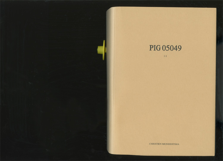
Pig book cover

Pig book cover

“Pig 05049” is a background story in reverse: This book starts from the initial ingredient (a pig) to tell the (future) story of everything that the pig becomes after slaughter.
Pig part

Pig part

Made from the pig

Made from the pig

Book by Christien Meindertsma. Images from julie joliat.