Putting Climate Data into the Context of Human Lifespan

We humans have a hard time comprehending our future.

Fortunately, there’s a lot of great science being done about our collective future. Unfortunately, this data is typically presented in a way that feels removed from our human experience. No matter how real data is — if we don’t perceive it as having a direct, tangible impact on our own lives (and those of our friends and family) it will continue to be viewed as abstract and removed from our life experience.

Creativity can help answer the call to connect seemingly abstract data to people’s emotions.

Arlene is exploring opportunities to annotate existing climate data to help people see themselves within the data. During a recent artist residency at MASS MoCA, Arlene worked on a series of projects to put our own life spans into climate data.

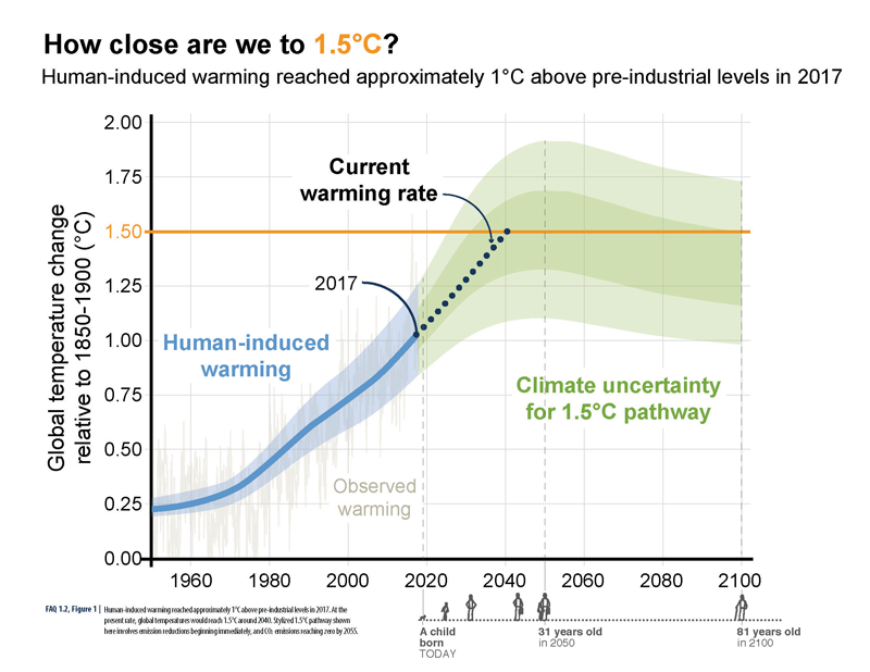
How Close Are We to 1.5˚C?ABOVE: A visual human lifespan is added to contextualize a series of future dates.

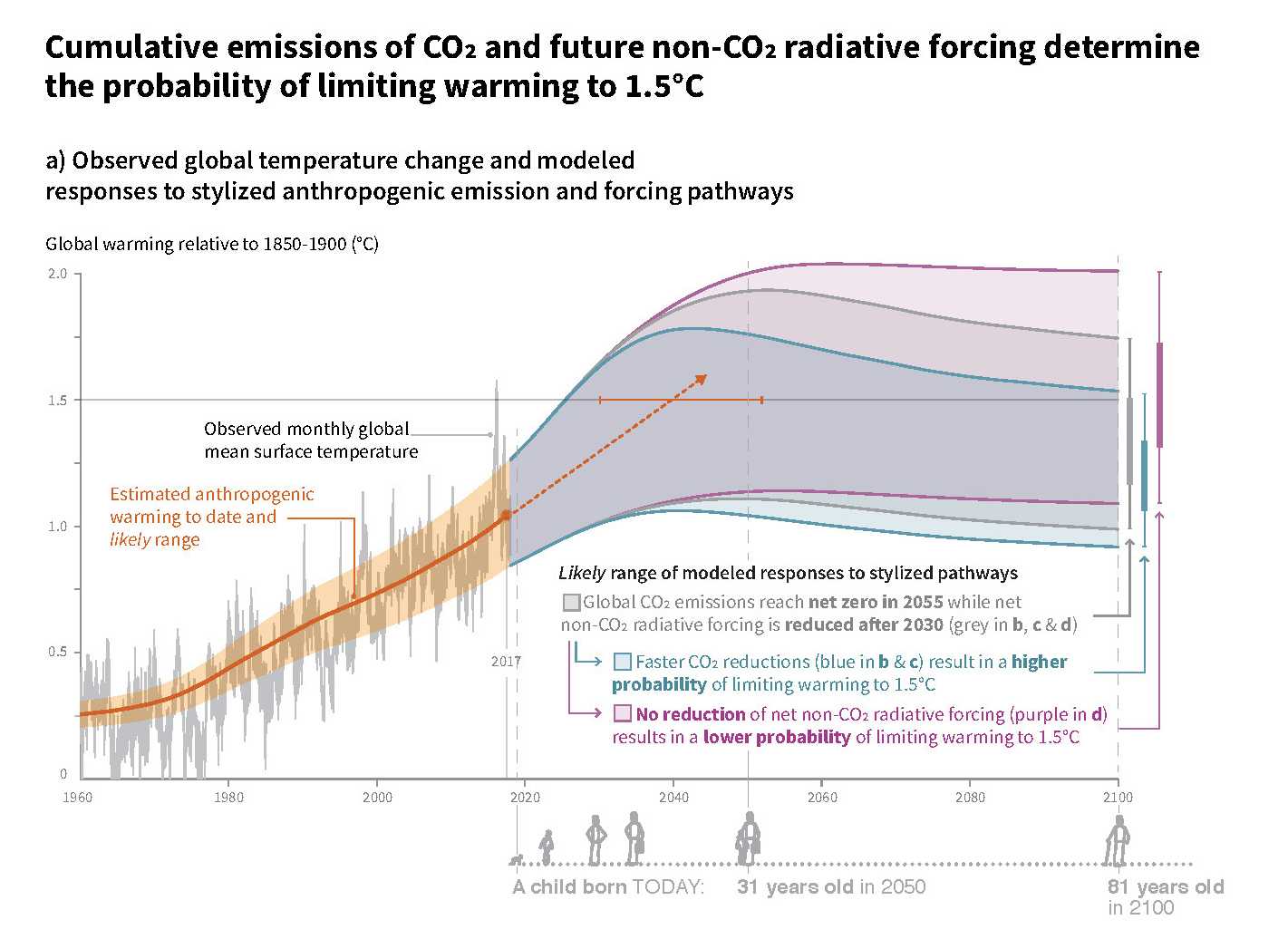
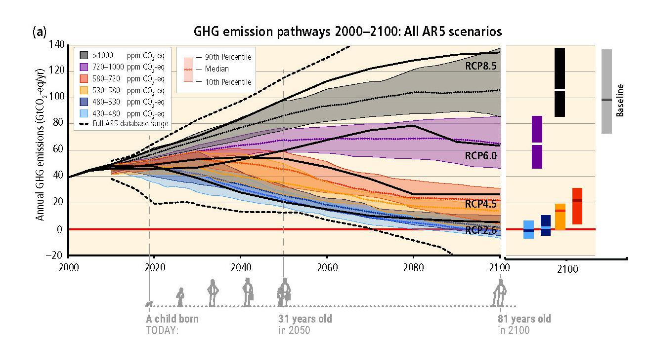
One project was to annotate graphs from Intergovernmental Panel on Climate Change (IPCC) reports that denote future climate trends. The graphs are annotated with a small illustration of an average human lifespan — starting with a child born today. The annotation shows how old the child will be in key years that are in the data. The inclusion of a human life span with this data helps remind us of the grand scale of the global changes that are being graphed, and how these changes will continue to impact our children, grandchildren, nieces and nephews long after we’re gone.

BELOW: Additional examples of human life spans visualized as part of a graph’s timeline.

Cumulative Emissions of CO2

GHG Emission Pathways

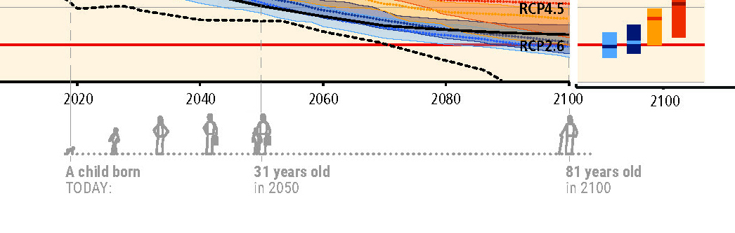
BELOW: Detail of the timeline with life span.

Detail of GHG Emission Pathways

Webinar: ‘Visual Storytelling: Putting Data into Context’

Audience First: Behavior Change and Values-Based Climate Communication

Connecting with audiences based on the values that are behind a desired activity/behavior can be more powerful than highlighting benefits to the audience. This values-driven approach has been shown to have more impact than ‘saving the environment’ or even ‘cost savings’ messages, according to the founder of Climate Outreach, George Marshall, who presented at Behavior, Energy and Climate Change conference (BECC). (See a synopsis of Arlene’s ‘Public Engagement through Art’ presentation on our previous newsletter.)


For example, instead of touting the cost-savings and environmental benefits of home insulation, consider:

“Your home is great. It’s where you bring up your family. It’s where you share some of the best moments of your life. You want to keep it cozy. Insulation is a good way to do that.”

This ‘audience first’ approach closely resembles ‘Start with Why’ and the design and communication processes that I use in practice, and with my students.

In our communication work, we orient every aspect of a message around the intended recipient: story structure, visual style, and language used. So, I can relate to focusing on an audience’s need.

Marshall’s presentation made the point that prioritizing the audiences’ values (even above the benefits of a product/service) throughout this messaging, can create impact on sustainability-related behavior change. 


Pollinator-Friendly Solar at the Fair

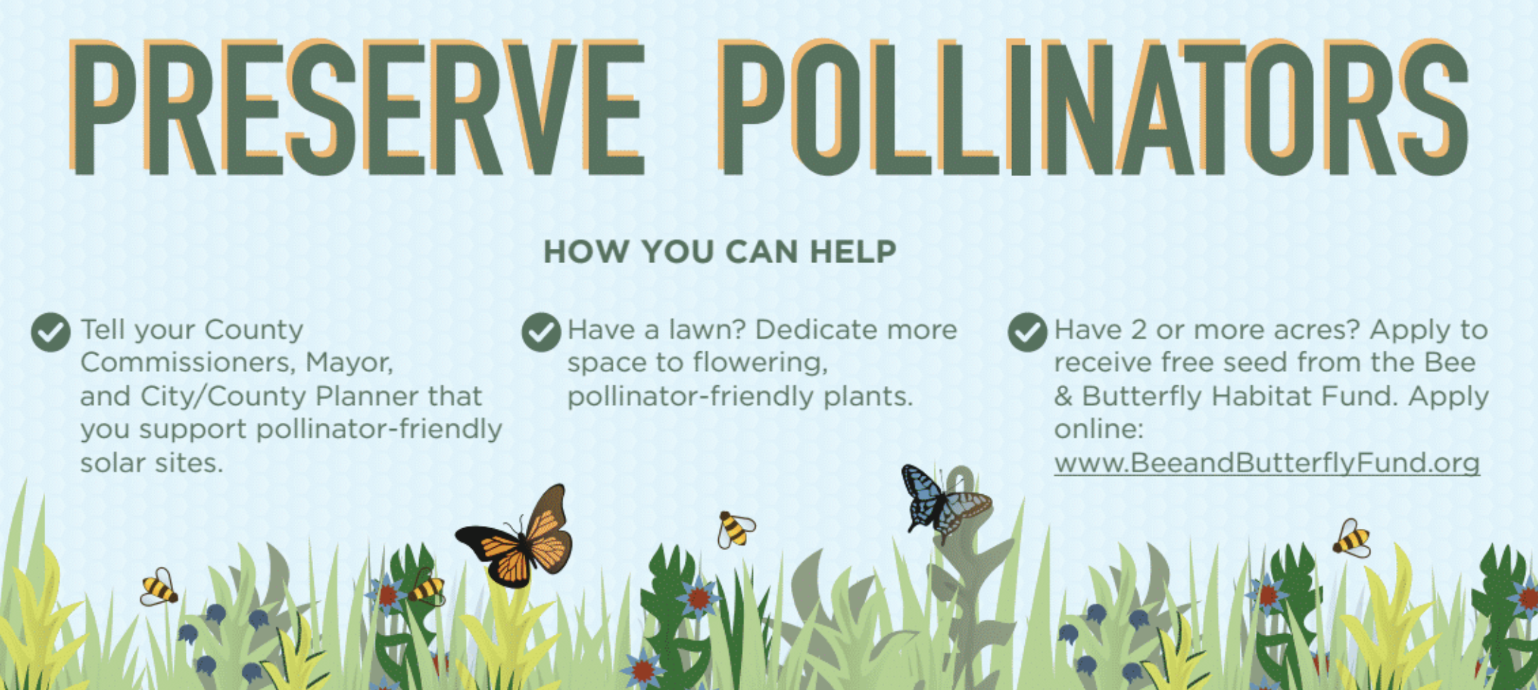
For this year’s Minnesota State Fair, we’ve teamed up with Fresh Energy and Connexus Energy to create a three-dimensional display to draw attention to a new way of thinking about renewable energy: Pollinator-friendly solar.

Preserve Pollinators

Infographic poster from the Minnesota State Fair display.

Our display, part of “The Common Table: Minnesota Eats” exhibit in the Agriculture Horticulture Building, highlights how our region is leading the way in policymaking and on-farm efforts to bring more pollinator habitat to otherwise underutilized land. You can see the exhibit in-person from August 23 through September 3, along with nearly two million other fair-goers (who famously flock to the event for all kinds of foods and creations “on a stick”). Of course, our sticks — a series of cutout landscape elements and hide-and-seek pollinators for you to find — will be glued down, but you’re sure to learn a lot about the powerful partnership of pollinators and solar energy!

Selecting the Right Graph

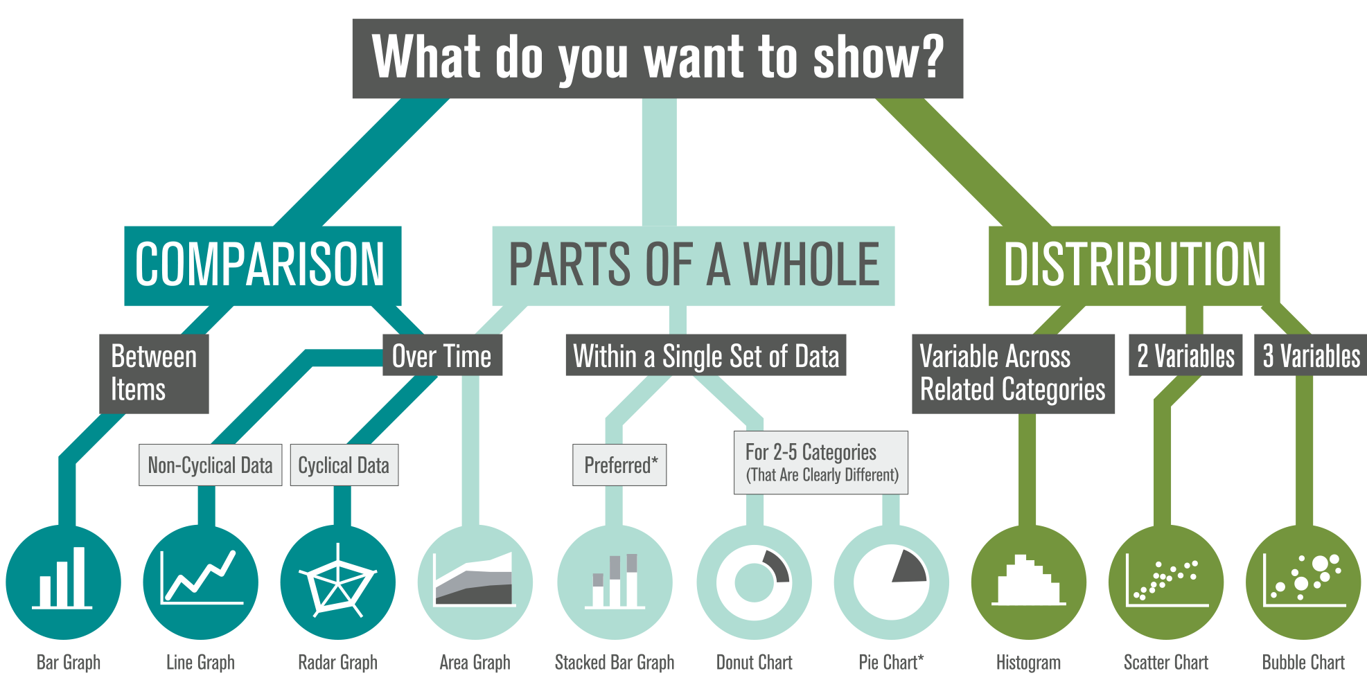
We’re often asked, “What type of graph should I use for this data?” We also see a lot of variety in how similar data sets are visualized (some working better than others). There’s plenty of debate out there, so how do you decide?

Selecting The Right Graph

*Stacked bar graphs show comparison most clearly — and are preferred over pie charts (which do not allow easy comparison). Donut charts are slightly better than pies. Hungry yet?

We’ve created this visual guide to recommend best practices, which starts with a clear understanding of your content — what are you trying to show? There are options within each category based on the type of data in your set (and ironically, many of the standard graph types tend to share food-based titles… by the time you decide between Pies, Bars, and Donuts, you might be tempted to hit the bakery!). Which graph will you apply to your next datavis project?

Designing Information for the Understanding of Sustainability

Notes From the GreenID Conference

Recently presenting at the International Institute of Information Design’s (IIID) GreenID conference in Vienna, I was struck by the phrase, “Context brings understanding.” As information designers, we seek to clarify complex information. And sustainability is certainly a topic area that involves a lot of complexities in communicating related social, ecological and financial attributes of a product or service.

Green ID sustainable information design conference logo

My work focuses on developing ‘visual stories’ to help consumers understand how their individual actions play into the ‘big picture’ of sustainability. In my mind, it’s the communication of the context of sustainability that brings understanding to consumers.

To this aim, I presented research and techniques for communicating sustainability – gleaned through my work on narrative life cycles and with students at the Minneapolis College of Art and Design’s (MCAD) sustainability program. I aimed to demonstrate how a visually-compelling story can present complex sustainability data in an approachable, layered format that can act as a tool for consumer education.

The conference covered a wide variety of topics and projects related to the overlap of info design and sustainability. Three areas of interest for my work and the upcoming visual communication course at MCAD include techniques of designing for understanding, measuring impacts and questions on the effectiveness of info design in changing behavior.


Designing for Understanding:

When setting out to design information to aid in understanding, and to clarify context, there are a number of strategies to consider. 

Presenter Angela Morelli, who has done a thorough analysis of the hidden water footprints embedded behind everyday foods and activities, made a case for emotional connection with an audience. She presented 4 guidelines for designing for understanding: utilize empathy, reference cognitive science, observe beauty and play on an audiences’ interest.

To design for understanding, one must first thoroughly understand the content of what is being designed. In a workshop Morelli gave on data visualization, she also outlined the steps to creating information design: first we ‘look,’ then ‘read,’ ‘organize’ information then ‘cut & paste’ it into a format which communicates a message to others. This process mirrored the 4 steps of visual thinking outlined in Dan Roam’s book, “Back of the Napkin”: first we ‘look’ to scan what’s in our vision. Then we ‘see’ to make sense of that which is visible, and then ‘imagine,’ to use our mind to guess that which is not visible. At this point we ‘show’ to share with others (this is the actual stage of creating a visual info design).


Measuring Our Impacts:

Discussion at the conference considered methods of measurement for each of the 3 legs of sustainability in order to visualize data in a holistically-balanced way. 

Data obviously exists for financial measurement– all companies financial reports go into depth on this very important topic.

The ecological dimension is –relatively more recently- available through processes such as Life Cycle Analysis (LCA). In fact, my presentation showcased a variety of visual narrative approaches to information design, including examples from client work, creative practice and student work from a course I teach that concentrates on visualizing product life cycles and the more technical ecological measurements of sustainability known as Life Cycle Analysis (LCA).

However, defining measurement for the social component is much more slippery. (How exactly does one measure ‘happiness’?) As this field of ‘quality of life’ is based on qualitative research and varies based on cultural norms and individual expectations, it’s hard to make inclusive visualizations of the ‘social’ on-par with its financial and ecological counterparts.


Can Data Visualization Lead to Behavior Change?

Overwhelmingly, questions throughout conference discussion centered on ‘can visualization of information lead to behavior change?’ Fortunately, there was an environmental psychologist among the presenters to provide some guidelines for our research into this question. Dr. Karen Stanbridge of the University of Reading presented some theories to reference when designing for behavior change:

  • Theory of Planned Behavior – (Ajzen & Fishbein, 1980)
  • Stages of Change Model – (Prochaska & Diclemente, 1982)
  • Theory of Social Dilemmas

These theories can act as a starting point for research into measuring the effectiveness of this emerging field of information design for the communication of sustainability. 

MEDEA Talk on ‘Visualizing Sustainability’

Arlene Birt presenting at MEDEA in Malmö, Sweden on Dec.10 (15:00-17:00 Central European time).

Arlene will present two projects that she’s done as artist-in-residence at MEDEA and a behind-the-scenes view on her work on how to visualize ‘background stories’. One project is a visual mapping of the sustainability-oriented systems at work within the Västra Hamnen area of the city through a collaboration with Unsworn Industries to show this information using the parascope technology they’ve developed. Another project visually communicates the benefits of bicycling – in terms of CO2 saved, money saved and calories burned.

Details on the talk here. There will also be a live-stream of the talk.

Tracing a Taco

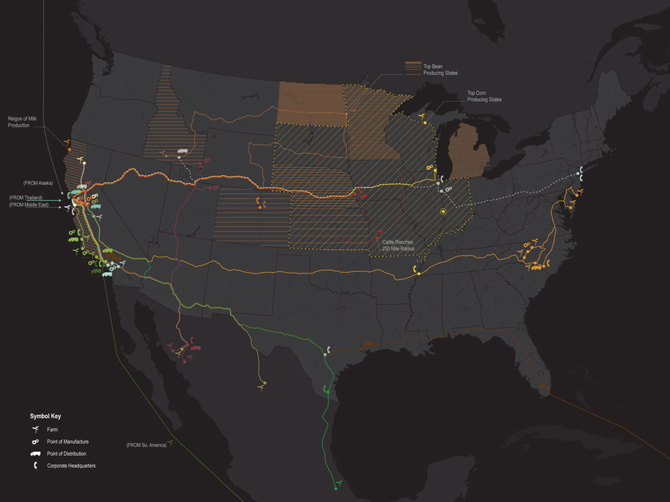
‘Tacoshed’ tracks the journey (and miles) of all the ingredients from a taco produced by a specific taco truck in San Francisco.

Tracing Food miles from a taco

TRACING THE BACK-STORY OF A SPECIFIC TACO

Compiled by students at California College of the Arts and design group Rebar, this info-visualization highlights the complexity of our food systems.

Tough resulting in complex maps, the results accurately gives people an idea where their food comes from.

Year in Numbers

A local cafe has compiled a somewhat-visual depiction of their activities over the year. The focus is on communicating data as it relates to the sustainability initiatives of the cafe.
Read more

Linking Everyday Gestures with Digital Details

Pranav Mistry combines standard, everyday gestures with digital information. His solutions -which include the SixthSense wearable computer – have potential to bring real transparency into sustainability, and enable people to literally immerse themselves in their own ecological footprints. Read more