Presentation topics have included:
- The visual and emotional opportunities for sustainability
- Connecting audiences to the greater contexts of their everyday experiences
- Visually communicating sustainability
Select Presentations:
Twin Cities Big Data, Data Science and Analytics Community conference, MinneFRAMA, (MN, US) | presentation | 2018
Behavior, Energy, Climate Change Conference (DC, US) | panel presentation: arts and science collaborations | 2018
Sustainable Brands ‘Innovation Lab’ on Good Cities (BC, CA) | workshop: design thinking for sustainable cities | 2018
Talk Climate Institute (Climate Generation, MN, US) | presentation: arts and climate | 2018
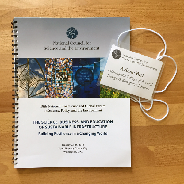
National Council for Science and Environment, Annual Conference (DC, US) | panel presenter | 2018
Minnesota Council for Nonprofits, Annual Conference (MN, US) | co-presenter | 2018
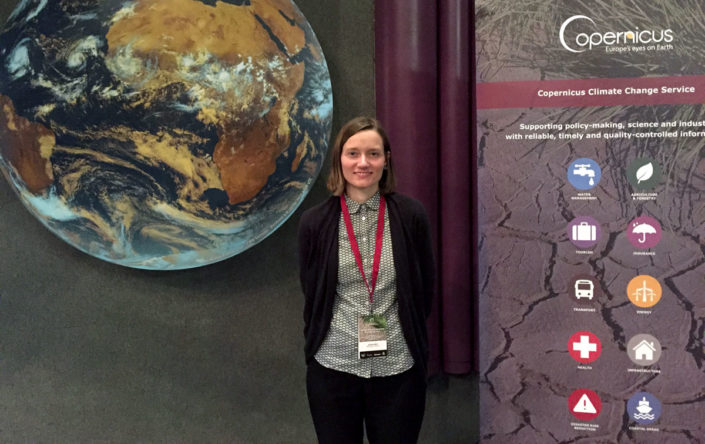
Copernicus Climate Change Service general assembly (Toulouse, France) | presentation on communicating climate science | 2017
Monicat Data for Art Workshop (Minneapolis, MN, US) | Panelist on creative strategy and data visualization | 2017
MOSES Organic Farming conference (La Crosse, WI, US) | expert roundtable on ‘Visualizing your Farm Story’ | 2017
Environmental Initiative’s Business and Environment Series (Minneapolis, MN, US) | “Sustainability Storytelling: Going Beyond the Report” | 2016
Sustainability Employee Engagement Network (SEEN) Virtual Summit | 2016
Spectrum Brands’ Global Sustainability Annual Meeting (WI, US) | presentation on communicating sustainability | 2016
Copernicus climate change communications workshop (Brussels, Belgium) | European Sustainable Energy Week | 2015
Retail Sustainability Conference (Minneapolis, MN, US) | keynote | 2014
Sustainable Food Institute (Monterey Bay Aquarium, CA, US) | keynote | 2014
TEDxFulbright (D.C., US) | Sustainability: Made Visual | 2014
Interaction14 (ixda) (The Netherlands) | ‘The Visual [Emotional] Vocabulary of Sustainability’ | 2014
University Nebraska – Lincoln (NE, US) | public presentation during artist visit | 2013
Visualized (NY, US) | presentation at conference on Information Design | 2012
Interaction12 (ixda) (Ireland) | workshop: narrative visualization for sustainability | 2012
Green Information Design (Austria) | presentation on narrative visualization | 2011
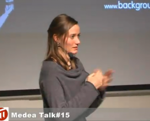
MEDEA Talk #15 (Sweden) | presentation at collaborative media institute, Malmö University | 2010
Earth Day ‘Pecha Kucha’ at Minneapolis College of Art and Design (MN, US) |“Designing our way out of this” | 2010
Joint OECD and International Institute for Information Design Conference (France) | 2009
New Media Meeting 4 (Sweden) | 2009
AIGA Minnesota Sustainability Retreat (MN, US) | 2009
New Media Meeting 3 (Sweden) | online presentation | 2008
Twin Cities Solutions (MN, US) | 2007
Walker Art Center (MN, US) | Group presentation curated by Twin Cities Solutions | 2007
Doors of Perception Conference (India) | 2007