Cell Size Comparison

This nifty flash tool from the University of Utah’s Genetic’s lab lets viewers zoom into an image to experience the size of increasingly small cells relative to each other. Such an interactive and immersive experience helps people understand more about the world around them – the very, very small world.

Zooming into increasingly small size comparison of cells.

Zooming into increasingly small size comparison of cells.

A useful application based on some of the same principles behind the Eames’ Powers of 10.

Communication Design Recognized in Back-Story-Telling Project

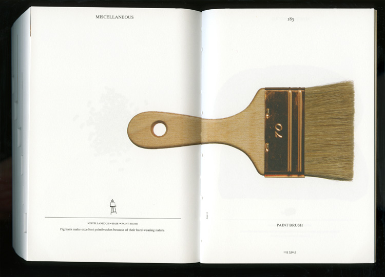
For the first time, the prestigious INDEX Design Award has a winner from the field of communication design. ‘PIG 05049’ is a primarily-visual book, designed and conceived by Christien Meindertsma, that traces all the products made from one pig.

Visual spread from the book 'Pig 05049'

Visual spread from the book

Meindertsma’s intent for the project:

Help people in a highly mechanized and “packaged” world understand how things are made and where they come from so that the resources involved can be cared for by enlightened, informed people.

It’s nice to see the role of communication design to build awareness being recognized within the design community.

Read a previous entry on Meindertsma’s project here.

Disclosing Dish Soap

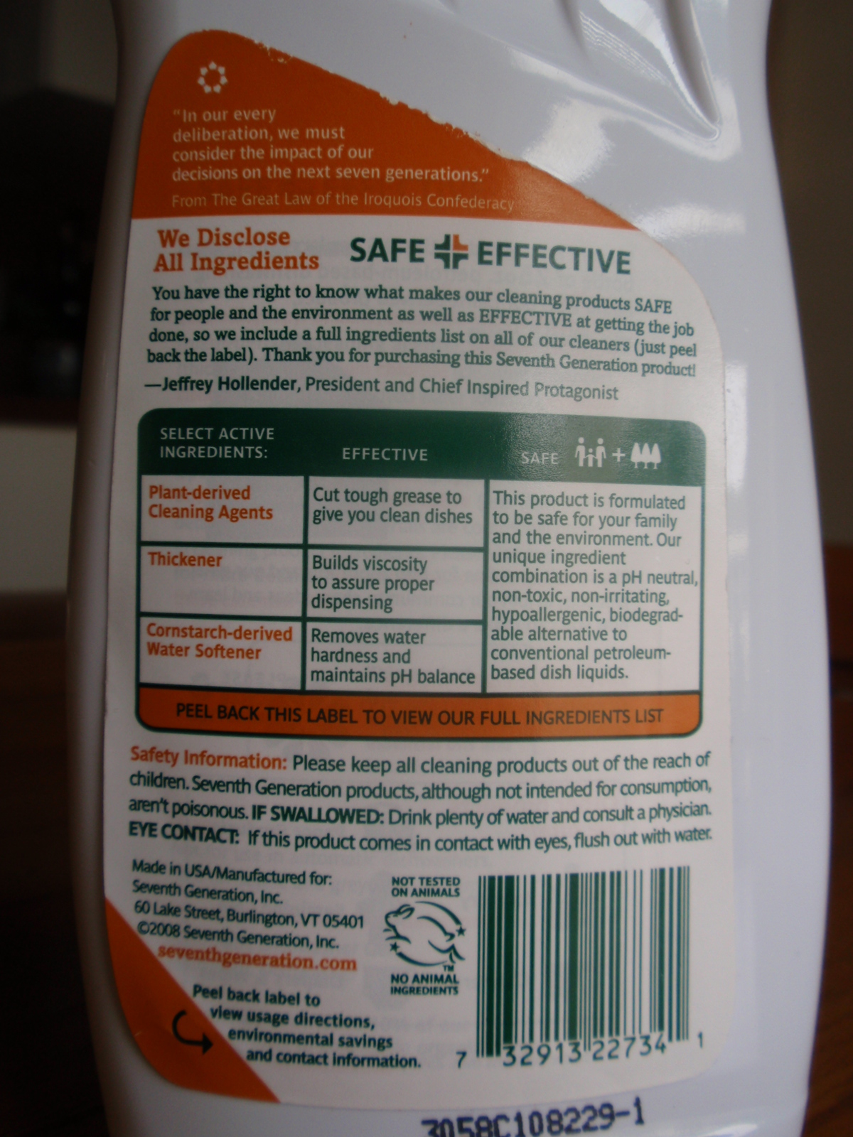
Seventh Generation’s liquid dish soap bottles are sporting an in-depth ingredient label – under the existing label.
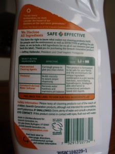
Dish soap ingredient information label

Dish soap ingredient information label

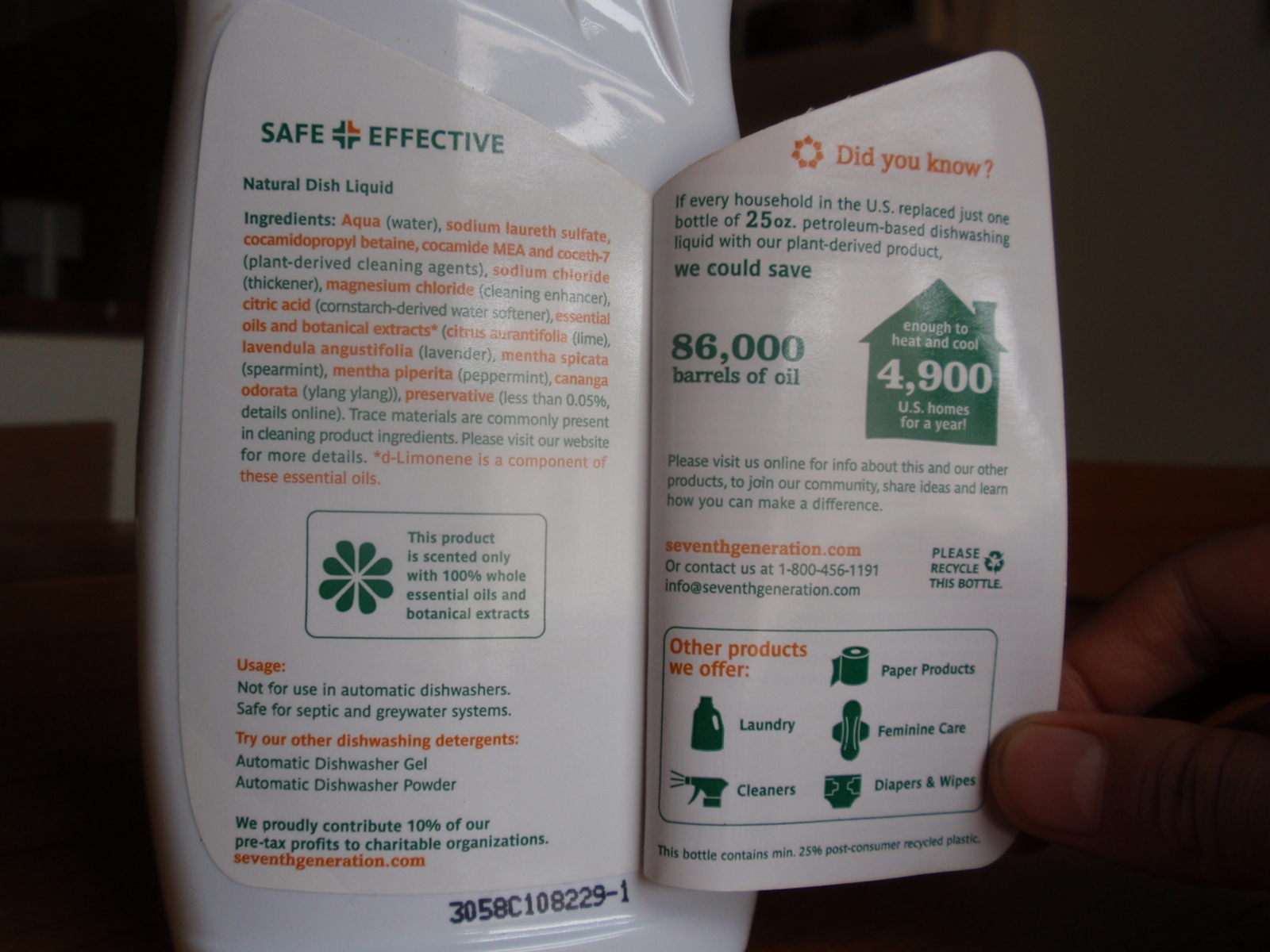
The peel-away outer back-panel gives a text-heavy overview of the company’s safety criteria and commitment to transparency. Inside, an extended eco-label takes the first steps toward integrating statistics: Minimally illustrated with a home icon, the statement reads that ‘if every household in the U.S. replaced petroleum-based dish soap with plant-based… we would save 86,000 barrels of oil (the equivalent to heat and cool 4,900 U.S. homes per year).

Its nice to see a comparison that puts so many barrels of oil into a meaningful perspective for the purchaser.
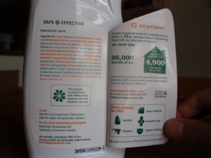
Stats and info revealed on Dish liquid bottle

Stats and info revealed on Dish liquid label

The peel-away label allows for 2 additional panels for the consumer to transparently uncover information, but the space could have been used even more effectively: I’d love to see a more life-cycle oriented approach applied to this design format, and the icons used to highlight information, rather than to advertise the company’s other product offerings.

Turning over a New Leaf (paper)

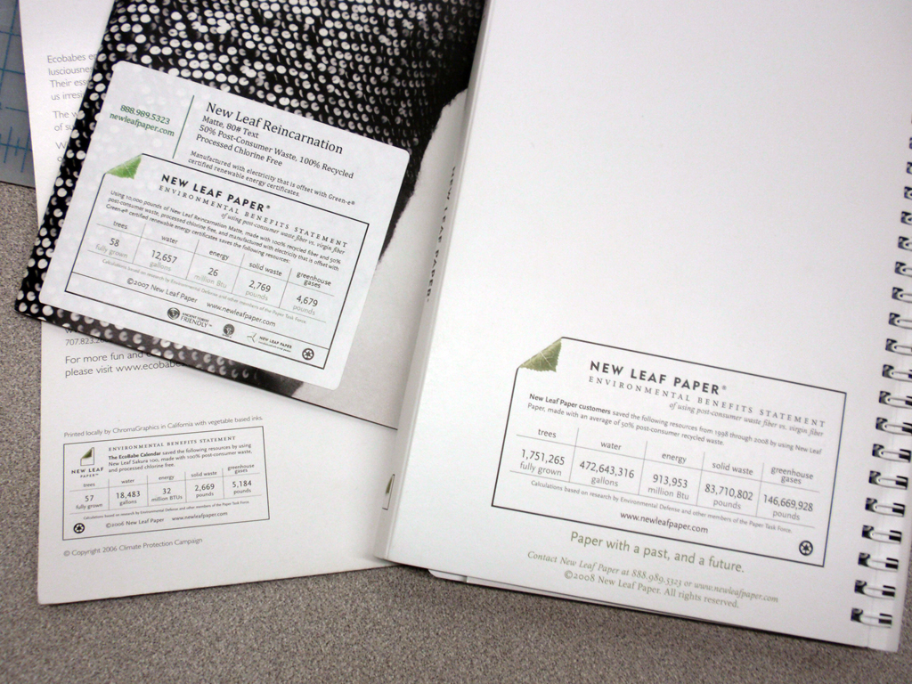
The New Leaf paper eco-audit is a well-thought out tool that communicates transparency, and -in a beautiful way- helps the end consumer understand the sustainability-positive impact of using a specific paper.

The eco-audit provides a place for data on resources that have been saved throughout the life-cycle of New Leaf’s paper (as compared to the industry standard). The eco-audit profiles the quantity of ‘saved’ trees, water, energy, solid waste and greenhouse gases. And an online portal allows companies to customize the quantities for their own print-jobs.

New Leaf labels on printed projects

New Leaf labels on printed projects

Customizable background stories supported by sustainability statistics- what isn’t to love? A bit more visual reference could be incorporated into the eco-audit label, or the concept could have some accompanying publicity or other materials that really bring this idea to (visual) life. This may include developing an application to show comparisons online, or supplementing the numbers with visual representation.  I -for one- would like to see what an expanse of 118-saved trees actually looks like. Or a comparison to how many swimming pools 50,178 gallons would fill.

Tracking water droplets: Playing raincloud.

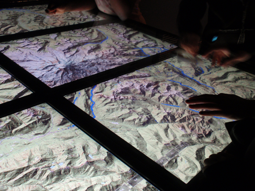
An exhibit on Water at the Science Museum of Minnesota contains an interactive display that allowed people to ‘become’ a raincloud. By rubbing a ‘raincloud’ tool over a series of screens displaying a topographic map, the cloud rains drops of water onto the topo-map. Visitors can see how the drops of water run down the sides of a topographic map to slow and pool together in the valleys between mountains. Colliding together, the blue drops create rivers which meander through valleys until falling off the screen.

Interactive table created interaction for watersheds

Interactive table created interaction for watersheds

As a fun way for visitors to interact with the exhibit, this project helps people understand how water flows (the fact being downhill- which I thought was obvious, but apparently there is an overwhelming number of people who are surprised when rivers turn to flow North instead of South, as on maps they must have an idea that gravity makes the water flow off the page.)

Reality, augmented. […sustainably?]

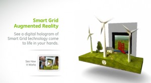
Merging analog and digital, this new tool allows users to use their webcam to make a simple printed page come to life. In 3 dimensions!
Augmented Reality: a virtually 3-d landscape unfolds via your computer's webcam.

Augmented Reality: a virtually 3-d landscape unfolds via your computer

An incredible display of technology, it’s not hard to imagine the communication possibilities for sustainability, communicating the background stories of products…or anything for that matter. However it’s not immediately clear how this technique is as exclusive to the future of sustainable communications as it would have us believe (the tool is introduced from within GE’s micro site promoting sustainable technologies like the smart grid and smart power meters). Though a extremely promising tool, a slight scent of greenwash clouds the air.
Watch the video, as presented by Adobe CTO, then try it for yourself.

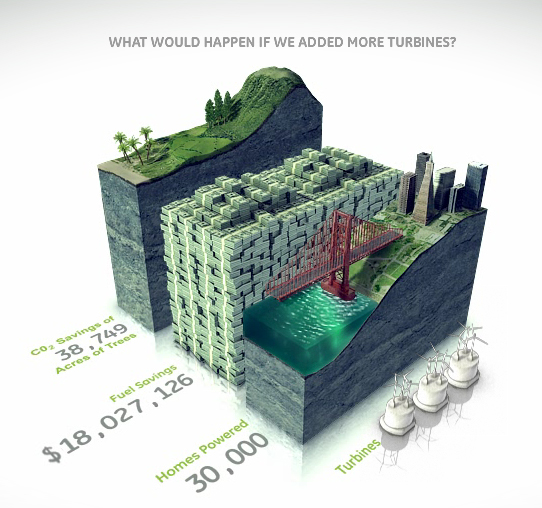
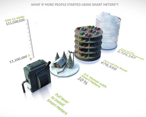
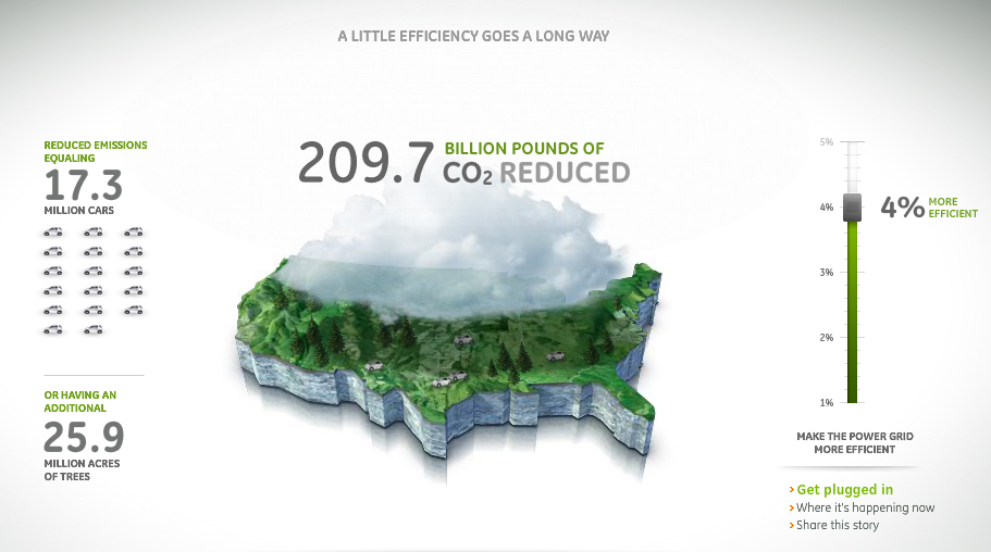
On the topic of eco-magination, there are some wonderfully communicative info-graphics throughout the micro site. However, overall the site is excessively flashy: lots of pretty pictures…but not much overall content.  It seems to have been created as a playground for cutting-edge graphics more than to support sustainability. (Though, one could argue that’s GE’s intent…) More easily accessible information to back up the claims that GE wants to communicate through such elaborate – and interactive- visuals would lend significantly more credibility to this site.
bar graphs bring information to life with visual virtual worlds

Bar graphs bring information to life with visual virtual worlds

Environmental and financial savings stack up in a bar graph.

Environmental and financial savings stack up in a bar graph.

GE infographic - Mapping CO2 Emissions

GE infographic - Mapping CO2 Emissions

Home energy usage via Google

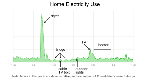
Google is in the development stages of a power meter that enables users to monitor real-time feedback on their household energy consumption. This kind of instantaneous feedback gets to the basic premise of why it’s important to show & tell background stories. This power meter is tool that enables the customer to make their own choices: in this case, the customer can make the connection between more energy usages= more $.

Google's plan to meter home energy consumption

Google's plan to meter home energy consumption.

Follow google’s developments on www.google.org/powermeter.

Perhaps this precision monitoring of the background of products also paves the way for technologies enabling people to generate their own power – and sell it back to utilities.

Chips with visual crisp

Good info-design requires consistency and repetition in order to establish a visual pattern. This site does both well.

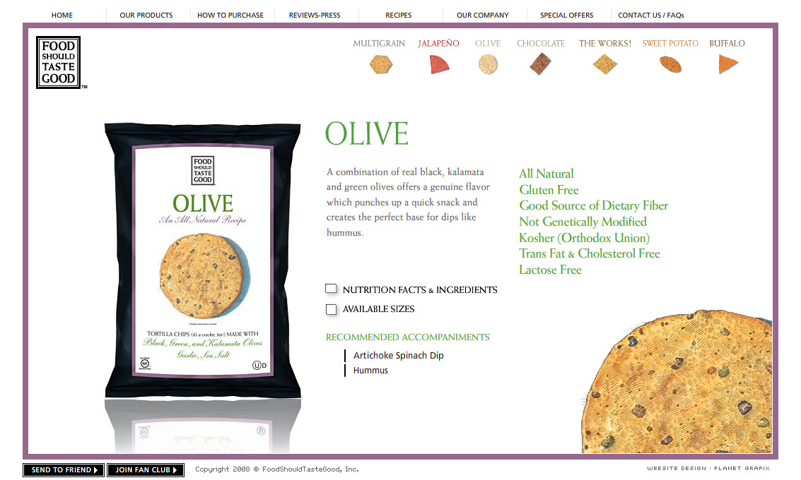
Using a small-multiples-like approach that allows the viewer to compare the chips at-a-glance, the designer has clearly paired color pallet with the chips. The miniature chips (color, texture and all) are both a reference to the chip variety, and a visual navigation to additional information on the product.

Website with chip navigation

Website with chip navigation

Small multiples of chips, color-coded

Small multiples of chips, color-coded

And they taste good too.

www.foodshouldtastegood.com

No Smoking. No Food. No Robots.

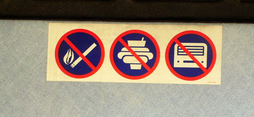
No Smoking. No Food. No Robots.

A lesson in information and graphic design:Graphics need to be able to withstand the test of time.

This info-graphic inside a Minneapolis bus does alright communicating no smoking and no food or drink. But my only guess is that the ‘robot’ icon was intended to represent a tape deck (as a symbol for loud music) … a technology that has not withstood the test of time. At least not in this era.

This lends a lack-of-trust and a sense of out-dated-ness to the first 2 graphics – which are quite comprehensible by themselves.

It’s important that an audience be able to comprehend a visual icon. An infographic must be able to capture the essence of the object/idea without being too detailed about age/brand/….etc. Naturally, this job is made difficult by the changing design of products, trends, etc.

Showing the Full Story

First: show it all. Then let people zoom into the pieces of information that interest them. A visual story can be overwhelming if it doesn’t provide some context.

A good background story makes it clear what information is found in what part of a product’s background.

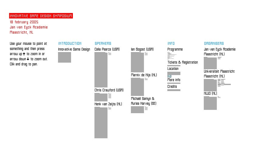
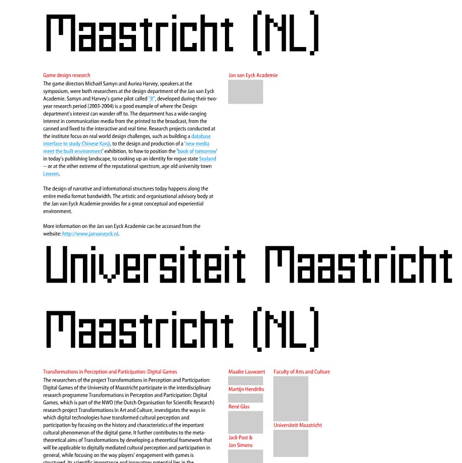
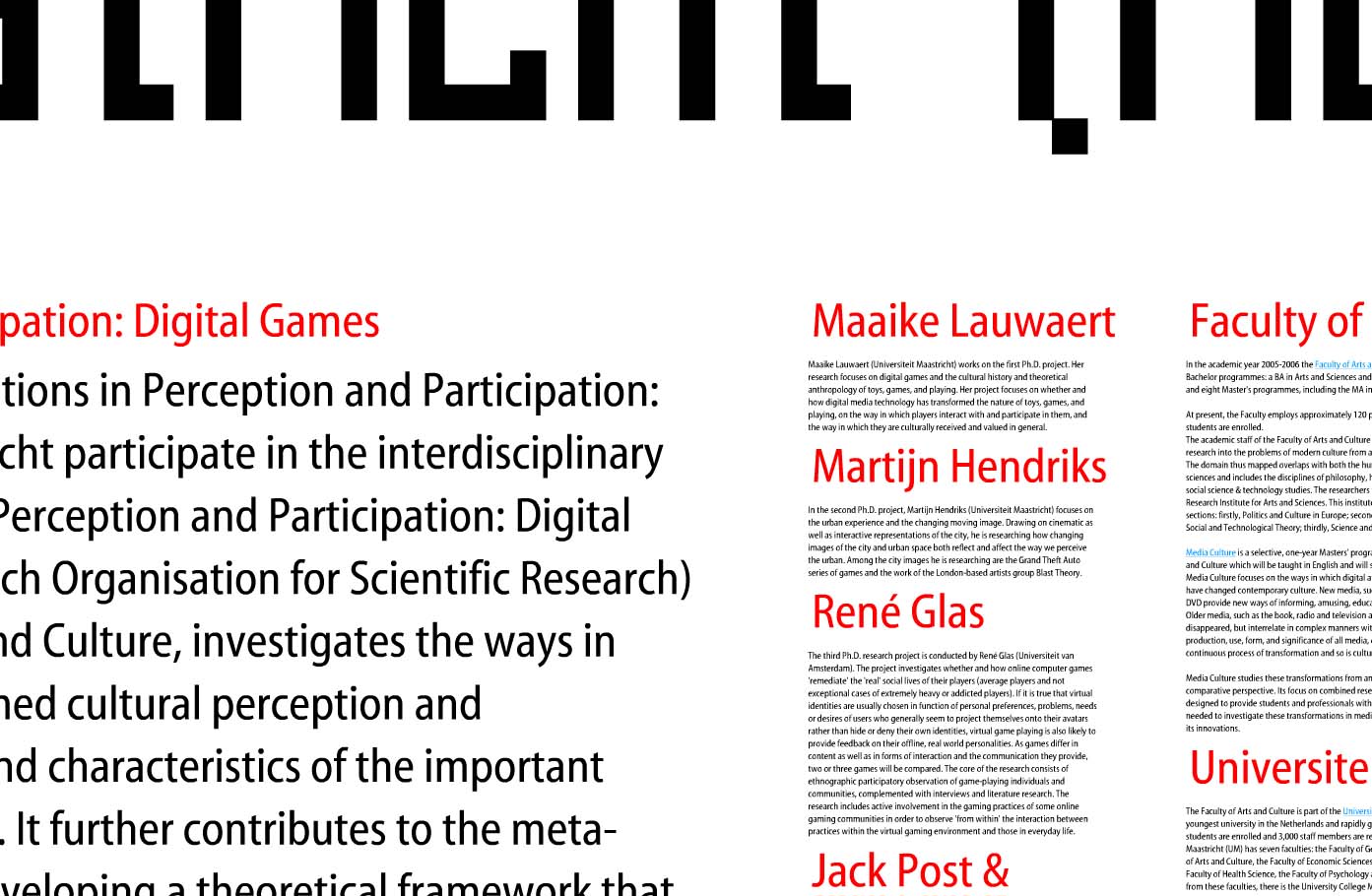
This example makes excellent use of spacial relationships to put increasingly detailed information in context: and help the viewer understand that context in a visual way. Shown are 3 levels of zoom into a site for a symposium at the Jan Van Eyck Academie in the Netherlands. The keystrokes needed to zoom in and out of the information are a bit clunky, but the overall concept is an intriguing way to communicate layers of information.

overview of all information zoom level 2 zoom level 3

Such is the concept of transparency – a viewer should be able to access even the most minute details of data: It’s all part of the big picture.