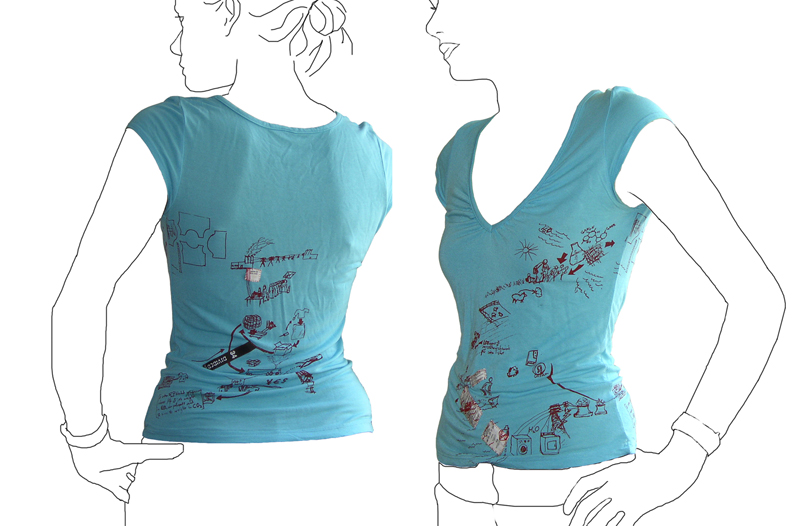
T shirt tells its own life cycle.

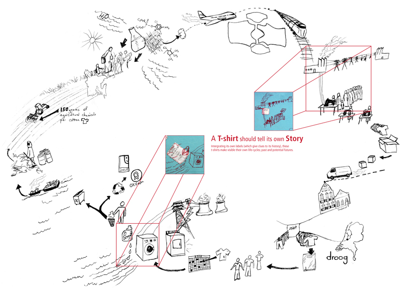
Tshirt printed with it\'s own life cycleLife cycle of a T-shirt: Droog Design

This t-shirt tells its own back story: the t-shirt tags are cut from the inside and stitched into the screenprint graphic of an imagined life of the product. The shirt was put into production in 2006 by Droog Design.

This is a more illustrative, conceptual version of a background story – less data based. The graphic is customized based on available information at the time (this includes where the cotton comes from, and where the t-shirt is sold). More quantitative figures on distance and carbon footprint could be input with the right data available.

Apple Card

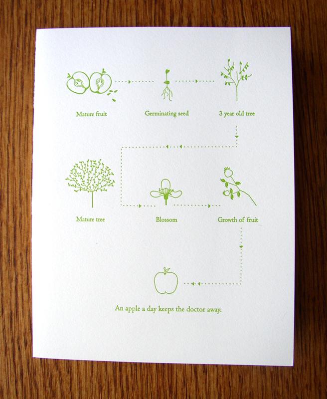
Greeting Card with graphic of Apple life-cycle

If an apple a day keeps the doctor away, this card is worth an entire year doctor-free.

The graphic on this greeting card describes the life-cycle of an apple seed/tree/fruit. The scale of each element is irrelevant because segment of illustration concentrates on the most important component of that part of the cycle; giving the viewer the appropriate zoomed-in or zoomed-out view.

The key words are a bit redundant (especially “Blossom”). Without these words the viewer would still understand that the story is about the cyclic growth of the apple. However, if the subject in question were more complex or unusual than the common apple, keywords would become essential.

Take it one step further: imagine how the graphic could get even better connected if the paper its printed on was made from apple tree pulp…then embed an apple seed inside so the disposal of the card grows another tree. The graphic could then expand to include the tree trunk’s second life as this card.

Card by Pancake & Franks.

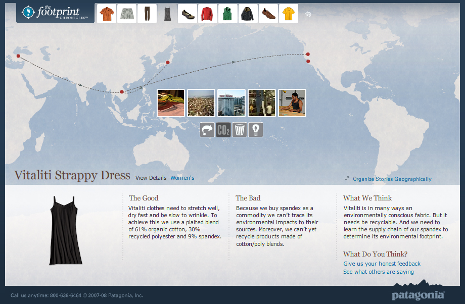
Patagonia’s Footprint Map

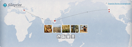
Footprint ChroniclesTravels of a Patagonia Dress - Footprint Chronicles

Companies are increasingly able to track the life of their products through their supply chains and trace the origins of even the smallest notion.

Patagonia’s Footprint Chronicles outlines the potential for a company to unveil its transparency in the name of promoting sustainability (and hence, appearing as a sustainable company). From an information standpoint, Patagonia is open about “The Good” and “The Bad” – admitting that, like any human, they’re not yet perfect, but they know where they need to improve.

The online tool carries the viewer through design, materials, manufacture, distribution (among others) of a handful of the company’s products, allowing the user to explore info both sequentially or geographically. Based on google-esque maps, the tool is well-designed as both a piece of information design and as an interactive tool.

Though included are a handful of data and other numbers, I’d like to see these numbers presented in a more visual way – nice parallels are drawn to perceivable concepts to make abstract quantities real. For example: where they say the CO2 generated from a specific shirt is equal to 100x the weight of the shirt, it would be nice to have a more standard reference: such as how many miles average driving…or how many trees need to be planted to counteract this release of CO2. This reference could in-turn, be illustrated in a more graphic format that would enable more direct comparison between various products.

Icy “ICE” sign

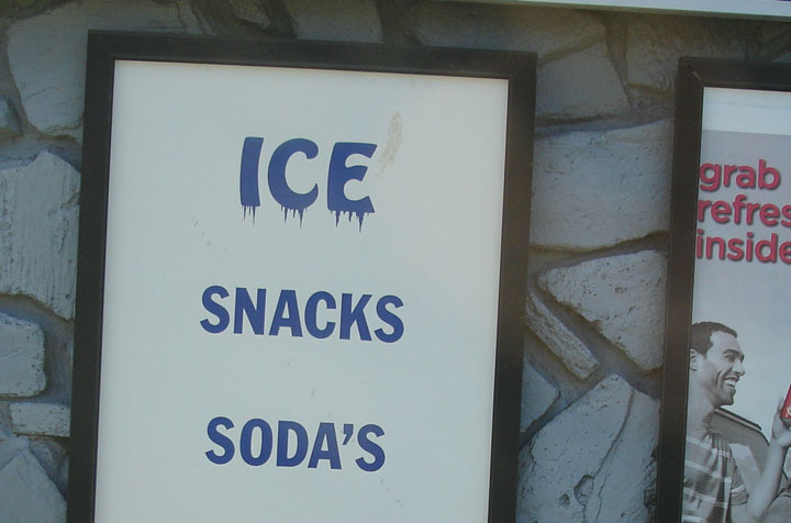
Ice for sale sign

The “ICE” on this sign gives visual cues to the effect of the product itself.

Where the viewer may have understand what “SNACKS” and “SODA’S” mean, they will feel the meaning of “ICE”. This technique can also aid in understanding for low-literacy audiences.