Posts

Disclosing Dish Soap

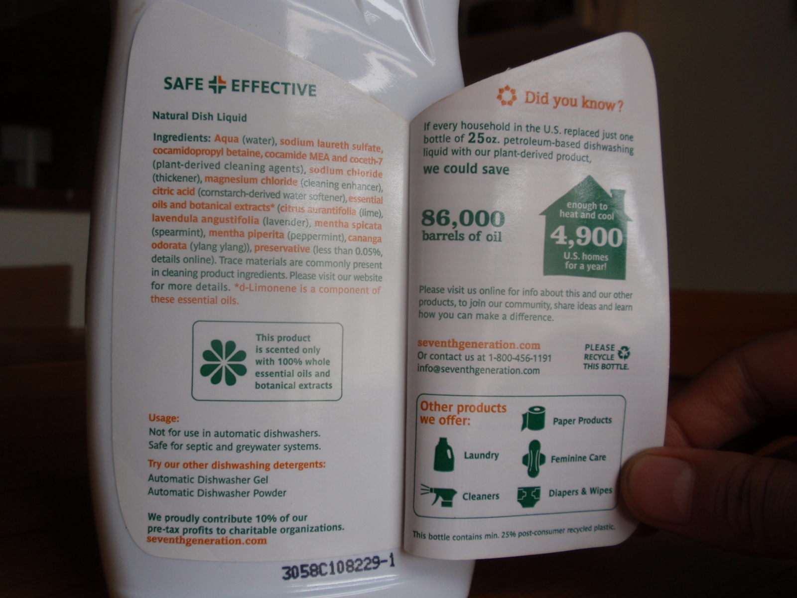
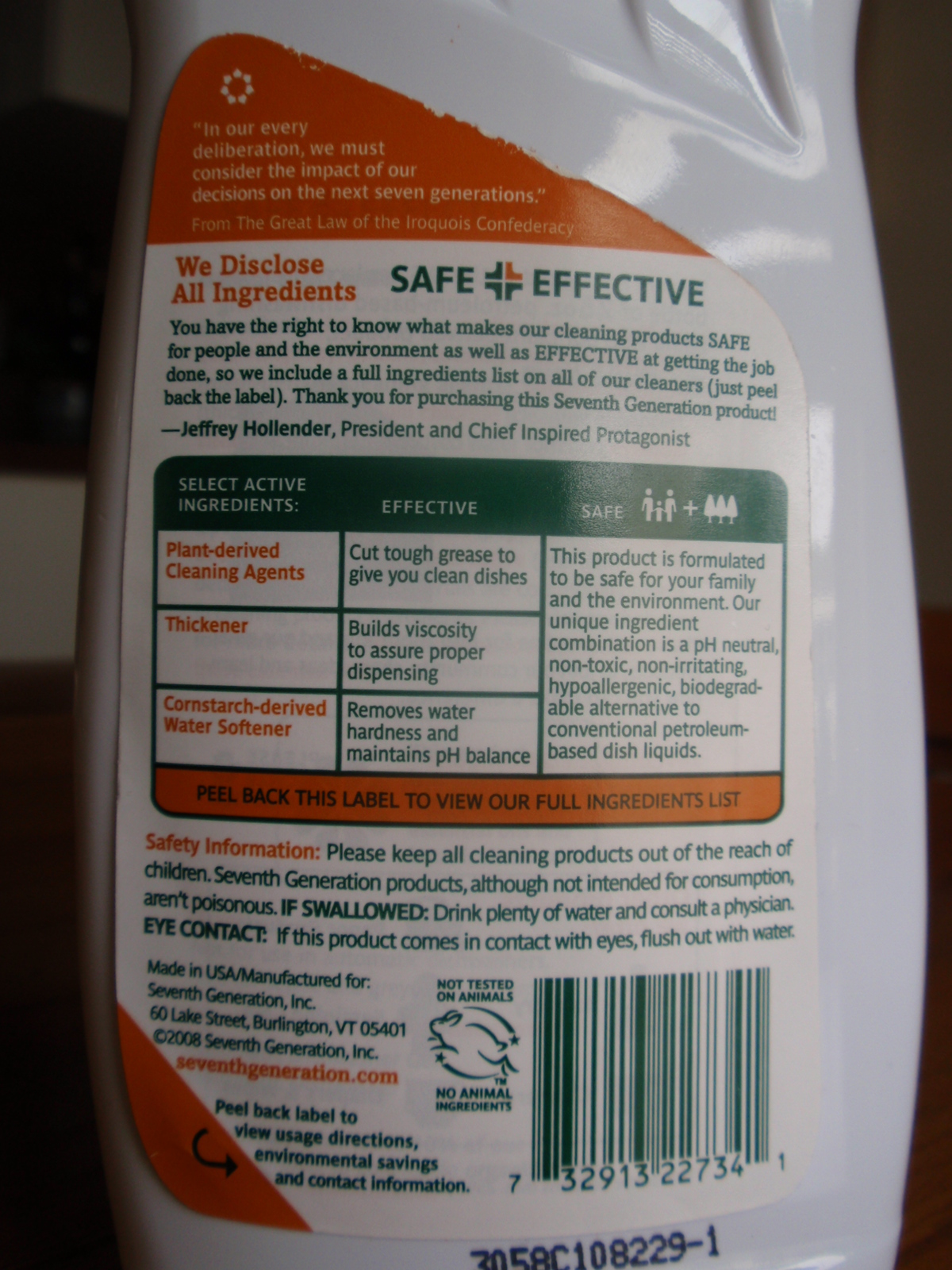
Seventh Generation’s liquid dish soap bottles are sporting an in-depth ingredient label – under the existing label.

Dish soap ingredient information label

Dish soap ingredient information label

The peel-away outer back-panel gives a text-heavy overview of the company’s safety criteria and commitment to transparency. Inside, an extended eco-label takes the first steps toward integrating statistics: Minimally illustrated with a home icon, the statement reads that ‘if every household in the U.S. replaced petroleum-based dish soap with plant-based… we would save 86,000 barrels of oil (the equivalent to heat and cool 4,900 U.S. homes per year).

Its nice to see a comparison that puts so many barrels of oil into a meaningful perspective for the purchaser.

Stats and info revealed on Dish liquid bottle

Stats and info revealed on Dish liquid label

The peel-away label allows for 2 additional panels for the consumer to transparently uncover information, but the space could have been used even more effectively: I’d love to see a more life-cycle oriented approach applied to this design format, and the icons used to highlight information, rather than to advertise the company’s other product offerings.

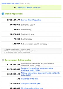
Real time data: watch the world go by.

Not much can put things in perspective like real-time data.
(Even if it is based on an algorithm.)

http://www.worldometers.info/

Watch the world work

Watch the world work

5lb. butter = How many cows?

My local, local-foods eatery, Common Roots, has launched the first of a series of profiles on the local farms from which the restaurant/coffee shop sources their ingredients. First up: Butter from Hope Creamery in Hope, MN.

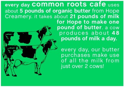
Nice story about the history of the creamery (though slightly lengthy for online attention spans) . And a short video (the first time I’ve seen 2500 pounds of butter churned). But what was most Background Story-esque is a graphic that was included in an email announcing the endeavor:

How many cows does it take...

How many cows does it take...

Not only does this factoid give us a bit of background on butter production (by stating the average daily output of 1 cow), it also quantifies the cafe’s own usage in terms of cows. This kind of information puts data in context. I hope to see similar comparisons (especially in terms of land use, water use, etc.) in future showings of Common Roots’ farm/product profiles.

Tracking water droplets: Playing raincloud.

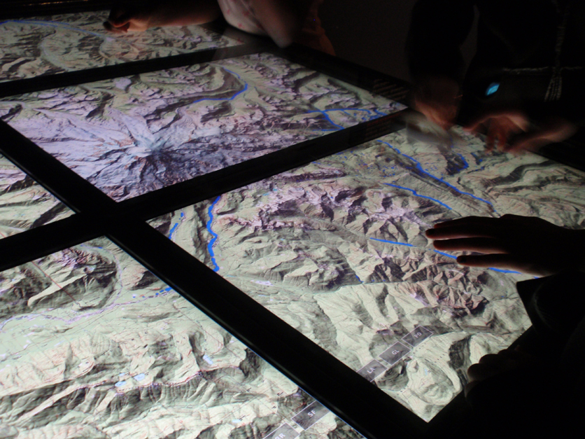
An exhibit on Water at the Science Museum of Minnesota contains an interactive display that allowed people to ‘become’ a raincloud. By rubbing a ‘raincloud’ tool over a series of screens displaying a topographic map, the cloud rains drops of water onto the topo-map. Visitors can see how the drops of water run down the sides of a topographic map to slow and pool together in the valleys between mountains. Colliding together, the blue drops create rivers which meander through valleys until falling off the screen.

Interactive table created interaction for watersheds

Interactive table created interaction for watersheds

As a fun way for visitors to interact with the exhibit, this project helps people understand how water flows (the fact being downhill- which I thought was obvious, but apparently there is an overwhelming number of people who are surprised when rivers turn to flow North instead of South, as on maps they must have an idea that gravity makes the water flow off the page.)

Home energy usage via Google

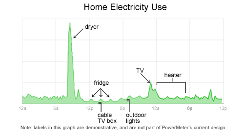
Google is in the development stages of a power meter that enables users to monitor real-time feedback on their household energy consumption. This kind of instantaneous feedback gets to the basic premise of why it’s important to show & tell background stories. This power meter is tool that enables the customer to make their own choices: in this case, the customer can make the connection between more energy usages= more $.

Google's plan to meter home energy consumption

Google's plan to meter home energy consumption.

Follow google’s developments on www.google.org/powermeter.

Perhaps this precision monitoring of the background of products also paves the way for technologies enabling people to generate their own power – and sell it back to utilities.

Frowning Utility Bills

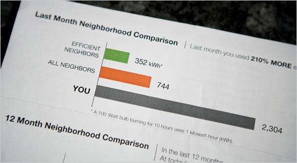
A utility company is literally establishing an emotional connection with the audience: via smiley or frowning faces on their utility bills.

Visual Comparison, photo by Max Whittaker for The New York Times

Visual Comparison, photo by Max Whittaker for The New York Times

A New York Times article reports how a Sacramento utility is inspiring residents to lower their energy usage by providing them visual feedback on their utility bills…and it doesn’t hurt that the bill compares them with their neighbors. A little competition can go a long way – it puts people’s own actions in context to their peers.

Car eco-label only inches forward despite potential

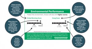
Environmental label for CA cars

Environmental label for CA cars

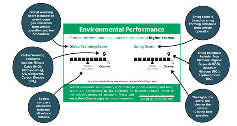
Effective since January 1st, California has launched a clean air label required on every new car produced and sold in California. The label rates ‘Smog’ and ‘Global Warming’ on a scale of 1-10 (5 being the average car, 10 being the cleanest). Though there has been a smog index label since 1998, this marks the first time such information has been available to the consumer at point-of-sale – though it seems you’ll have to pop the hood to find the label.

The best part is that the implementation of the label signifies a step toward transparency and ultimately sustainability: a system is now in place to transfer information from car producers, 3rd party reviewers, auto dealers and to communicate that to consumer.

However, the visual representation of the label leaves a lot to be desired. Very little actual information is communicated in these graphics – despite the seemingly substantial space allocated. A simple line makes up the ranking, but portrays very little detail about what the vague titles are all about. I’d like to see this label make use of the technique of layering: to call out the most basic important information (what’s already shown), while incorporating another level of supporting information to further educate viewers.

The ‘global warming’ score actually includes some interesting elements to touch on the larger life-cycle of the system – a stance not often acknowledged in products. But although this label touches on some issues related to sustainability, it leaves many questions in the viewer’s mind. For many audiences that already have a basic understanding of the principles of sustainability, the infographic neglects to transparently inform what the ‘smog’ and ‘global warming’ rankings actually include. [smog-producing emissions from use of the car for the former, and greenhouse gas emissions from fuel production, vehicle operation, and the car’s A/C system for the latter.] It’s also unclear whether average car score will adjust as cars are built cleaner in the coming years.

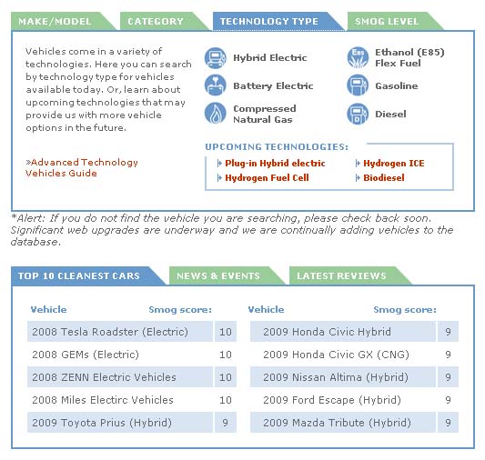
An online website clears up some of the vagueness: Consumers can also see the top 10-rated cars and check another vehicle’s rating  on the DriveClean website. But as information design, it certainly would be nice if the visual representation took the opportunity to communicate more substantive information to potential buyers, educate them on the potential environmental outcome of their purchases, or even motivate them toward sustainability.
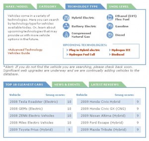
Detail of the DriveClean site

Detail of the DriveClean site
Prius console monitors the product’s energy

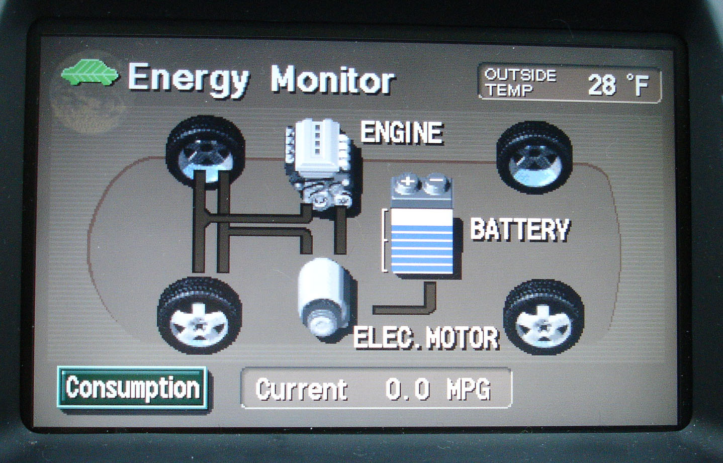
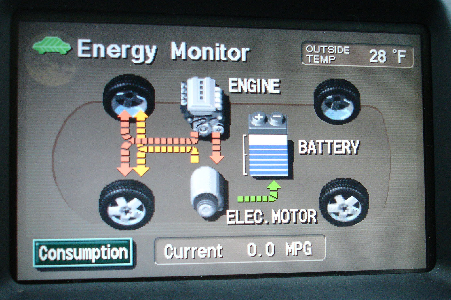
Prius’ console allow users (and passengers) to see what happens under the hood. The console sports an energy monitor (among other controls) that transparently provides information to the user (and passengers) so they can understand how the ups-and-downs of gas and break pedals impact the hybrid’s fuel usage and battery charging.

Prius Energy Transfer map

Prius Energy Transfer map

Using simple visuals and motion graphics, the console maps how energy is used, and shows how the battery gets recharged.  What results is the ultimate in immediate user-feedback.

Map of Prius Energy Usage in motion

Map of Prius Energy Usage in motion

In addition to helping the riders to understand what exactly a hybrid is, and how it works, this system helps users drive more eco-efficient because they get immediate feedback. As a driver, you can start to understand what’s going on, and how your driving techniques impact the fuel-efficiency of the vehicle. This model integrates enough feedback loops so a driver can learn to adjust their own driving to help the system optimize how it runs.

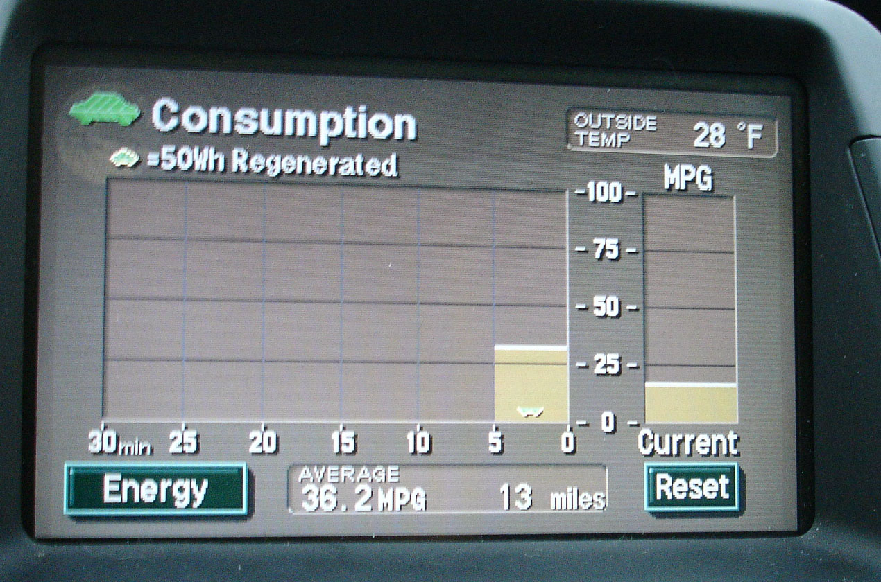
An added layer of feedback on newer Prius models is a chart that records energy consumption over the last 30 minutes of use – enabling the user to compete against themselves for improvement.

Graph charts energy consumption

Graph charts energy consumption

Products should be designed to showcase some level of their inner-workings. Even if the vehicle was not a hybrid, it’s a great step toward product transparency. Just imagine if more of our energy-devouring equipment incorporated similar feedback mechanisms.

Showing the Full Story

First: show it all. Then let people zoom into the pieces of information that interest them. A visual story can be overwhelming if it doesn’t provide some context.

A good background story makes it clear what information is found in what part of a product’s background.

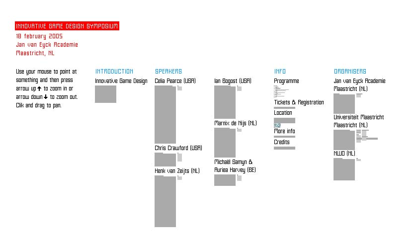
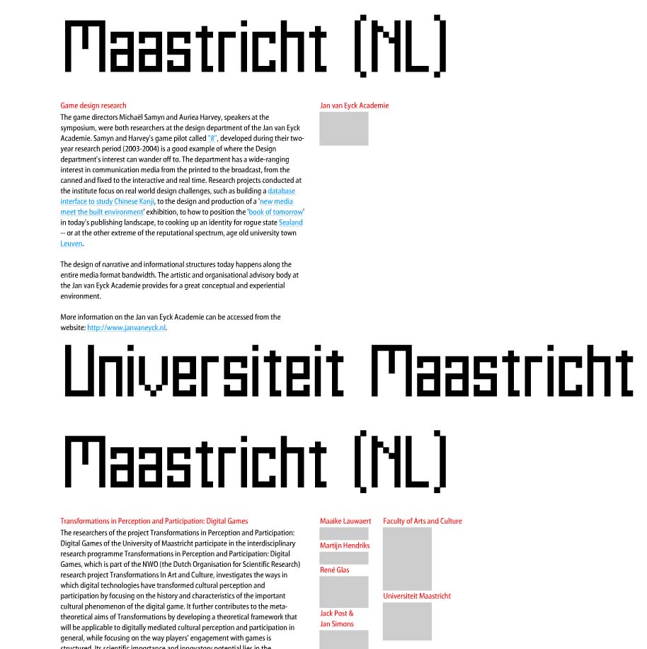
This example makes excellent use of spacial relationships to put increasingly detailed information in context: and help the viewer understand that context in a visual way. Shown are 3 levels of zoom into a site for a symposium at the Jan Van Eyck Academie in the Netherlands. The keystrokes needed to zoom in and out of the information are a bit clunky, but the overall concept is an intriguing way to communicate layers of information.

overview of all information zoom level 2 zoom level 3

Such is the concept of transparency – a viewer should be able to access even the most minute details of data: It’s all part of the big picture.

Timberland

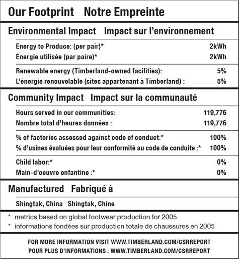
Timberland footprint label

This much-hailed label from Timberland was one of the first to label a product with details on the social and sustainability footprint of the product. It was a good start, but not nearly the level of detail that is possible – nor the level that consumers are clamoring for.

It’s a laudable first effort — in theory, at least. In real life, it’s not very helpful. Simply put: there’s less going on here than meets the eye. –Timberland Reveals Its “Nutritional” Footprint, Worldchanging

Though approachable because the label is created in the format of a nutrition label, beyond that, it’s not very visually satisfying. More depth and emotion could have been portrayed had they gone more into infographics.