Posts

Pollinator-Friendly Solar at the Fair

For this year’s Minnesota State Fair, we’ve teamed up with Fresh Energy and Connexus Energy to create a three-dimensional display to draw attention to a new way of thinking about renewable energy: Pollinator-friendly solar.

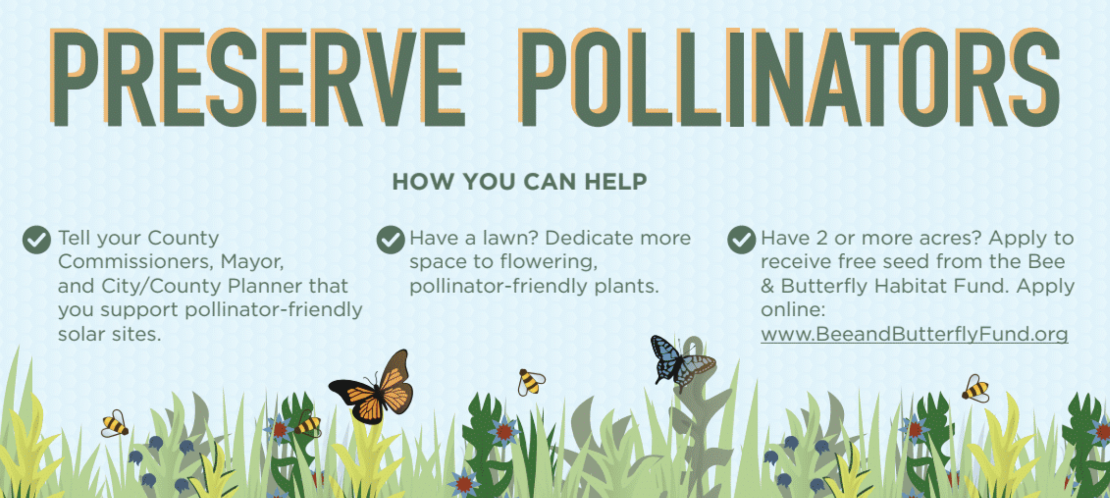
Preserve Pollinators

Infographic poster from the Minnesota State Fair display.

Our display, part of “The Common Table: Minnesota Eats” exhibit in the Agriculture Horticulture Building, highlights how our region is leading the way in policymaking and on-farm efforts to bring more pollinator habitat to otherwise underutilized land. You can see the exhibit in-person from August 23 through September 3, along with nearly two million other fair-goers (who famously flock to the event for all kinds of foods and creations “on a stick”). Of course, our sticks — a series of cutout landscape elements and hide-and-seek pollinators for you to find — will be glued down, but you’re sure to learn a lot about the powerful partnership of pollinators and solar energy!

Planning for Growth

Online engagement tool shapes the City’s future

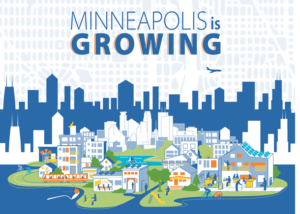
The latest phase of our work with the City of Minneapolis launched this week: A new online, interactive engagement tool designed to involve residents in shaping the next 20 years of City development.

Minneapolis 2040

This visual story utilizes a scrolling technique called “parallax,” which creates a deeper, more immersive online experience. Visitors to the page will be introduced to City planning information in a new & fun way, and have the opportunity to leave feedback on the action items presented. Their comments will inform Minneapolis planners’ decision-making on future City policies.

Feedback collected during this phase of development will go into the City’s Comprehensive Plan, titled Minneapolis 2040. The plan will cover topics such as housing, job access, the design of new buildings, as well as how we use our streets — all in the name of smart, sustainable development.

Check out the live site at growth.minneapolis2040.com

‘Emotional’ Sustainability for a Post-Truth World

Visual storytelling reveals context and appeals to our individual beliefs

Riding the tails of Brexit and the U.S. presidential election, Oxford Dictionaries has selected “post-truth” as 2016’s international word of the year.
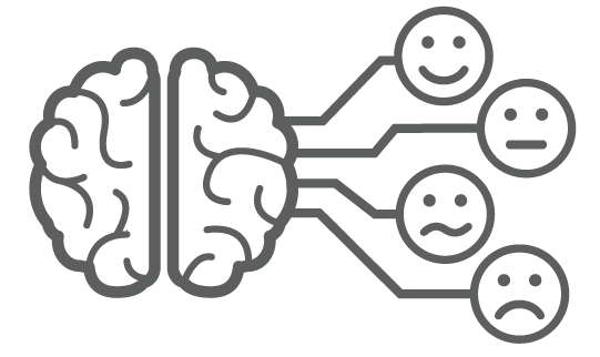
Emotional AppealIt’s not hard to believe, given the events of the past year, to see how people do not make decisions based purely on fact. Appeals to our personal beliefs and emotional centers are important. Data alone does not influence decisions. To a large portion of society, facts simply do not matter.

Feelings matter. Connection matters.
I can spout off statistics and information, but unless you — my audience — feel connected to it, it won’t make a difference. The author of ‘How to Convince Someone When Facts Fail’ also describes the mental stress that we endure when we hold two conflicting beliefs at the same time (a.k.aCognitive Dissonance). He acknowledges the need for a calm discussion when presenting new information — and new facts — to an individual with a strong pre-determined worldview. So what are some ways visual communication can help make sustainability information appeal to our emotions, and allow us to gradually open our minds to new information?

Here are a few key points and resources: 

Show & Tell Data as a Story
Numbers, by themselves, are not generally very welcoming. Deciphering numbers and comparisons requires a lot of effort and time — particularly given that 65% of the population are visual learners (Mind Tools, 1998). Icons and illustrations can provide context for the numbers. Diagrams can show how a set of data flows over time.

Use Visuals that Connect to Individuals
This research shows how people interpret visual images of climate change. The report finds, for example, that protest images do not resonate, however images of real people taking action in a local context do resonate.

Communicate the Context of your Social or Environmental Goal
Show individuals how bigger picture climate consequences will impact their personal lives. This can mean mapping out the narrative in a visual infographic or developing a diagram to walk audiences through how a larger goal is connected to individuals and their families.

Motivating Sustainable Behavior

How can we help people act more sustainably?

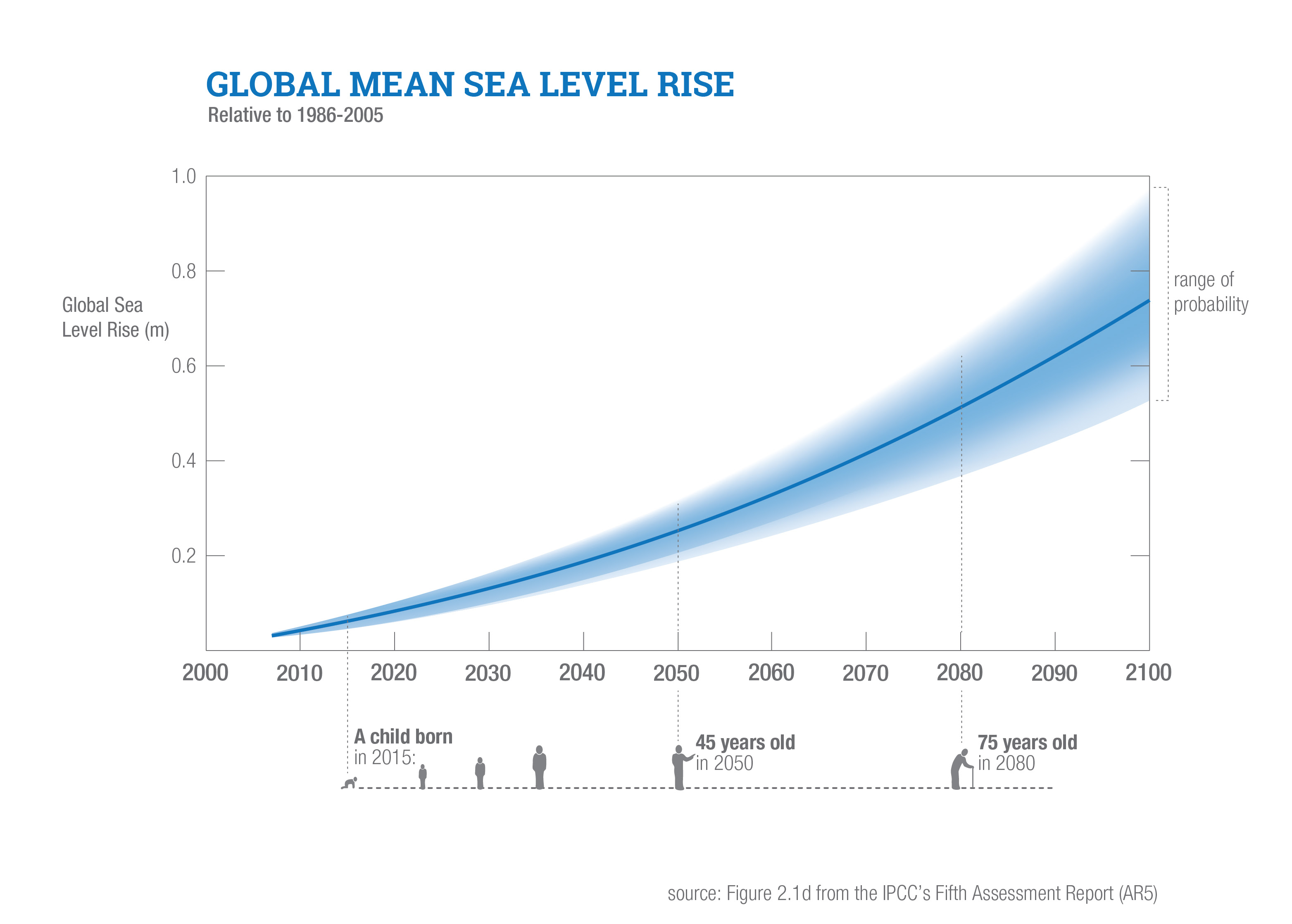
According to a series of studies from the Harvard Business Review, ‘seeing’ ourselves in the future helps us make decisions that prioritize long-term benefits to our future selves (over short-term gains).

One study had half of participants interview digitally-aged avatars of themselves. Then participants did a seemingly-unrelated exercise to divide a budget. Those who had interacted with their future selves allocated twice as much of the hypothetical budget to retirement.

There’s already a lot of literature showing that response is stronger when you people are given vivid examples -those that touch them emotionally. So these studies seem to suggest that long-term thinking can be accessed through establishing emotional connection with the future.

In sustainability, ’the future’ is already plastered throughout tag lines and campaigns: “for our children” or “without compromising the ability of future generations to meet their own needs” are common examples. However, these phrases often aren’t positioned in a way that helps the ‘future self’ of individuals become visible. Maybe instead of talking about the future in vague, society-oriented terms, we should spend more time helping people see themselves in their own future. This could involve helping people understand the ways in which data or information parallels with their own, individual future. Or how trends over time align with their children’s existence.

So let’s help people first envision their own futures; in order to prepare individuals to understand the important role that sustainability plays in life.

Global Mean Sea Level Rise

GoodGuide coming to iPhones

Via a New York Times article, barcode-reader iPhone apps will put product info in consumers hands at point-of-sale.

GoodGuide is already a beta database of info on products will help consumers know what is in the products they consider purchasing.

A Goodguide app on iPhone will let consumers access info via barcode.

A GoodGuide app on iPhone will let consumers access info via barcode. Image Credit: Peter DaSilva for The New York Times

The service reduces lots of complex info into a single number (the higher the number, the better the product overall). Though the purpose of the system is to create transparency on products, such a single-number approach lacks transparency. Consumers also need education on what’s behind the number. A more visual approach incorporating icons to reference each product’s background story could help.

Thanks Craig!

Turning over a New Leaf (paper)

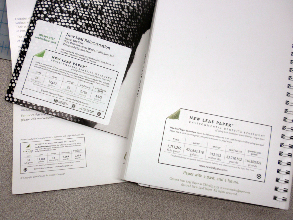
The New Leaf paper eco-audit is a well-thought out tool that communicates transparency, and -in a beautiful way- helps the end consumer understand the sustainability-positive impact of using a specific paper.

The eco-audit provides a place for data on resources that have been saved throughout the life-cycle of New Leaf’s paper (as compared to the industry standard). The eco-audit profiles the quantity of ‘saved’ trees, water, energy, solid waste and greenhouse gases. And an online portal allows companies to customize the quantities for their own print-jobs.

New Leaf labels on printed projects

New Leaf labels on printed projects

Customizable background stories supported by sustainability statistics- what isn’t to love? A bit more visual reference could be incorporated into the eco-audit label, or the concept could have some accompanying publicity or other materials that really bring this idea to (visual) life. This may include developing an application to show comparisons online, or supplementing the numbers with visual representation.  I -for one- would like to see what an expanse of 118-saved trees actually looks like. Or a comparison to how many swimming pools 50,178 gallons would fill.

5lb. butter = How many cows?

My local, local-foods eatery, Common Roots, has launched the first of a series of profiles on the local farms from which the restaurant/coffee shop sources their ingredients. First up: Butter from Hope Creamery in Hope, MN.

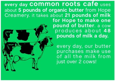
Nice story about the history of the creamery (though slightly lengthy for online attention spans) . And a short video (the first time I’ve seen 2500 pounds of butter churned). But what was most Background Story-esque is a graphic that was included in an email announcing the endeavor:

How many cows does it take...

How many cows does it take...

Not only does this factoid give us a bit of background on butter production (by stating the average daily output of 1 cow), it also quantifies the cafe’s own usage in terms of cows. This kind of information puts data in context. I hope to see similar comparisons (especially in terms of land use, water use, etc.) in future showings of Common Roots’ farm/product profiles.

Reality, augmented. […sustainably?]

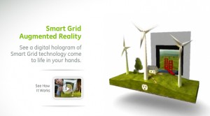
Merging analog and digital, this new tool allows users to use their webcam to make a simple printed page come to life. In 3 dimensions!
Augmented Reality: a virtually 3-d landscape unfolds via your computer's webcam.

Augmented Reality: a virtually 3-d landscape unfolds via your computer

An incredible display of technology, it’s not hard to imagine the communication possibilities for sustainability, communicating the background stories of products…or anything for that matter. However it’s not immediately clear how this technique is as exclusive to the future of sustainable communications as it would have us believe (the tool is introduced from within GE’s micro site promoting sustainable technologies like the smart grid and smart power meters). Though a extremely promising tool, a slight scent of greenwash clouds the air.
Watch the video, as presented by Adobe CTO, then try it for yourself.

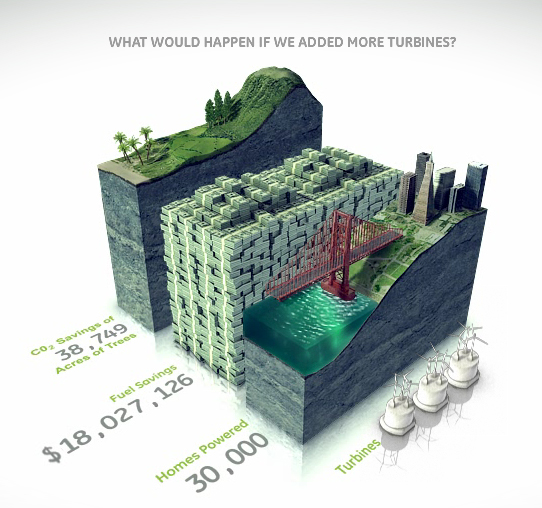
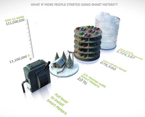
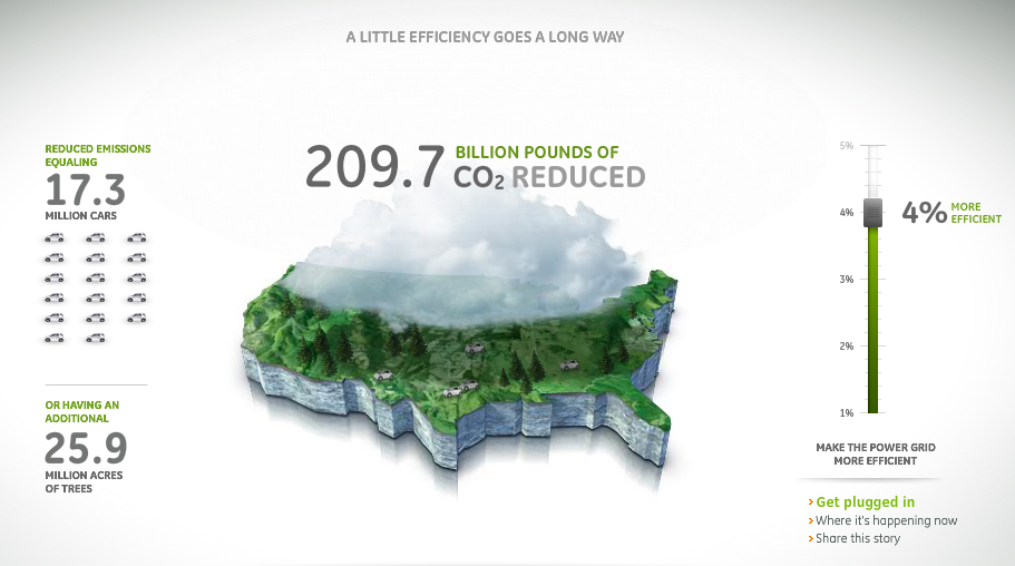
On the topic of eco-magination, there are some wonderfully communicative info-graphics throughout the micro site. However, overall the site is excessively flashy: lots of pretty pictures…but not much overall content.  It seems to have been created as a playground for cutting-edge graphics more than to support sustainability. (Though, one could argue that’s GE’s intent…) More easily accessible information to back up the claims that GE wants to communicate through such elaborate – and interactive- visuals would lend significantly more credibility to this site.
bar graphs bring information to life with visual virtual worlds

Bar graphs bring information to life with visual virtual worlds

Environmental and financial savings stack up in a bar graph.

Environmental and financial savings stack up in a bar graph.

GE infographic - Mapping CO2 Emissions

GE infographic - Mapping CO2 Emissions

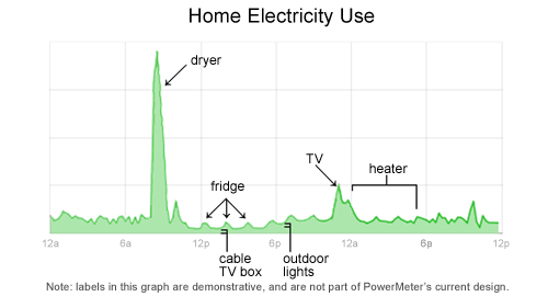
Home energy usage via Google

Google is in the development stages of a power meter that enables users to monitor real-time feedback on their household energy consumption. This kind of instantaneous feedback gets to the basic premise of why it’s important to show & tell background stories. This power meter is tool that enables the customer to make their own choices: in this case, the customer can make the connection between more energy usages= more $.

Google's plan to meter home energy consumption

Google's plan to meter home energy consumption.

Follow google’s developments on www.google.org/powermeter.

Perhaps this precision monitoring of the background of products also paves the way for technologies enabling people to generate their own power – and sell it back to utilities.

Frowning Utility Bills

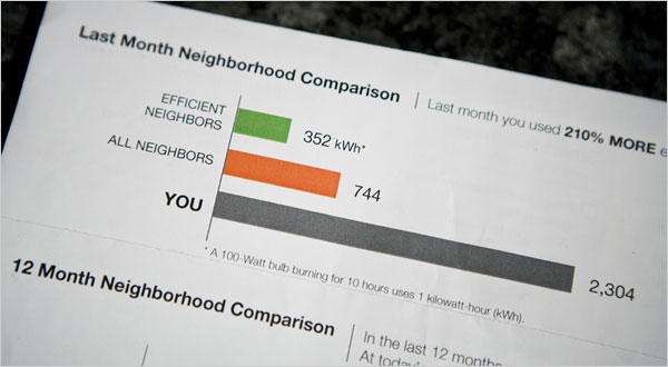
A utility company is literally establishing an emotional connection with the audience: via smiley or frowning faces on their utility bills.

Visual Comparison, photo by Max Whittaker for The New York Times

Visual Comparison, photo by Max Whittaker for The New York Times

A New York Times article reports how a Sacramento utility is inspiring residents to lower their energy usage by providing them visual feedback on their utility bills…and it doesn’t hurt that the bill compares them with their neighbors. A little competition can go a long way – it puts people’s own actions in context to their peers.