Posts

Car eco-label only inches forward despite potential
Environmental label for CA cars

Environmental label for CA cars

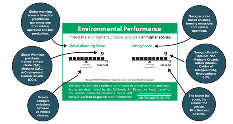
Effective since January 1st, California has launched a clean air label required on every new car produced and sold in California. The label rates ‘Smog’ and ‘Global Warming’ on a scale of 1-10 (5 being the average car, 10 being the cleanest). Though there has been a smog index label since 1998, this marks the first time such information has been available to the consumer at point-of-sale – though it seems you’ll have to pop the hood to find the label.

The best part is that the implementation of the label signifies a step toward transparency and ultimately sustainability: a system is now in place to transfer information from car producers, 3rd party reviewers, auto dealers and to communicate that to consumer.

However, the visual representation of the label leaves a lot to be desired. Very little actual information is communicated in these graphics – despite the seemingly substantial space allocated. A simple line makes up the ranking, but portrays very little detail about what the vague titles are all about. I’d like to see this label make use of the technique of layering: to call out the most basic important information (what’s already shown), while incorporating another level of supporting information to further educate viewers.

The ‘global warming’ score actually includes some interesting elements to touch on the larger life-cycle of the system – a stance not often acknowledged in products. But although this label touches on some issues related to sustainability, it leaves many questions in the viewer’s mind. For many audiences that already have a basic understanding of the principles of sustainability, the infographic neglects to transparently inform what the ‘smog’ and ‘global warming’ rankings actually include. [smog-producing emissions from use of the car for the former, and greenhouse gas emissions from fuel production, vehicle operation, and the car’s A/C system for the latter.] It’s also unclear whether average car score will adjust as cars are built cleaner in the coming years.

An online website clears up some of the vagueness: Consumers can also see the top 10-rated cars and check another vehicle’s rating  on the DriveClean website. But as information design, it certainly would be nice if the visual representation took the opportunity to communicate more substantive information to potential buyers, educate them on the potential environmental outcome of their purchases, or even motivate them toward sustainability.
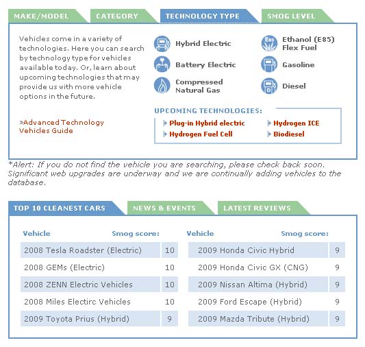
Detail of the DriveClean site
Detail of the DriveClean site
Stuff has a Story

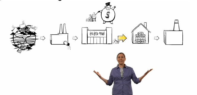
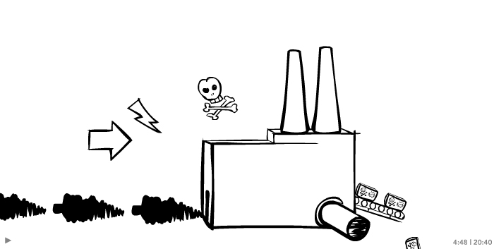
Story of Stuff Life CycleStuff goes into a factory

‘The story of stuff’ is an animation/video that strolls through the ‘big picture’ of the production/consumption life cycle.

Story of Stuff exposes the connections behind products (and really behind our whole economic system). It paints a relatively dreary outlook, and thereby inspires action. It has been out for a while, and fortunately they’ve recently added an update to the website now allows the start of an outlet for ideas on what a consumer can do about the situation. (An earlier version of the animation left out the last step “Another Way,” lacking details on what the everyday consumer can do about the situation.)

The visualization of the system is impeccable: Black & white sketched and stylized drawings with simple animation leave enough room for the viewer to get their own ideas and apply the concept to their own situation. When people can see the possibilities, they can more easily understand how their own everyday decisions impact the big picture. Story of Stuff does a great job at establishing that connection.

Ba Baa Baacode

Baa code entry

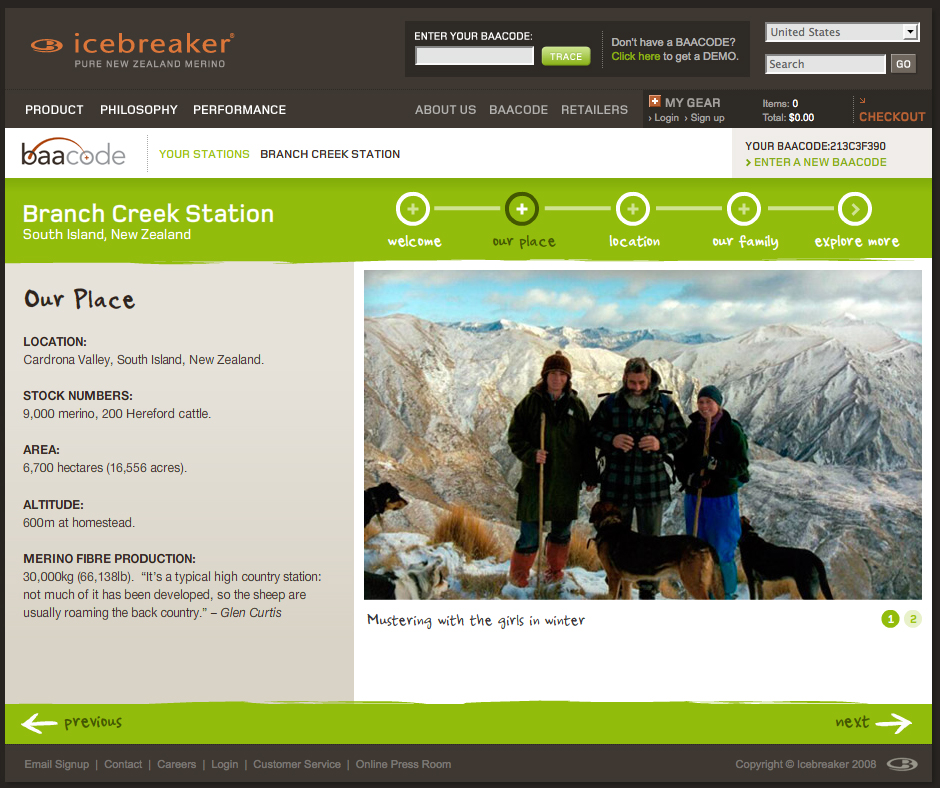
Consumers can track the back story of their Icebreaker product through a portal on the company’s homepage.

BaaCode micro site screengrab

Entering a ‘baacode’ reveals pictures and video clips of the people that raise the sheep and the place they roam.

The information for the sample code paints only a picture around the actual beast (sheep) that the wool fibers come from – not the full production cycle or other components of the clothing. But it’s a good start and an intriguing, at least partially interactive space.

It’s great to offer a sample code, but it would be even better to further incorporate the theme of transparency into the application by opening up the archives so that anyone perusing the website can see details behind all the products. (Only having viewed one sample location upon many visits, I’m also skeptical about how many different stories are actually covered in the online application).

The concept is ripe with potential to give the consumer cues to the product’s backstory at point-of-sale.

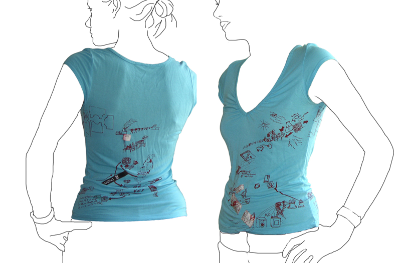
T shirt tells its own life cycle.

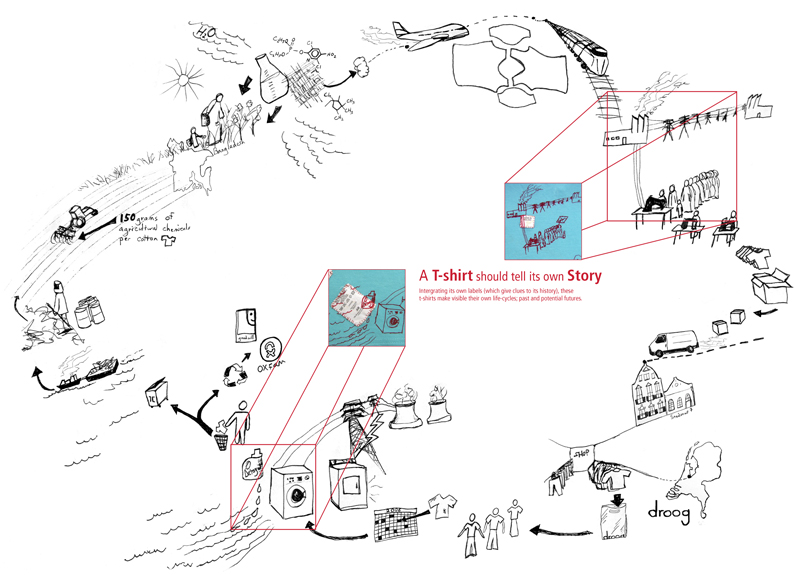
Tshirt printed with it\'s own life cycleLife cycle of a T-shirt: Droog Design

This t-shirt tells its own back story: the t-shirt tags are cut from the inside and stitched into the screenprint graphic of an imagined life of the product. The shirt was put into production in 2006 by Droog Design.

This is a more illustrative, conceptual version of a background story – less data based. The graphic is customized based on available information at the time (this includes where the cotton comes from, and where the t-shirt is sold). More quantitative figures on distance and carbon footprint could be input with the right data available.

Economic Breakdown: Chocolate

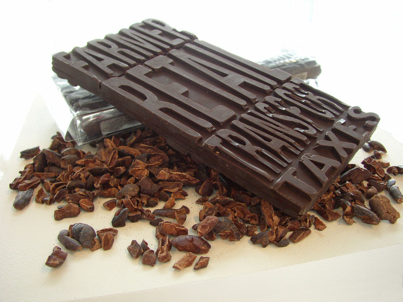
chocolate bar with its economics imprinted

The economics of this (fair trade) chocolate bar are molded into it. The consumer can readily see what percentage of the money they paid went to the farmer vs. transportation. On the reverse is another set of the same text; this time representing non-fair trade chocolate (the farmer gets only half as much as the fair trade example).

Part of a 2006 thesis project on communicating product backgrounds.

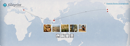
Patagonia’s Footprint Map

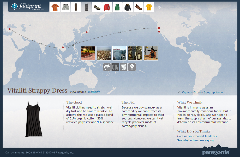
Footprint ChroniclesTravels of a Patagonia Dress - Footprint Chronicles

Companies are increasingly able to track the life of their products through their supply chains and trace the origins of even the smallest notion.

Patagonia’s Footprint Chronicles outlines the potential for a company to unveil its transparency in the name of promoting sustainability (and hence, appearing as a sustainable company). From an information standpoint, Patagonia is open about “The Good” and “The Bad” – admitting that, like any human, they’re not yet perfect, but they know where they need to improve.

The online tool carries the viewer through design, materials, manufacture, distribution (among others) of a handful of the company’s products, allowing the user to explore info both sequentially or geographically. Based on google-esque maps, the tool is well-designed as both a piece of information design and as an interactive tool.

Though included are a handful of data and other numbers, I’d like to see these numbers presented in a more visual way – nice parallels are drawn to perceivable concepts to make abstract quantities real. For example: where they say the CO2 generated from a specific shirt is equal to 100x the weight of the shirt, it would be nice to have a more standard reference: such as how many miles average driving…or how many trees need to be planted to counteract this release of CO2. This reference could in-turn, be illustrated in a more graphic format that would enable more direct comparison between various products.

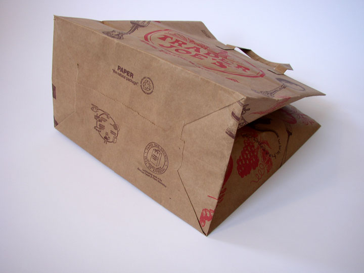
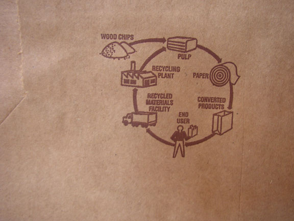
Grocery Bag Life Cycle

Bottom of a Paper Grocery Bag with life-cyclegrocery bag life cycle graphic

Lately, I’ve seen a few paper grocery bags that have a small graphic of the life cycle printed on the bottom. It’s not very descriptive, but it’s nice to see this small reminder about the larger impact of this simple, everyday item. It would even better to see more detailed information on distance traveled, where the wood chips come from, actual recycled content, etc.