Serving Carbon With Your Crackers
Carbon foot-printing has made its way onto the plates of people living in Sweden.
Read more →

Carbon foot-printing has made its way onto the plates of people living in Sweden.
Read more →
Colombia Sportswear is asking you to ‘Consider the box’ with their project: A Box Life. A Box Life brings awareness to an often-overlooked part of mail-order products’ life-cycles: the packaging.

Box life transparently tracks the back-stories of where boxes have traveled.
Not only is it a clever way to encourage people to reuse packing materials, but telling the stories behind the travels of things also acts as a tool for transparency, and reminds consumers of how individual actions impact sustainability.
read more: Springwise
A new type of barcode is coming.
As announced by a recent BBC Technology article, the tiny (3mm) bokodes can contain a much more information than traditional barcodes, or even other digital cousins like qr-codes.The codes use light and reflection to contain code, and will be readable by a standard cellphone camera.
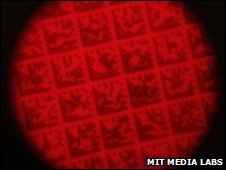
Close up of the bokode.
The truly interesting part of this technology is the ability to send different information out to different directions. For example, viewing a product’s bokode head-on could tell you different details than a product further which you’re not looking directly at further down the aisle.
Bokodes are yet in development stage, but they are a strong indication of technologies emerging to make information on transparency accessible to the everyday consumer.
Via a New York Times article, barcode-reader iPhone apps will put product info in consumers hands at point-of-sale.
GoodGuide is already a beta database of info on products will help consumers know what is in the products they consider purchasing.
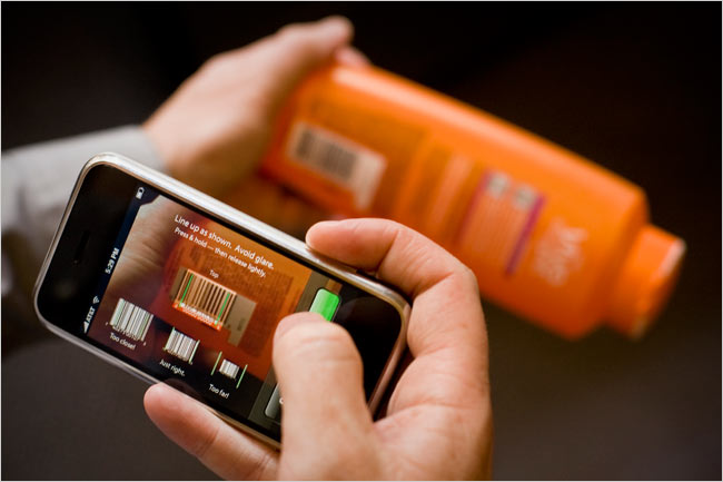
A GoodGuide app on iPhone will let consumers access info via barcode. Image Credit: Peter DaSilva for The New York Times
The service reduces lots of complex info into a single number (the higher the number, the better the product overall). Though the purpose of the system is to create transparency on products, such a single-number approach lacks transparency. Consumers also need education on what’s behind the number. A more visual approach incorporating icons to reference each product’s background story could help.
Thanks Craig!
Seventh Generation’s liquid dish soap bottles are sporting an in-depth ingredient label – under the existing label.
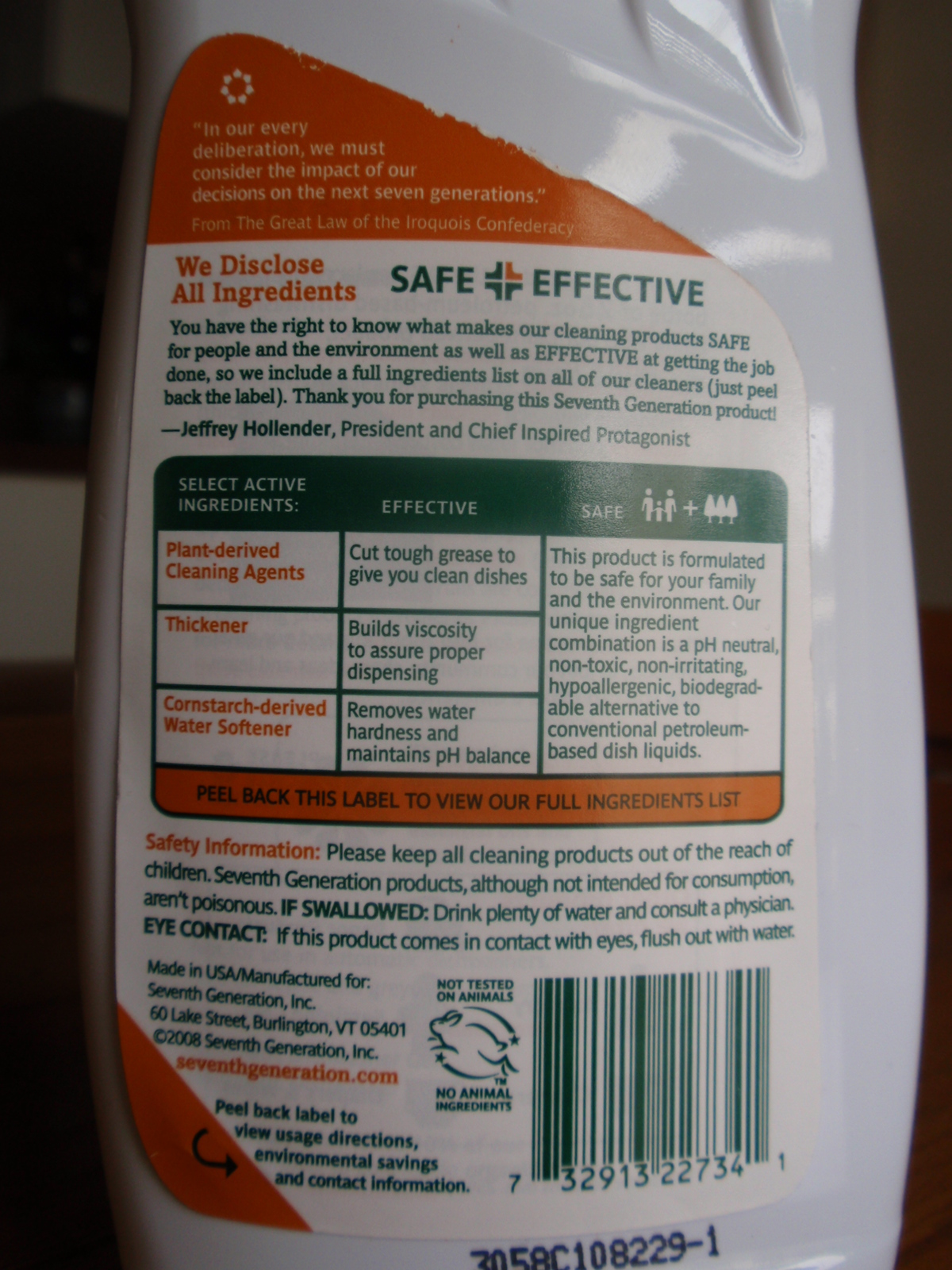
Dish soap ingredient information label
The peel-away outer back-panel gives a text-heavy overview of the company’s safety criteria and commitment to transparency. Inside, an extended eco-label takes the first steps toward integrating statistics: Minimally illustrated with a home icon, the statement reads that ‘if every household in the U.S. replaced petroleum-based dish soap with plant-based… we would save 86,000 barrels of oil (the equivalent to heat and cool 4,900 U.S. homes per year).
Its nice to see a comparison that puts so many barrels of oil into a meaningful perspective for the purchaser.
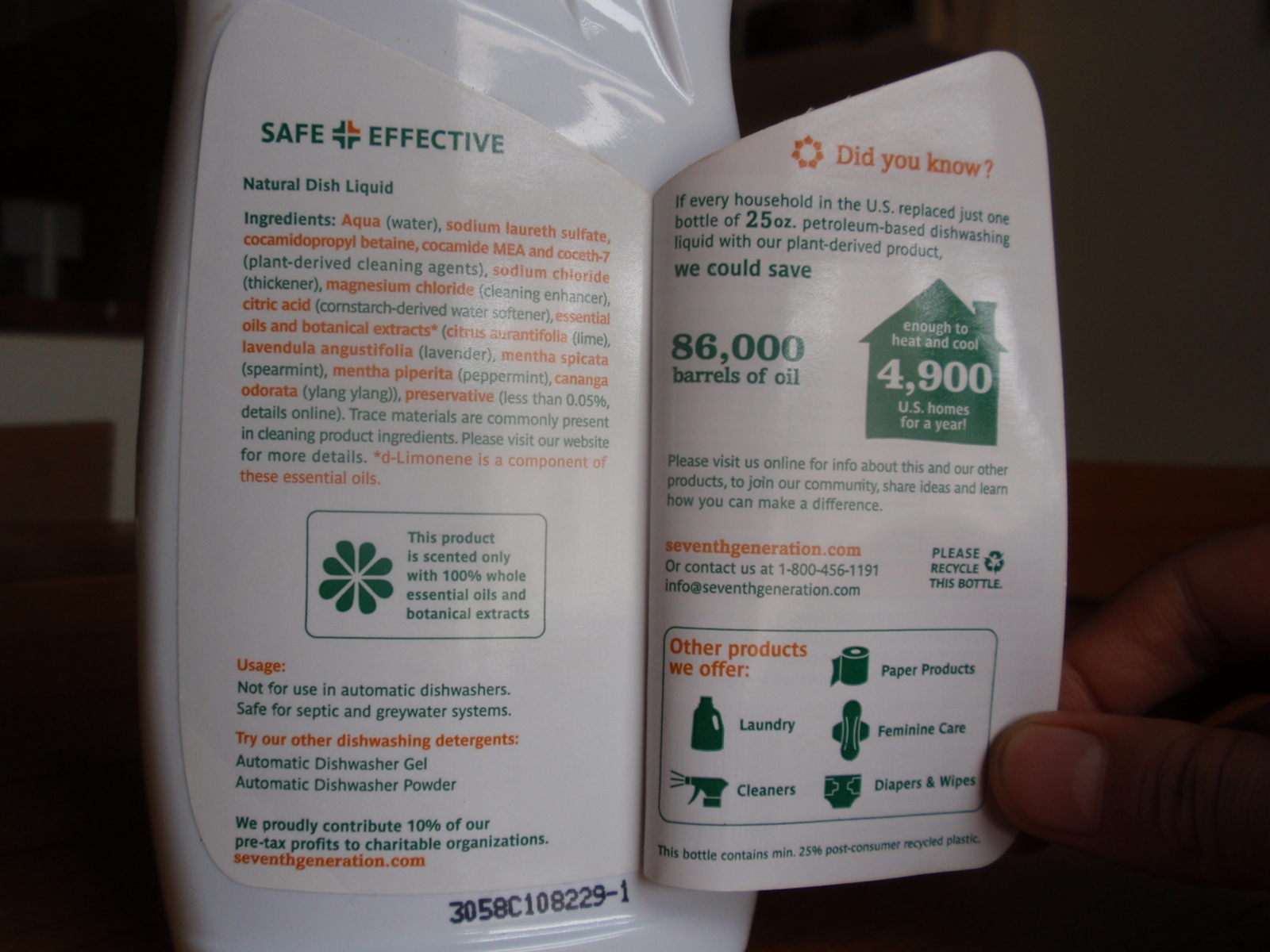
Stats and info revealed on Dish liquid label
The peel-away label allows for 2 additional panels for the consumer to transparently uncover information, but the space could have been used even more effectively: I’d love to see a more life-cycle oriented approach applied to this design format, and the icons used to highlight information, rather than to advertise the company’s other product offerings.
Good info-design requires consistency and repetition in order to establish a visual pattern. This site does both well.
Using a small-multiples-like approach that allows the viewer to compare the chips at-a-glance, the designer has clearly paired color pallet with the chips. The miniature chips (color, texture and all) are both a reference to the chip variety, and a visual navigation to additional information on the product.
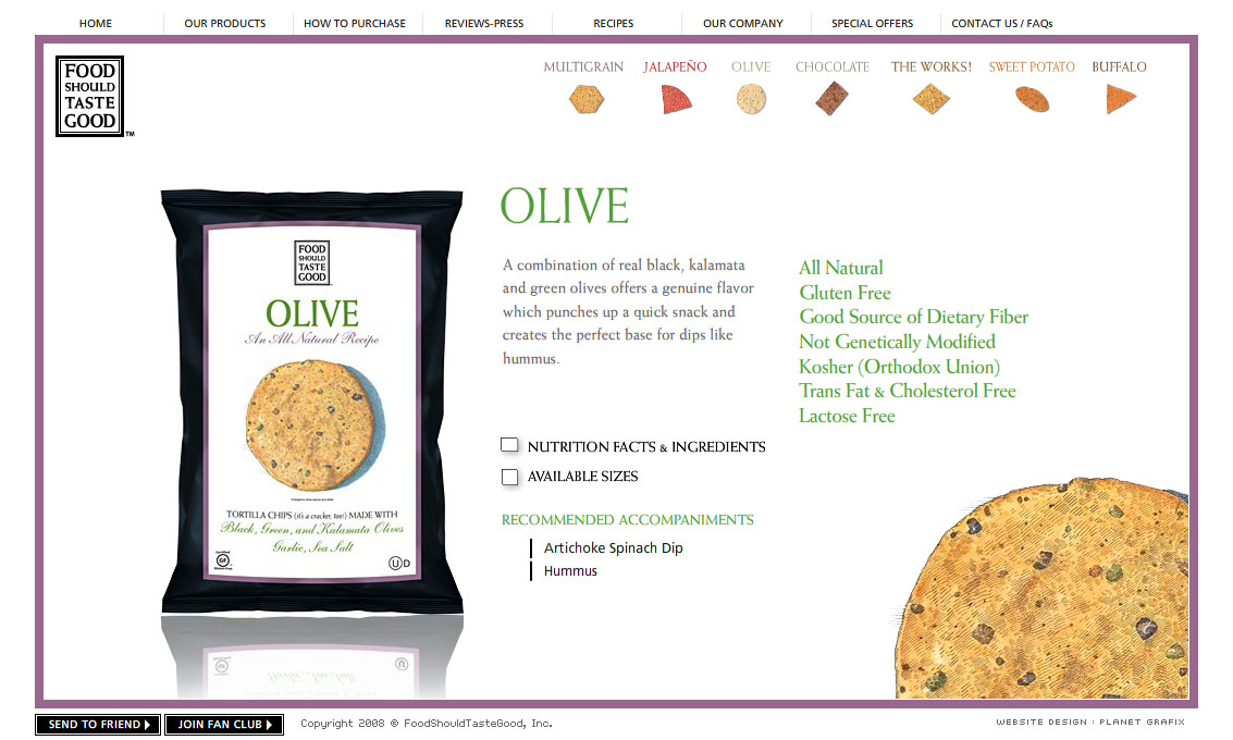
Website with chip navigation

Small multiples of chips, color-coded
And they taste good too.
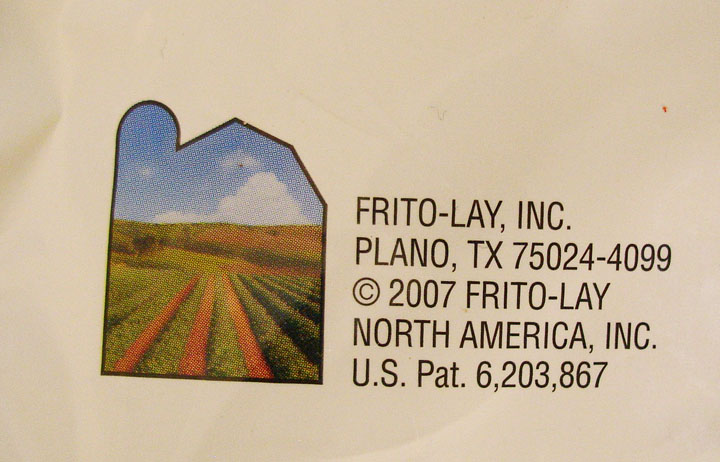
This graphic from the back-side of a Fritos chip bag seems to say that the company is farming-focused. The visual of peaceful farm landscape framed within the outline of a traditional barn is in direct contradiction with the accompanying address. (It’s also common knowledge that the company’s chips are about as processed and far from the farm as they can get.)
This is a case of graphics gone deceptive. Though Plano sounds like a perfectly nice place, from it’s wikipedia entry, it doesn’t seem to agricultural as this graphic suggests.
“Plano (IPA: /ˈpleɪnoʊ/) is a city in Collin and Denton Counties in the U.S. state of Texas. Located mainly within Collin County, it is a wealthy northern suburb of Dallas. The population was 222,030 at the 2000 census, making it the ninth largest city in Texas.”
If Frito-Lay was trying to follow the criteria of corporate transparency by revealing their address in Plano, the company has also under-estimated the power of graphics. Their packaging’s contradictory stance will make any visually-aware consumer doubt their mixed messages.
Visual cues can add new dimension to text-based information, but when text and graphic are in direct contradiction to each other (and obviously wrong for the context of the product), the addition of visual information can do more harm to the image of the company than good.
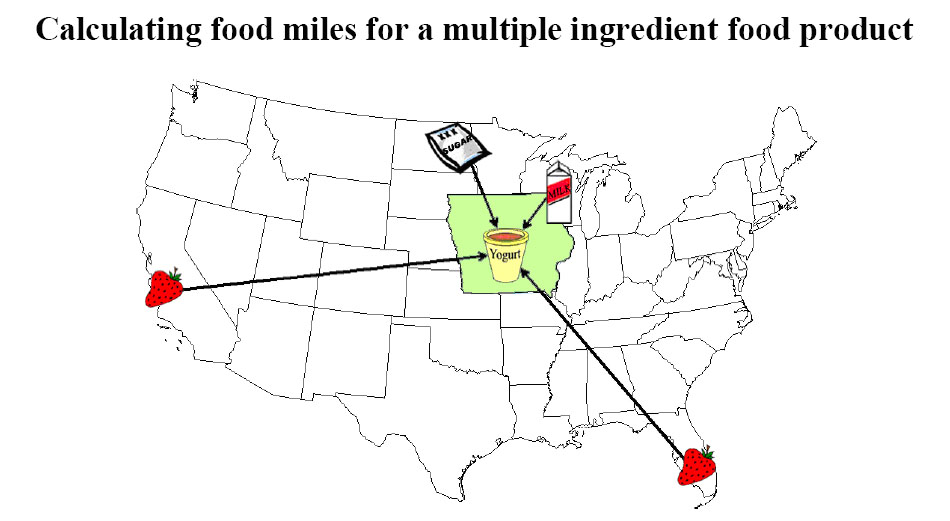
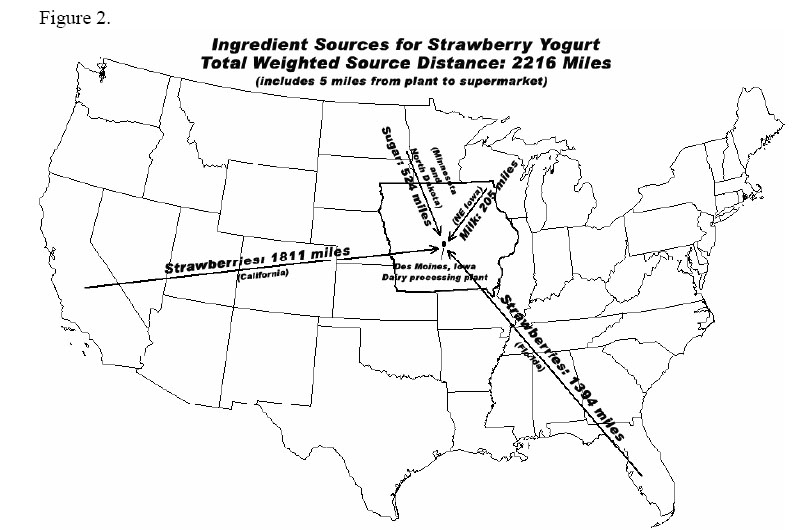
This pair of straight-forward graphics appear on separate pages of “Calculating food miles for a multiple ingredient food product” – a white paper from Iowa State University’s Leopold Center.
The graphics show where the ingredients of a specific Strawberry Yogurt have come from.
The first graphic is more visual, and thereby more enticing at first glance, but it does not convey the useful information of the 2nd graphic. The first graphic could be expanded to incorporate the detail of the second graphic: exactly how far each ingredient has traveled. And it could be further expanded to specify which method of travel (plane, train, truck, etc.), and with what carbon footprint.
A more detailed report (including stats on this yogurt’s Life-Cycle Assessment [LCA]) accompanies these graphic. Source: http://www.leopold.iastate.edu/pubs/staff/files/foodmiles_030305.pdf
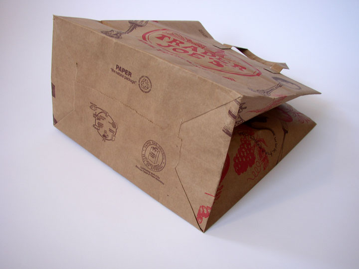
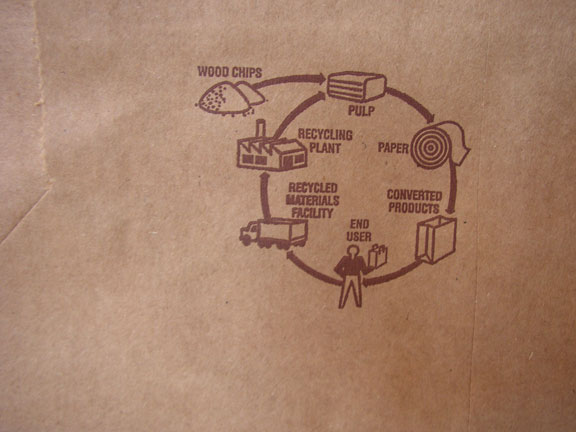
Lately, I’ve seen a few paper grocery bags that have a small graphic of the life cycle printed on the bottom. It’s not very descriptive, but it’s nice to see this small reminder about the larger impact of this simple, everyday item. It would even better to see more detailed information on distance traveled, where the wood chips come from, actual recycled content, etc.