Posts

Artist Residency to Visualize Impacts in Malmö, Sweden

Arlene has begun an artist residency at interactive center for new media MEDEA, where she will develop work to visualize the impacts/benefits of bicycling for the Västra Hamnen area of Malmö in order to encourage and celebrate a culture of bicycling.

More on the progress of the project, which will run Oct-Dec 2010, is posted on the MEDEA site.

sketch of visualizing sustainaiblity in bicycling

WORK-IN-PROGRESS

Sourcemap for product ingredients

Sourcemap, developed by an MIT-based team, uses Google Earth to map the origins of materials in products. A view inside the open-source application also showcases each ingredient’s carbon footprint – which I hope is an indication that it is only a matter of time until tools like this will expand to highlight other Life-Cycle Analysis data.

Computer components as mapped by a Sourcemap user.

Computer components as mapped by a Sourcemap user.

This tool does a great job communicating that ‘ingredients’ in our products are connected to the world around us. As a next step, it would be great to show the carbon impacts in terms that are relevant to consumers – ‘showing’ what the quantity means rather than just stating the number. And to tell more of a story to help consumers frame these big-picture ideas within their everyday experience.

Revealing Hidden Time

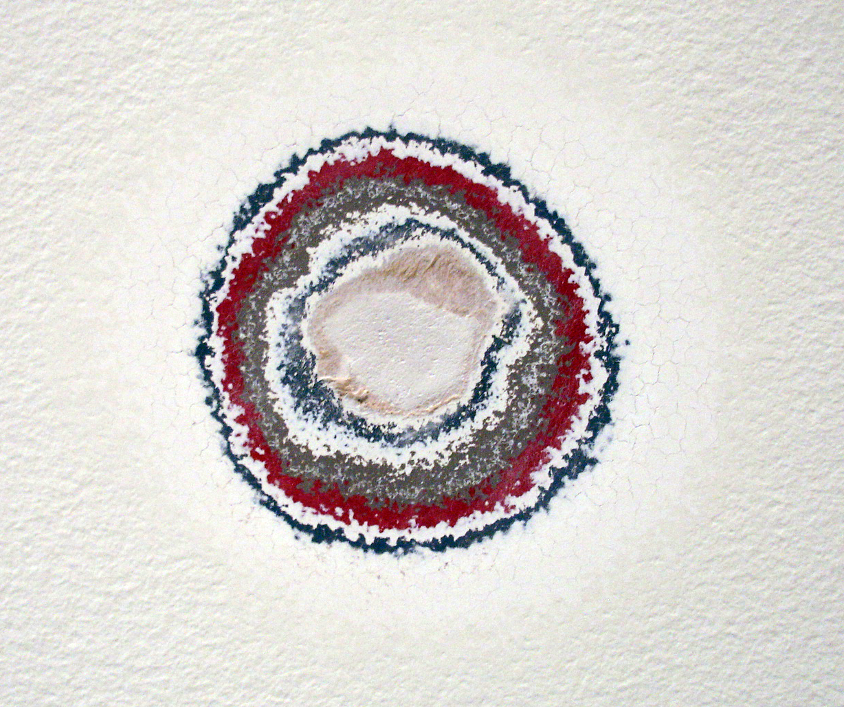
A work by artist Pierre Huyghe, entitled ‘Timekeeper’ uncovers a history of exhibits in this space at the Walker Art Center through sanding down layers of paint on the gallery walls.

Previous layers of gallery paint revealed through sanding.

Previous layers of gallery paint revealed through sanding.

This work is especially interesting in the context of a white-walled exhibition space: the walls are usually forced into the background in order to highlight the work hung on them. In this case, the very history of that back-drop is what’s highlighted.

The work is part of the Walker’s exhibition, The Quick and the Dead;

Surveying art that tries to reach beyond itself and the limits of our knowledge and experience, The Quick and the Dead seeks, in part, to ask what is alive and dead within the legacy of conceptual art.

Communication Design Recognized in Back-Story-Telling Project

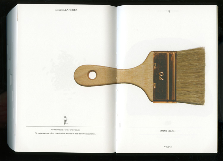
For the first time, the prestigious INDEX Design Award has a winner from the field of communication design. ‘PIG 05049’ is a primarily-visual book, designed and conceived by Christien Meindertsma, that traces all the products made from one pig.

Visual spread from the book 'Pig 05049'

Visual spread from the book

Meindertsma’s intent for the project:

Help people in a highly mechanized and “packaged” world understand how things are made and where they come from so that the resources involved can be cared for by enlightened, informed people.

It’s nice to see the role of communication design to build awareness being recognized within the design community.

Read a previous entry on Meindertsma’s project here.

Toaster, from Scratch

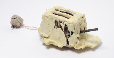
The Toaster Project: A design student’s fascinating project to make a toaster – starting with finding and processing small quantities of raw materials.The project took him all over the UK searching for raw minerals, and developing methods to process them at home.

His whole process was about re-creating the background story. I’d love to see a graphic outlining all of his steps.

the final toaster (photo Daniel Alexander)

the final toaster (photo Daniel Alexander)

The project is featured on we-make-money-not-art.com

Cross Section of History

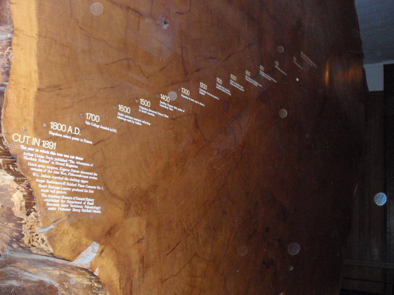
A Giant Sequoia in New York’s American Museum of Natural History reveals centuries of history juxtaposed with the tree’s growth rings. The pairing of dates of history with centuries of growth rings gives us deeper understanding of how time passes and things change: as seen both in nature and in civilization.

Historical events juxtaposed on growth rings

Historical events juxtaposed on growth rings

A definite ‘background story’ – pairing visual cues with data and textual information. This visual reference to nature’s growth is a peak into the life story of the tree: marking the years of fast and slow growth. The numerical years provide a reference to our own history: with additional stories of what happened in civilization corresponding with each growth ring. A good reminder that everything changes.

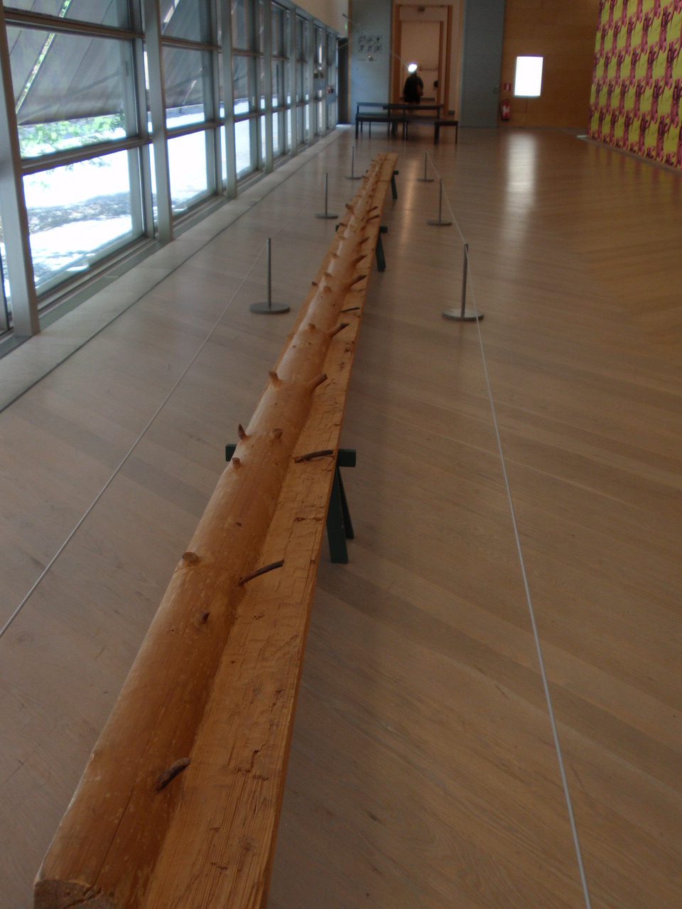
On the topic of trees, the image below is from the Moderna Museet in Stockholm (by an artist whose name I seem to have unfortunately misplaced…). Following growth rings, this artist carves away the ‘years’ of a length of log: revealing the shape of the tree’s younger self.

carved tree reveals it's younger self

carving reveals youth

5lb. butter = How many cows?

My local, local-foods eatery, Common Roots, has launched the first of a series of profiles on the local farms from which the restaurant/coffee shop sources their ingredients. First up: Butter from Hope Creamery in Hope, MN.

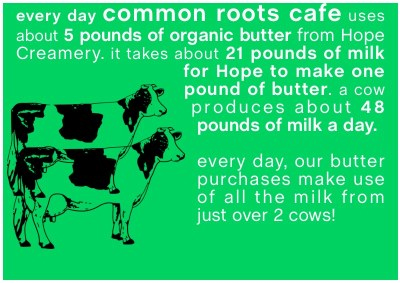
Nice story about the history of the creamery (though slightly lengthy for online attention spans) . And a short video (the first time I’ve seen 2500 pounds of butter churned). But what was most Background Story-esque is a graphic that was included in an email announcing the endeavor:
How many cows does it take...

How many cows does it take...

Not only does this factoid give us a bit of background on butter production (by stating the average daily output of 1 cow), it also quantifies the cafe’s own usage in terms of cows. This kind of information puts data in context. I hope to see similar comparisons (especially in terms of land use, water use, etc.) in future showings of Common Roots’ farm/product profiles.