Year in Numbers
A local cafe has compiled a somewhat-visual depiction of their activities over the year. The focus is on communicating data as it relates to the sustainability initiatives of the cafe.
Read more →

A local cafe has compiled a somewhat-visual depiction of their activities over the year. The focus is on communicating data as it relates to the sustainability initiatives of the cafe.
Read more →
A work by artist Pierre Huyghe, entitled ‘Timekeeper’ uncovers a history of exhibits in this space at the Walker Art Center through sanding down layers of paint on the gallery walls.
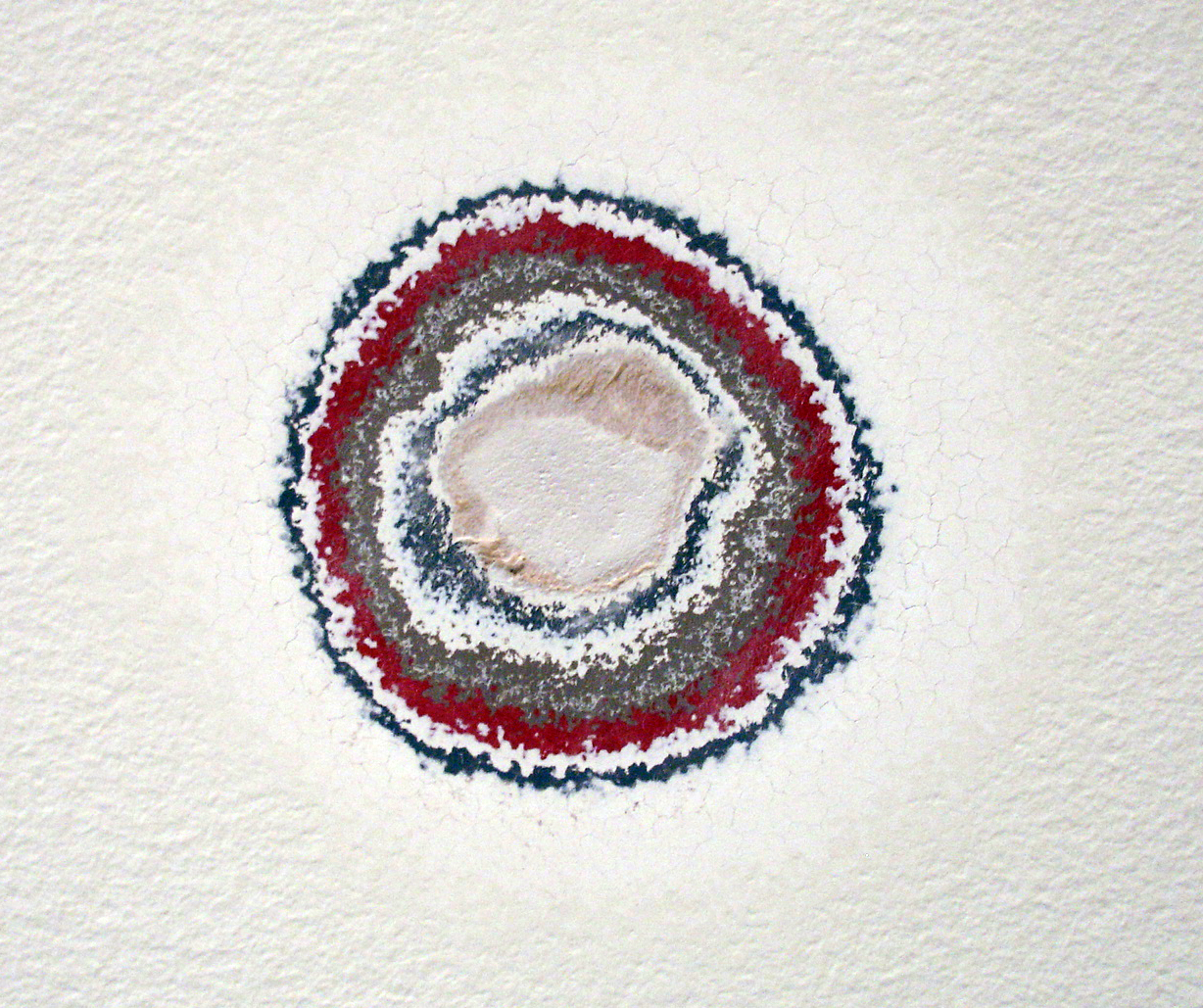
Previous layers of gallery paint revealed through sanding.
This work is especially interesting in the context of a white-walled exhibition space: the walls are usually forced into the background in order to highlight the work hung on them. In this case, the very history of that back-drop is what’s highlighted.
The work is part of the Walker’s exhibition, The Quick and the Dead;
Surveying art that tries to reach beyond itself and the limits of our knowledge and experience, The Quick and the Dead seeks, in part, to ask what is alive and dead within the legacy of conceptual art.
For the first time, the prestigious INDEX Design Award has a winner from the field of communication design. ‘PIG 05049’ is a primarily-visual book, designed and conceived by Christien Meindertsma, that traces all the products made from one pig.
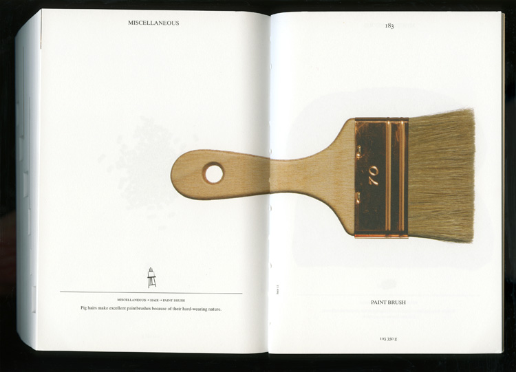
Visual spread from the book
Meindertsma’s intent for the project:
Help people in a highly mechanized and “packaged” world understand how things are made and where they come from so that the resources involved can be cared for by enlightened, informed people.
It’s nice to see the role of communication design to build awareness being recognized within the design community.
Read a previous entry on Meindertsma’s project here.
In a beautiful example of layered visual information, Harold Fisk mapped a portion of the Mississippi River in 1944. The series of plates show the changes in the path of the river through time. I’m drawn to the simple and clear detail, effective color palette and the amount of information communicated through this simple technique.
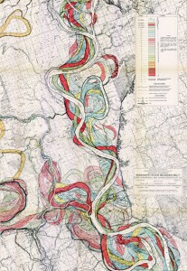
A portion of Fisk’s visually-stunning map of the Mississippi
The full map is available at the US Army Corp of Engineers.
The Toaster Project: A design student’s fascinating project to make a toaster – starting with finding and processing small quantities of raw materials.The project took him all over the UK searching for raw minerals, and developing methods to process them at home.
His whole process was about re-creating the background story. I’d love to see a graphic outlining all of his steps.
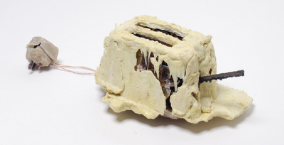
the final toaster (photo Daniel Alexander)
The project is featured on we-make-money-not-art.com
A Giant Sequoia in New York’s American Museum of Natural History reveals centuries of history juxtaposed with the tree’s growth rings. The pairing of dates of history with centuries of growth rings gives us deeper understanding of how time passes and things change: as seen both in nature and in civilization.
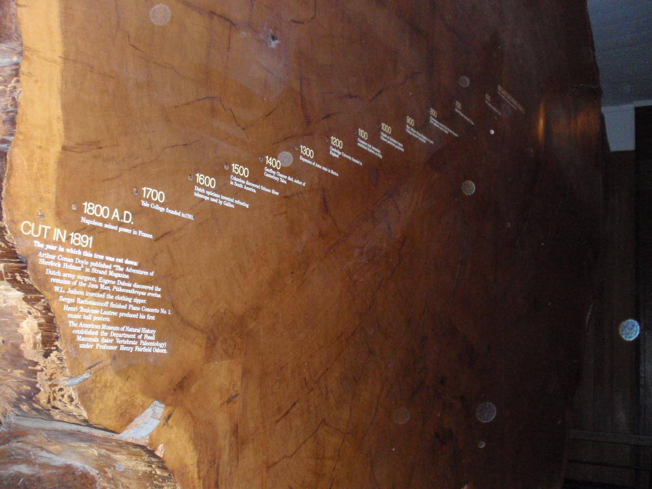
Historical events juxtaposed on growth rings
A definite ‘background story’ – pairing visual cues with data and textual information. This visual reference to nature’s growth is a peak into the life story of the tree: marking the years of fast and slow growth. The numerical years provide a reference to our own history: with additional stories of what happened in civilization corresponding with each growth ring. A good reminder that everything changes.
On the topic of trees, the image below is from the Moderna Museet in Stockholm (by an artist whose name I seem to have unfortunately misplaced…). Following growth rings, this artist carves away the ‘years’ of a length of log: revealing the shape of the tree’s younger self.
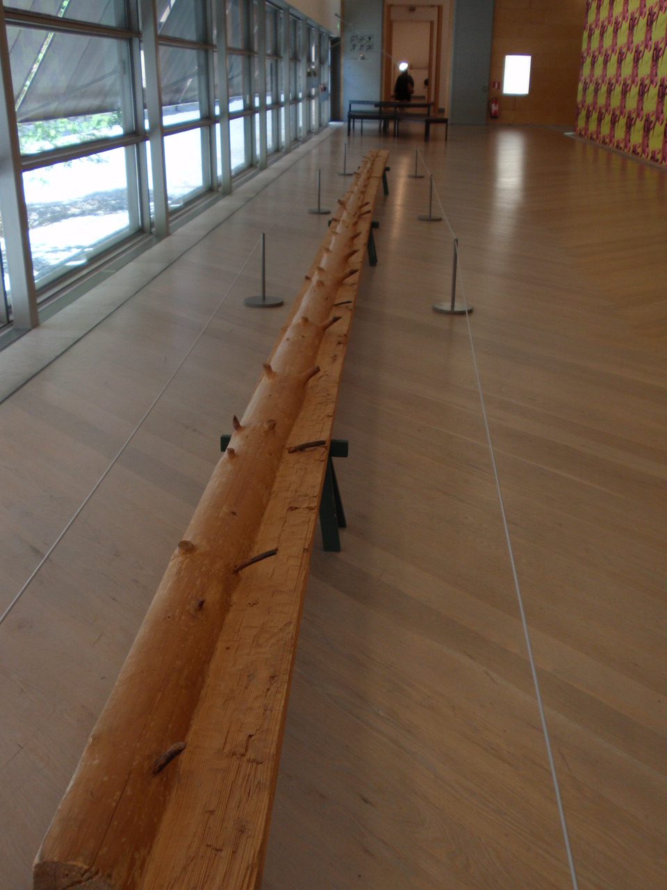
carving reveals youth
Augmented Reality: a virtually 3-d landscape unfolds via your computer
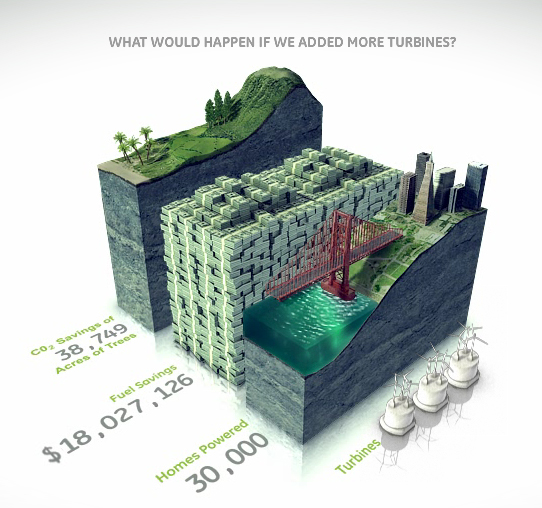
Bar graphs bring information to life with visual virtual worlds
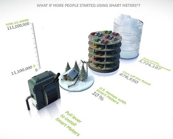
Environmental and financial savings stack up in a bar graph.
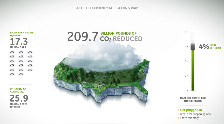
GE infographic - Mapping CO2 Emissions
Prius’ console allow users (and passengers) to see what happens under the hood. The console sports an energy monitor (among other controls) that transparently provides information to the user (and passengers) so they can understand how the ups-and-downs of gas and break pedals impact the hybrid’s fuel usage and battery charging.
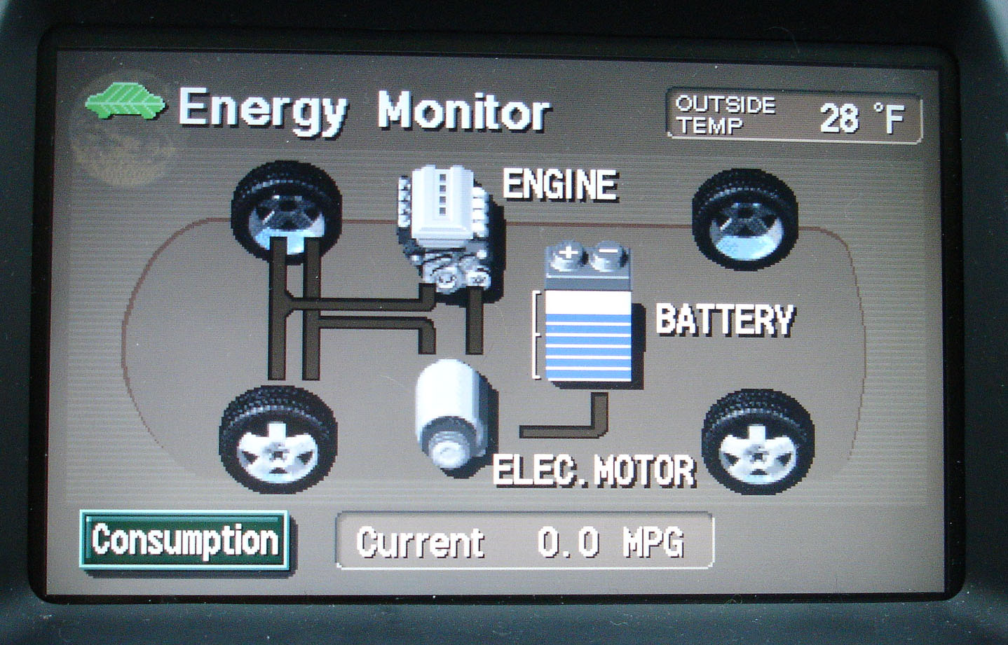
Prius Energy Transfer map
Using simple visuals and motion graphics, the console maps how energy is used, and shows how the battery gets recharged. What results is the ultimate in immediate user-feedback.
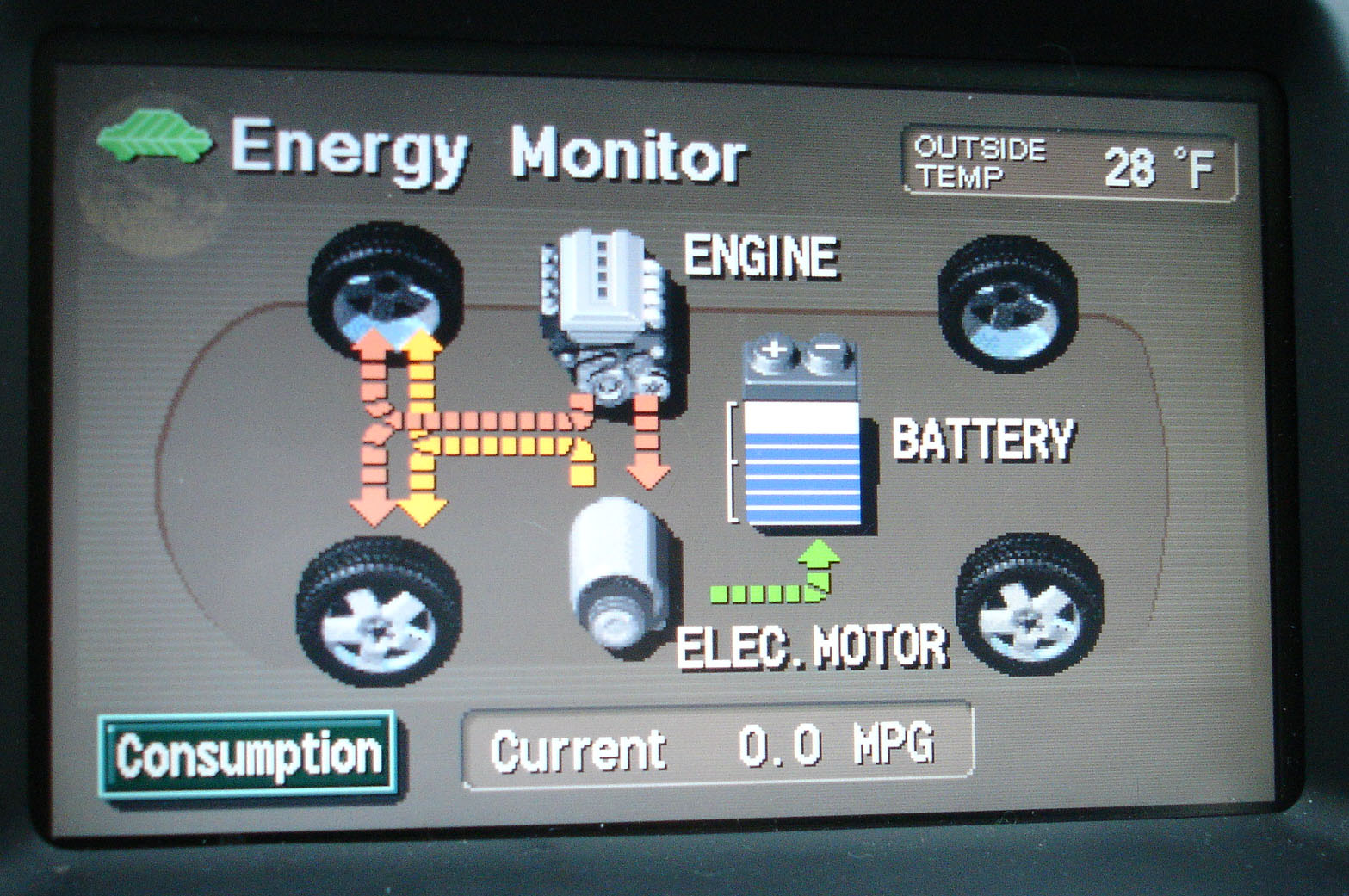
Map of Prius Energy Usage in motion
In addition to helping the riders to understand what exactly a hybrid is, and how it works, this system helps users drive more eco-efficient because they get immediate feedback. As a driver, you can start to understand what’s going on, and how your driving techniques impact the fuel-efficiency of the vehicle. This model integrates enough feedback loops so a driver can learn to adjust their own driving to help the system optimize how it runs.
An added layer of feedback on newer Prius models is a chart that records energy consumption over the last 30 minutes of use – enabling the user to compete against themselves for improvement.
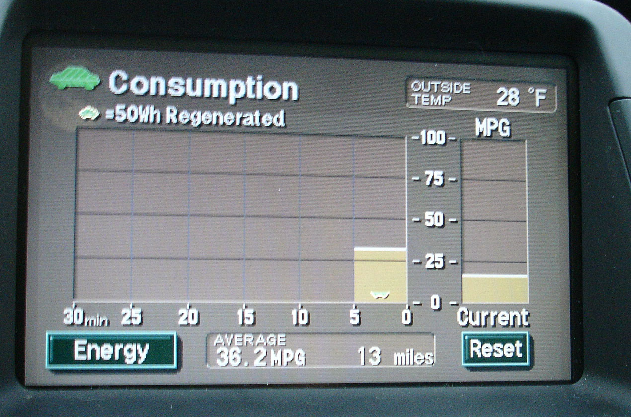
Graph charts energy consumption
Products should be designed to showcase some level of their inner-workings. Even if the vehicle was not a hybrid, it’s a great step toward product transparency. Just imagine if more of our energy-devouring equipment incorporated similar feedback mechanisms.
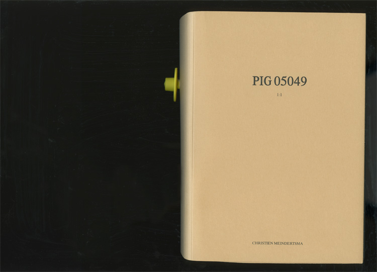
Pig book cover
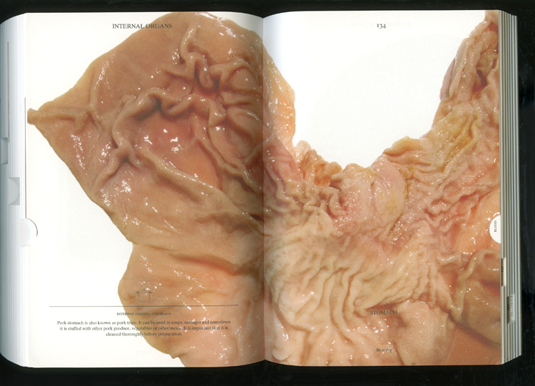
Pig part
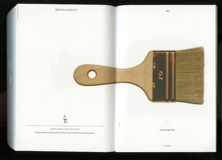
Made from the pig
Book by Christien Meindertsma. Images from julie joliat.
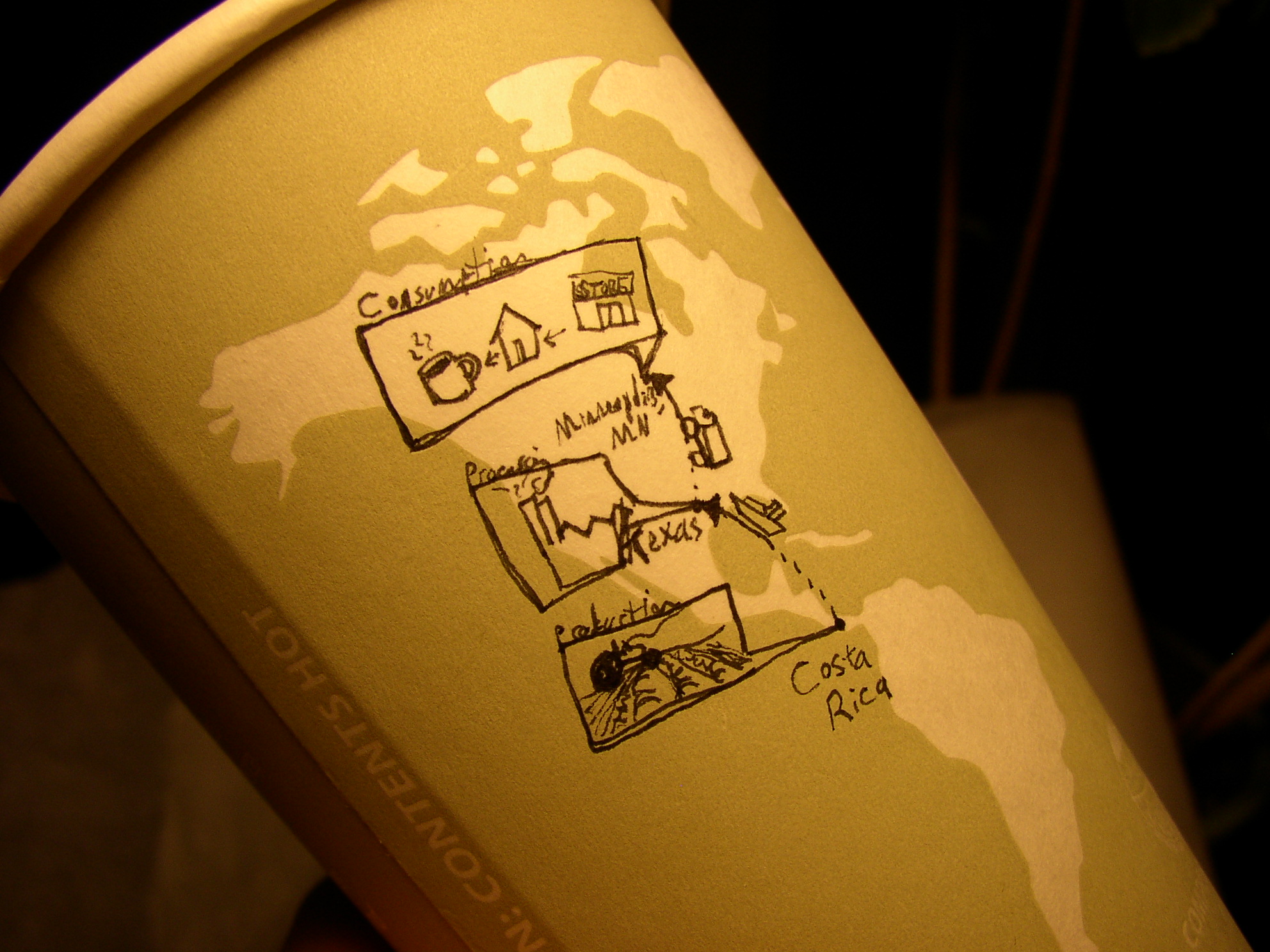
Here’s a quick sketch done on the map of a pre-printed coffee cup: Shows the journey of the coffee beans from origin to consumption.
Small text reads (from top): Consumption, Minneapolis, MN; Processing, Texas; Production, Costa Rica.