T shirt tells its own life cycle.

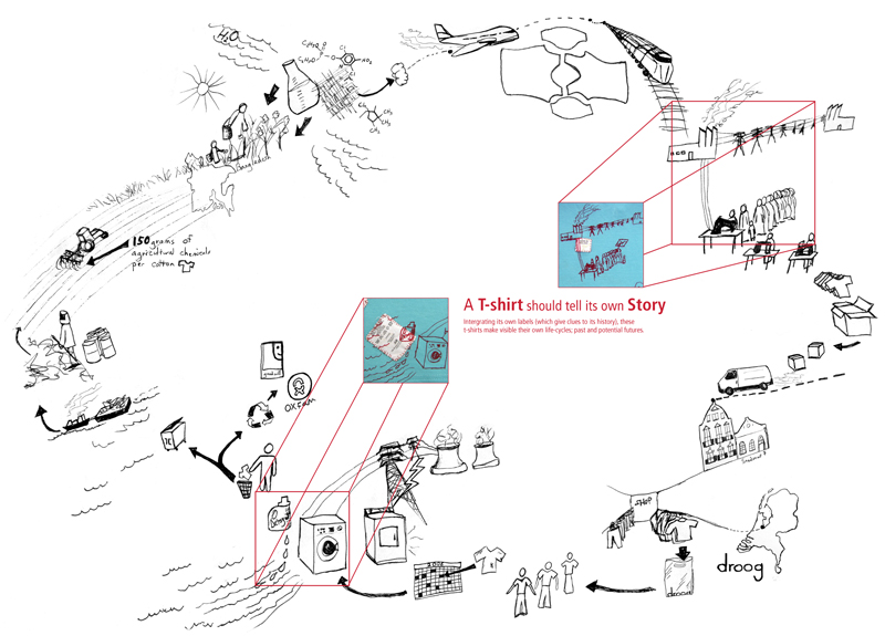
Tshirt printed with it\'s own life cycleLife cycle of a T-shirt: Droog Design

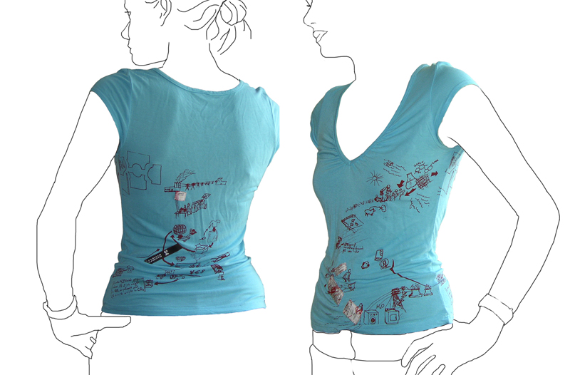
This t-shirt tells its own back story: the t-shirt tags are cut from the inside and stitched into the screenprint graphic of an imagined life of the product. The shirt was put into production in 2006 by Droog Design.

This is a more illustrative, conceptual version of a background story – less data based. The graphic is customized based on available information at the time (this includes where the cotton comes from, and where the t-shirt is sold). More quantitative figures on distance and carbon footprint could be input with the right data available.

CNN BackStory

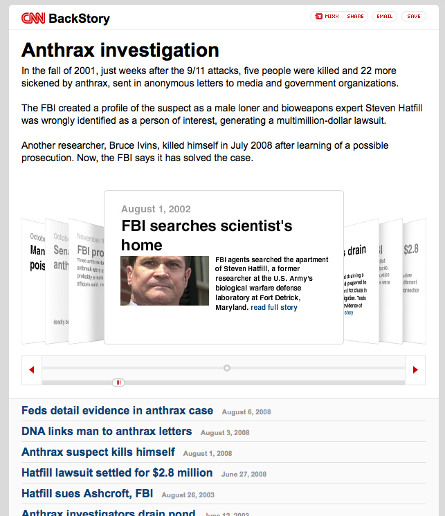
CNN BackStory screengrab

CNN has launched a new application to show how a story has developed over time. This is basically a collection of all CNN-posted stories associated with a particular event. The example they give is the Anthrax case. http://behindthescenes.blogs.cnn.com/

This allows readers to easily dig into the recent history of a story. The impact of a news service that offered such a view into history -AND incorporated stories from other key news media (CNN, BBC, and New York Times for example)- could be extremely powerful piece of online media to showcase varying perspectives. It will be interesting to see if partnerships emerge in this area – also incorporate other online media (video in addition to text-based stories).

Patagonia’s Footprint Map

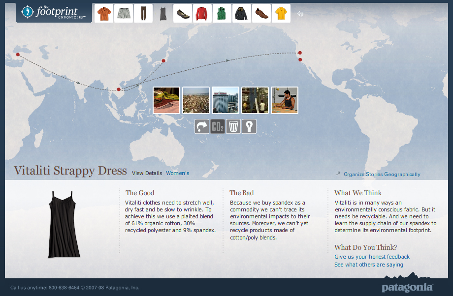
Footprint ChroniclesTravels of a Patagonia Dress - Footprint Chronicles

Companies are increasingly able to track the life of their products through their supply chains and trace the origins of even the smallest notion.

Patagonia’s Footprint Chronicles outlines the potential for a company to unveil its transparency in the name of promoting sustainability (and hence, appearing as a sustainable company). From an information standpoint, Patagonia is open about “The Good” and “The Bad” – admitting that, like any human, they’re not yet perfect, but they know where they need to improve.

The online tool carries the viewer through design, materials, manufacture, distribution (among others) of a handful of the company’s products, allowing the user to explore info both sequentially or geographically. Based on google-esque maps, the tool is well-designed as both a piece of information design and as an interactive tool.

Though included are a handful of data and other numbers, I’d like to see these numbers presented in a more visual way – nice parallels are drawn to perceivable concepts to make abstract quantities real. For example: where they say the CO2 generated from a specific shirt is equal to 100x the weight of the shirt, it would be nice to have a more standard reference: such as how many miles average driving…or how many trees need to be planted to counteract this release of CO2. This reference could in-turn, be illustrated in a more graphic format that would enable more direct comparison between various products.

Slow down for the children

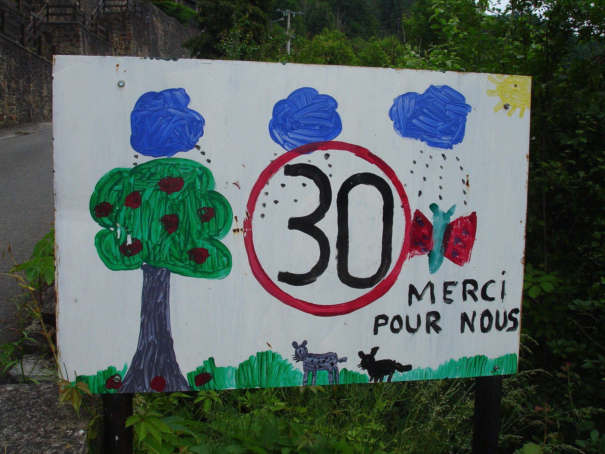
30km/hour Thanks. It\'s for us. 30km/hour Please!

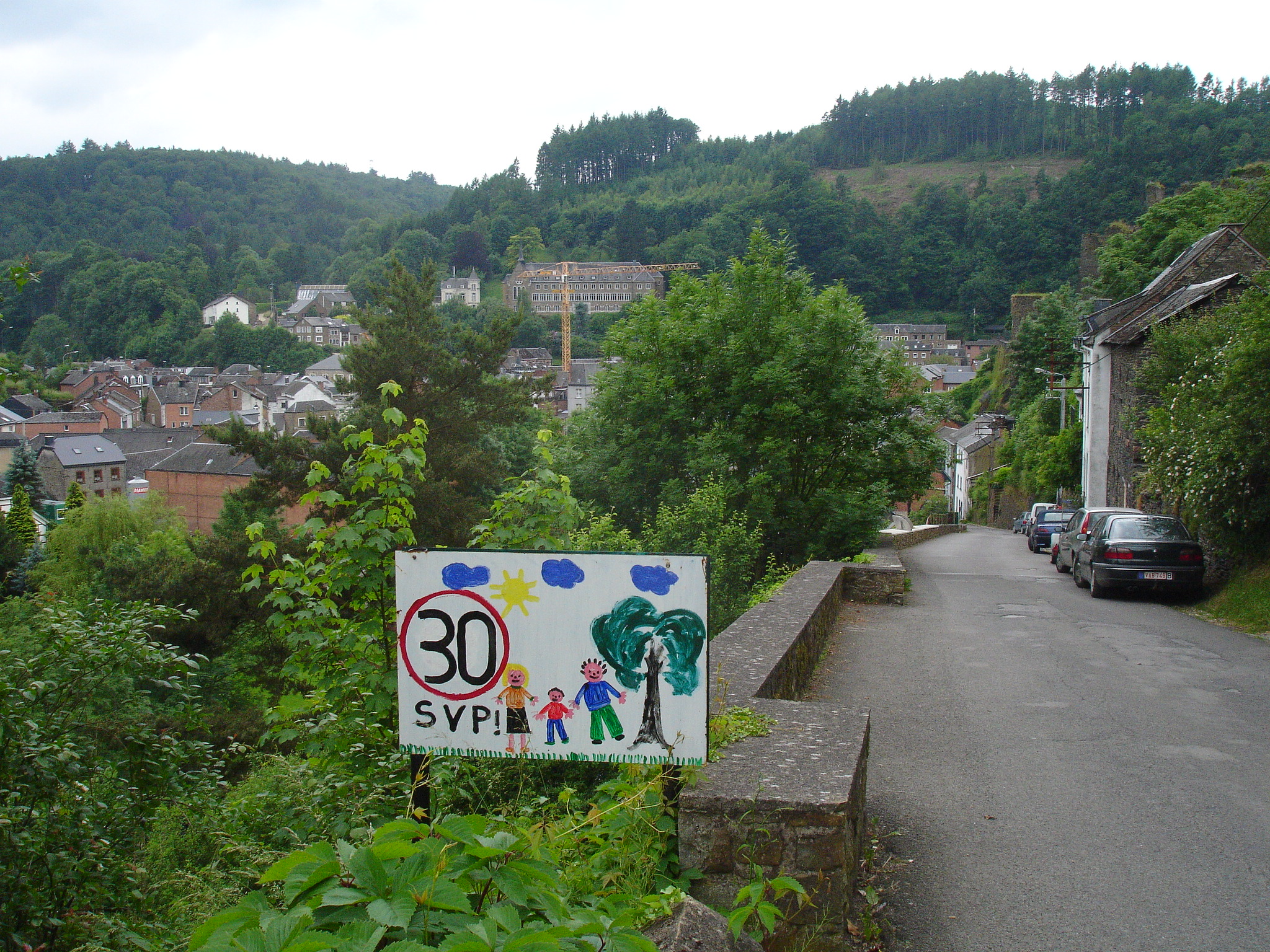
We came upon several of child-designed ‘slow down’ in a neighborhood area of this picturesque Southern Belgian village.

Not only do these signs get you to slow down to enjoy the art, they also are strong reminders of the reason one should reduce speed:as one sign distinctly puts it “for us”.

The circled ’30’ (the European symbol for speed limit) is consistent on sign. Painted on the white board surrounding this ‘slow down’ symbol are the happy indications of childhood in the area: sunshine, trees, swings, families, dogs, cats, and a myriad of other animals. Personalized, these tell the story of neighborhood life from kid-view.

Such a request for speed reduction is more effective and easier to obey when it comes direct from the pint-sized residents of the street than from the typical sterile government-issued signs. These factory-stamped signs only serve to remind a driver that there are staunch rules to conform to. Sure, the objective of each style of sign is the same, but by including an indication of the reason ‘why’ behind a request for conformity, drivers are more likely to adopt the concept as their own and ride the breaks.

Illustrated Story of Wine

Story of wine at a vineyard - frontStory of wine at a specific vineyard - back

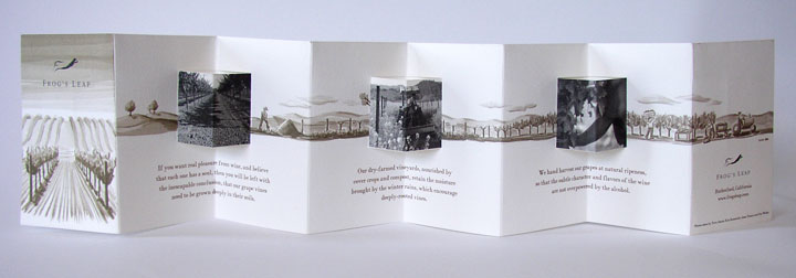
This accordion-fold brochure from a vineyard pulls the viewer through the story a bottle of wine from planting to enjoying – in 3 parallel formats: written storyline, photographs and a background illustration which ties the piece together. As a viewer, I’m right there walking with the grapes as they pass from farm to glass. Definitely more of a marketing piece than data-driven information design, but the brochure makes creative use of folding and visual design elements to evoke an emotional response.