I, Pencil – A Sustainability Story From 1958

I, Pencil by Leonard Read, is an essay on the life cycle of a pencil. Written in a way that references all the strings attached and people involved in the back-story of this simple, everyday object; this story is an excellent text to tie products to global social and environmental concerns. And it was written in 1958.

“Actually, millions of human beings have had a hand in my creation, no one of whom even knows more than a very few of the others.”

I, Pencil is referenced in this TED talk by Matt Ridley about the collective effort that leads to innovation,

Tracing A Box’s Life

Colombia Sportswear is asking you to ‘Consider the box’ with their project: A Box Life. A Box Life brings awareness to an often-overlooked part of mail-order products’ life-cycles: the packaging.

Box life transparently tracks the back-stories of where boxes have traveled.

Box life transparently tracks the back-stories of where boxes have traveled.

Not only is it a clever way to encourage people to reuse packing materials, but telling the stories behind the travels of things also acts as a tool for transparency, and reminds consumers of how individual actions impact sustainability.

read more: Springwise

Mapping the Mississippi: Through Time

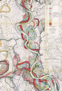
In a beautiful example of layered visual information, Harold Fisk mapped a portion of the Mississippi River in 1944. The series of plates show the changes in the path of the river through time. I’m drawn to the simple and clear detail, effective color palette and the amount of information communicated through this simple technique.

Fisk Map of the Mississippi through the ages

A portion of Fisk’s visually-stunning map of the Mississippi

The full map is available at the US Army Corp of Engineers.

Toaster, from Scratch

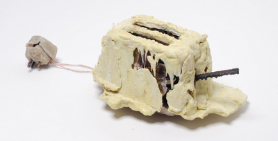
The Toaster Project: A design student’s fascinating project to make a toaster – starting with finding and processing small quantities of raw materials.The project took him all over the UK searching for raw minerals, and developing methods to process them at home.

His whole process was about re-creating the background story. I’d love to see a graphic outlining all of his steps.

the final toaster (photo Daniel Alexander)

the final toaster (photo Daniel Alexander)

The project is featured on we-make-money-not-art.com

Tracking water droplets: Playing raincloud.

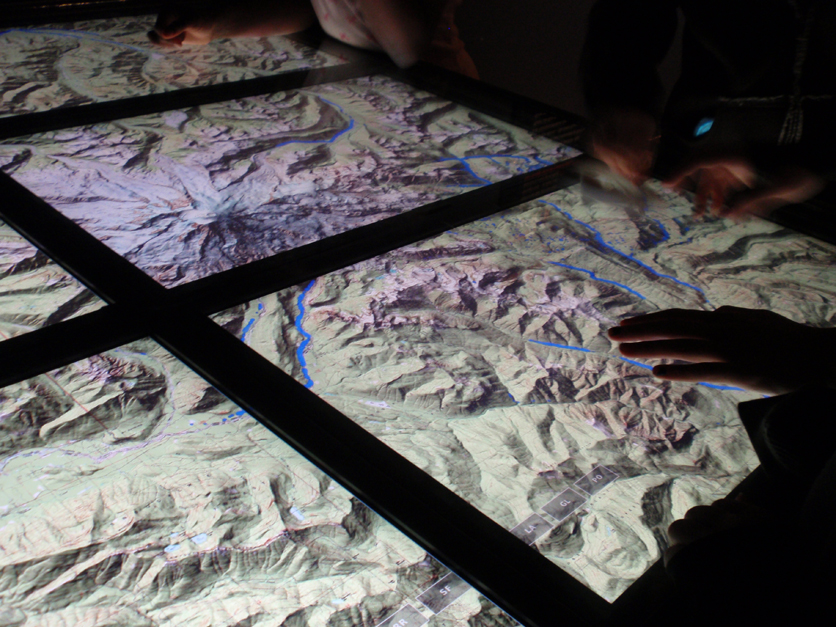
An exhibit on Water at the Science Museum of Minnesota contains an interactive display that allowed people to ‘become’ a raincloud. By rubbing a ‘raincloud’ tool over a series of screens displaying a topographic map, the cloud rains drops of water onto the topo-map. Visitors can see how the drops of water run down the sides of a topographic map to slow and pool together in the valleys between mountains. Colliding together, the blue drops create rivers which meander through valleys until falling off the screen.

Interactive table created interaction for watersheds

Interactive table created interaction for watersheds

As a fun way for visitors to interact with the exhibit, this project helps people understand how water flows (the fact being downhill- which I thought was obvious, but apparently there is an overwhelming number of people who are surprised when rivers turn to flow North instead of South, as on maps they must have an idea that gravity makes the water flow off the page.)

Reality, augmented. […sustainably?]

Merging analog and digital, this new tool allows users to use their webcam to make a simple printed page come to life. In 3 dimensions!
Augmented Reality: a virtually 3-d landscape unfolds via your computer's webcam.

Augmented Reality: a virtually 3-d landscape unfolds via your computer

An incredible display of technology, it’s not hard to imagine the communication possibilities for sustainability, communicating the background stories of products…or anything for that matter. However it’s not immediately clear how this technique is as exclusive to the future of sustainable communications as it would have us believe (the tool is introduced from within GE’s micro site promoting sustainable technologies like the smart grid and smart power meters). Though a extremely promising tool, a slight scent of greenwash clouds the air.
Watch the video, as presented by Adobe CTO, then try it for yourself.

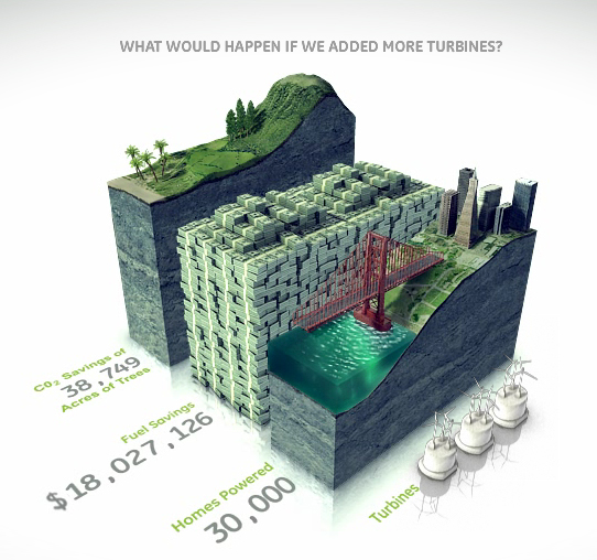
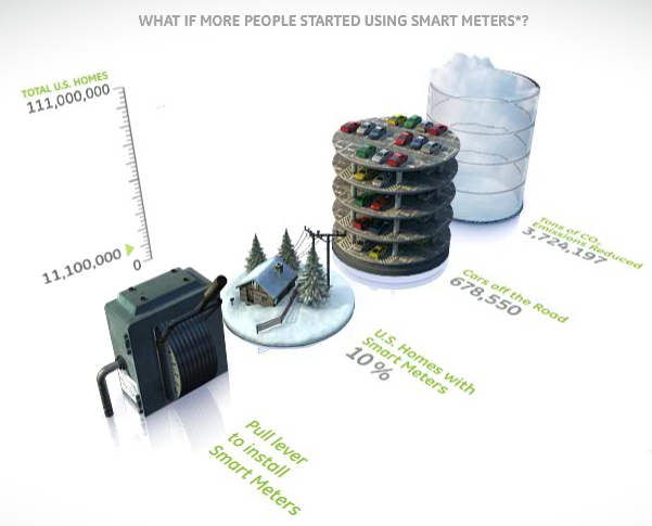
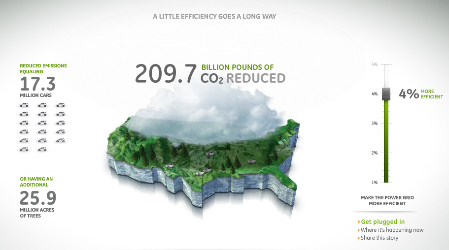
On the topic of eco-magination, there are some wonderfully communicative info-graphics throughout the micro site. However, overall the site is excessively flashy: lots of pretty pictures…but not much overall content.  It seems to have been created as a playground for cutting-edge graphics more than to support sustainability. (Though, one could argue that’s GE’s intent…) More easily accessible information to back up the claims that GE wants to communicate through such elaborate – and interactive- visuals would lend significantly more credibility to this site.
bar graphs bring information to life with visual virtual worlds

Bar graphs bring information to life with visual virtual worlds

Environmental and financial savings stack up in a bar graph.

Environmental and financial savings stack up in a bar graph.

GE infographic - Mapping CO2 Emissions

GE infographic - Mapping CO2 Emissions

This little piggy went …all over.

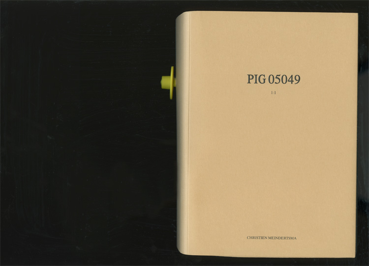
Pig book cover

Pig book cover

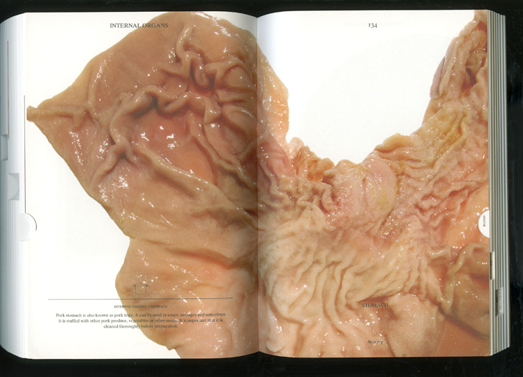
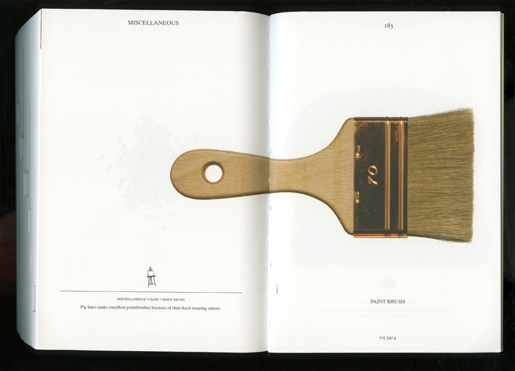
“Pig 05049” is a background story in reverse: This book starts from the initial ingredient (a pig) to tell the (future) story of everything that the pig becomes after slaughter.
Pig part

Pig part

Made from the pig

Made from the pig

Book by Christien Meindertsma. Images from julie joliat.

Stuff has a Story

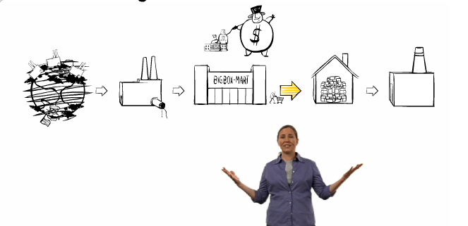
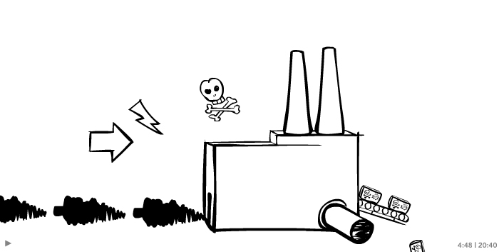
Story of Stuff Life CycleStuff goes into a factory

‘The story of stuff’ is an animation/video that strolls through the ‘big picture’ of the production/consumption life cycle.

Story of Stuff exposes the connections behind products (and really behind our whole economic system). It paints a relatively dreary outlook, and thereby inspires action. It has been out for a while, and fortunately they’ve recently added an update to the website now allows the start of an outlet for ideas on what a consumer can do about the situation. (An earlier version of the animation left out the last step “Another Way,” lacking details on what the everyday consumer can do about the situation.)

The visualization of the system is impeccable: Black & white sketched and stylized drawings with simple animation leave enough room for the viewer to get their own ideas and apply the concept to their own situation. When people can see the possibilities, they can more easily understand how their own everyday decisions impact the big picture. Story of Stuff does a great job at establishing that connection.

Ba Baa Baacode

Baa code entry

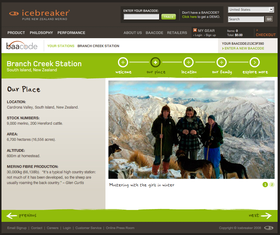
Consumers can track the back story of their Icebreaker product through a portal on the company’s homepage.

BaaCode micro site screengrab

Entering a ‘baacode’ reveals pictures and video clips of the people that raise the sheep and the place they roam.

The information for the sample code paints only a picture around the actual beast (sheep) that the wool fibers come from – not the full production cycle or other components of the clothing. But it’s a good start and an intriguing, at least partially interactive space.

It’s great to offer a sample code, but it would be even better to further incorporate the theme of transparency into the application by opening up the archives so that anyone perusing the website can see details behind all the products. (Only having viewed one sample location upon many visits, I’m also skeptical about how many different stories are actually covered in the online application).

The concept is ripe with potential to give the consumer cues to the product’s backstory at point-of-sale.

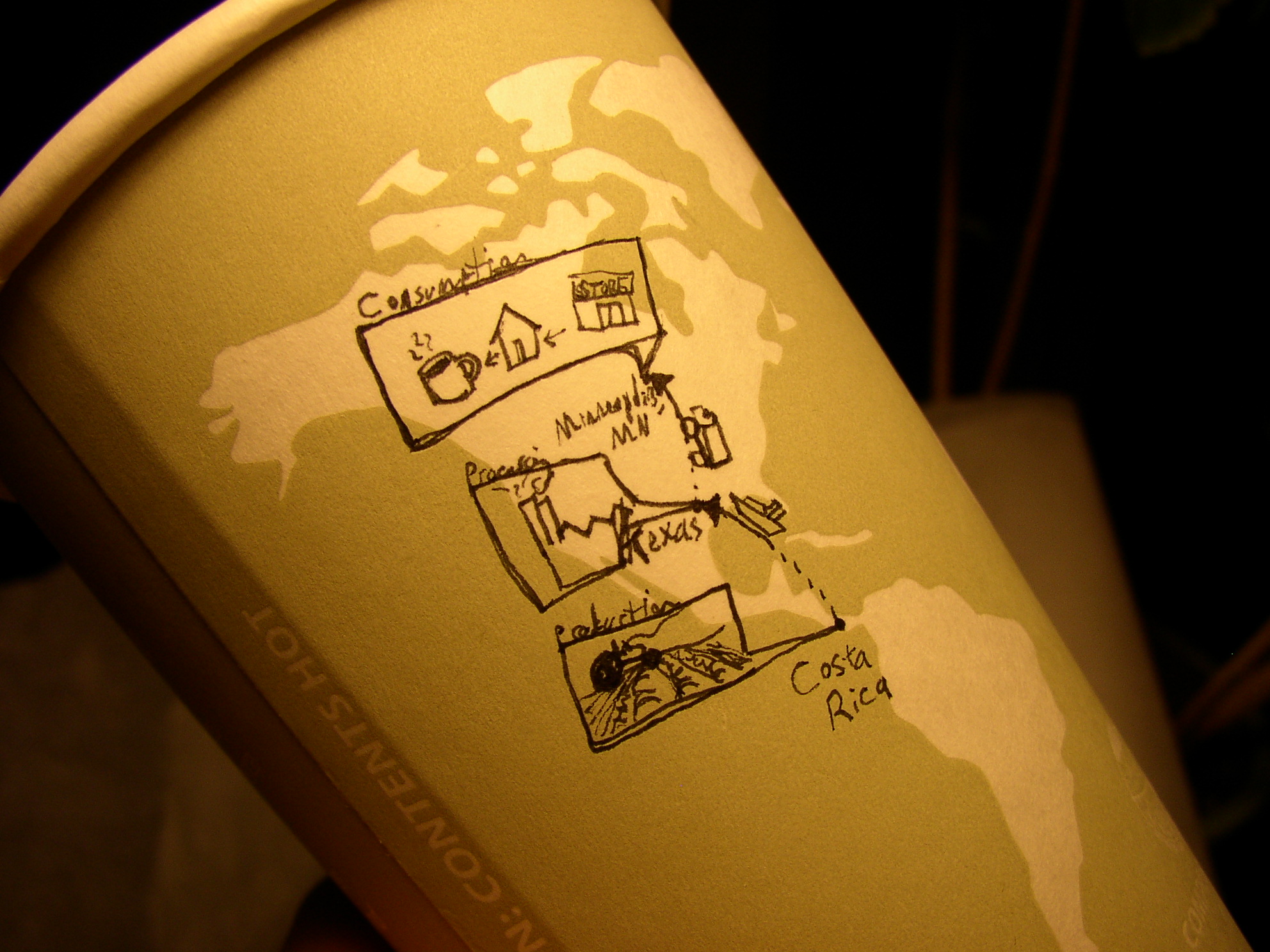
coffee from Costa Rica

journey of coffee to my cup

Here’s a quick sketch done on the map of a pre-printed coffee cup: Shows the journey of the coffee beans from origin to consumption.

Small text reads (from top): Consumption, Minneapolis, MN; Processing, Texas; Production, Costa Rica.