Visualizing Complex Systems

The way the world works as a complex science. 

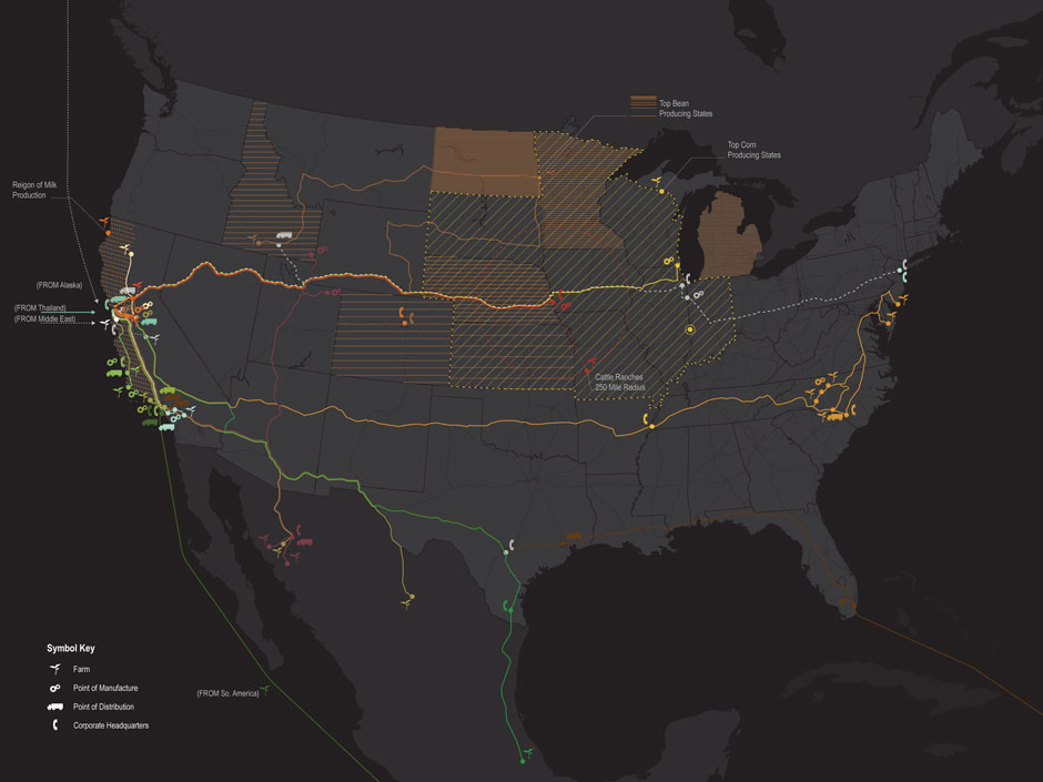
Most of what I do is related to communicating complexity: helping audiences understand systems to locate themselves within sustainability solutions. Complexity science is a field that was recently brought to my attention. In sustainability, we’re familiar with systems thinking and the complexity of the human interactions between society, the environment and economics.

According to complexity.ecs.soton.ac.uk

“Complexity science is the scientific study of complex systems, systems with many parts that interact to produce global behaviour that cannot easily be explained in terms of interactions between the individual constituent elements.”

Complexity science is an interesting lens through which to consider the intricate systems behind sustainable design solutions  – natural, technological and social.

Designing Information for the Understanding of Sustainability

Notes From the GreenID Conference

Recently presenting at the International Institute of Information Design’s (IIID) GreenID conference in Vienna, I was struck by the phrase, “Context brings understanding.” As information designers, we seek to clarify complex information. And sustainability is certainly a topic area that involves a lot of complexities in communicating related social, ecological and financial attributes of a product or service.

Green ID sustainable information design conference logo

My work focuses on developing ‘visual stories’ to help consumers understand how their individual actions play into the ‘big picture’ of sustainability. In my mind, it’s the communication of the context of sustainability that brings understanding to consumers.

To this aim, I presented research and techniques for communicating sustainability – gleaned through my work on narrative life cycles and with students at the Minneapolis College of Art and Design’s (MCAD) sustainability program. I aimed to demonstrate how a visually-compelling story can present complex sustainability data in an approachable, layered format that can act as a tool for consumer education.

The conference covered a wide variety of topics and projects related to the overlap of info design and sustainability. Three areas of interest for my work and the upcoming visual communication course at MCAD include techniques of designing for understanding, measuring impacts and questions on the effectiveness of info design in changing behavior.


Designing for Understanding:

When setting out to design information to aid in understanding, and to clarify context, there are a number of strategies to consider. 

Presenter Angela Morelli, who has done a thorough analysis of the hidden water footprints embedded behind everyday foods and activities, made a case for emotional connection with an audience. She presented 4 guidelines for designing for understanding: utilize empathy, reference cognitive science, observe beauty and play on an audiences’ interest.

To design for understanding, one must first thoroughly understand the content of what is being designed. In a workshop Morelli gave on data visualization, she also outlined the steps to creating information design: first we ‘look,’ then ‘read,’ ‘organize’ information then ‘cut & paste’ it into a format which communicates a message to others. This process mirrored the 4 steps of visual thinking outlined in Dan Roam’s book, “Back of the Napkin”: first we ‘look’ to scan what’s in our vision. Then we ‘see’ to make sense of that which is visible, and then ‘imagine,’ to use our mind to guess that which is not visible. At this point we ‘show’ to share with others (this is the actual stage of creating a visual info design).


Measuring Our Impacts:

Discussion at the conference considered methods of measurement for each of the 3 legs of sustainability in order to visualize data in a holistically-balanced way. 

Data obviously exists for financial measurement– all companies financial reports go into depth on this very important topic.

The ecological dimension is –relatively more recently- available through processes such as Life Cycle Analysis (LCA). In fact, my presentation showcased a variety of visual narrative approaches to information design, including examples from client work, creative practice and student work from a course I teach that concentrates on visualizing product life cycles and the more technical ecological measurements of sustainability known as Life Cycle Analysis (LCA).

However, defining measurement for the social component is much more slippery. (How exactly does one measure ‘happiness’?) As this field of ‘quality of life’ is based on qualitative research and varies based on cultural norms and individual expectations, it’s hard to make inclusive visualizations of the ‘social’ on-par with its financial and ecological counterparts.


Can Data Visualization Lead to Behavior Change?

Overwhelmingly, questions throughout conference discussion centered on ‘can visualization of information lead to behavior change?’ Fortunately, there was an environmental psychologist among the presenters to provide some guidelines for our research into this question. Dr. Karen Stanbridge of the University of Reading presented some theories to reference when designing for behavior change:

  • Theory of Planned Behavior – (Ajzen & Fishbein, 1980)
  • Stages of Change Model – (Prochaska & Diclemente, 1982)
  • Theory of Social Dilemmas

These theories can act as a starting point for research into measuring the effectiveness of this emerging field of information design for the communication of sustainability. 

MEDEA Talk on ‘Visualizing Sustainability’

Arlene Birt presenting at MEDEA in Malmö, Sweden on Dec.10 (15:00-17:00 Central European time).

Arlene will present two projects that she’s done as artist-in-residence at MEDEA and a behind-the-scenes view on her work on how to visualize ‘background stories’. One project is a visual mapping of the sustainability-oriented systems at work within the Västra Hamnen area of the city through a collaboration with Unsworn Industries to show this information using the parascope technology they’ve developed. Another project visually communicates the benefits of bicycling – in terms of CO2 saved, money saved and calories burned.

Details on the talk here. There will also be a live-stream of the talk.

Artist Residency to Visualize Impacts in Malmö, Sweden

Arlene has begun an artist residency at interactive center for new media MEDEA, where she will develop work to visualize the impacts/benefits of bicycling for the Västra Hamnen area of Malmö in order to encourage and celebrate a culture of bicycling.

More on the progress of the project, which will run Oct-Dec 2010, is posted on the MEDEA site.

sketch of visualizing sustainaiblity in bicycling

WORK-IN-PROGRESS

Chipotle Veggs Out Locally

Food retailer Chipotle has an online animated map showing the locality and seasonality of produce used in their menu items.

Though buried at the bottom of the page (click ‘integrity’, then scroll down), the graphic is a good educational tool: teaching about seasonality in produce.

From the perspective of informational design, it would be great to see it containing more specific data (rather than just being a visual description): I’d like to see what % of the onion used in Midwestern stores is local in the winter.

Regardless, it’s a good place to start communicating sustainability to consumers.

Seasonal Local Vegetables

SEASONAL LOCAL VEGETABLES ANIMATION

Tracing a Taco

‘Tacoshed’ tracks the journey (and miles) of all the ingredients from a taco produced by a specific taco truck in San Francisco.

Tracing Food miles from a taco

TRACING THE BACK-STORY OF A SPECIFIC TACO

Compiled by students at California College of the Arts and design group Rebar, this info-visualization highlights the complexity of our food systems.

Tough resulting in complex maps, the results accurately gives people an idea where their food comes from.

Serving Carbon With Your Crackers

Carbon foot-printing has made its way onto the plates of people living in Sweden.
Read more

Cell Size Comparison

This nifty flash tool from the University of Utah’s Genetic’s lab lets viewers zoom into an image to experience the size of increasingly small cells relative to each other. Such an interactive and immersive experience helps people understand more about the world around them – the very, very small world.

Zooming into increasingly small size comparison of cells.

Zooming into increasingly small size comparison of cells.

A useful application based on some of the same principles behind the Eames’ Powers of 10.

Sourcemap for product ingredients

Sourcemap, developed by an MIT-based team, uses Google Earth to map the origins of materials in products. A view inside the open-source application also showcases each ingredient’s carbon footprint – which I hope is an indication that it is only a matter of time until tools like this will expand to highlight other Life-Cycle Analysis data.

Computer components as mapped by a Sourcemap user.

Computer components as mapped by a Sourcemap user.

This tool does a great job communicating that ‘ingredients’ in our products are connected to the world around us. As a next step, it would be great to show the carbon impacts in terms that are relevant to consumers – ‘showing’ what the quantity means rather than just stating the number. And to tell more of a story to help consumers frame these big-picture ideas within their everyday experience.

Communication Design Recognized in Back-Story-Telling Project

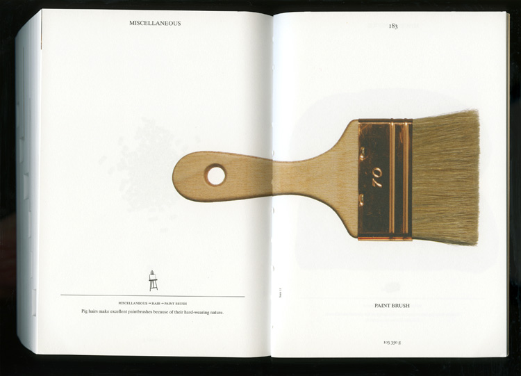
For the first time, the prestigious INDEX Design Award has a winner from the field of communication design. ‘PIG 05049’ is a primarily-visual book, designed and conceived by Christien Meindertsma, that traces all the products made from one pig.

Visual spread from the book 'Pig 05049'

Visual spread from the book

Meindertsma’s intent for the project:

Help people in a highly mechanized and “packaged” world understand how things are made and where they come from so that the resources involved can be cared for by enlightened, informed people.

It’s nice to see the role of communication design to build awareness being recognized within the design community.

Read a previous entry on Meindertsma’s project here.