Car eco-label only inches forward despite potential
Environmental label for CA cars

Environmental label for CA cars

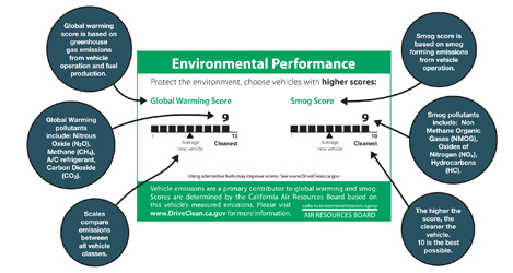
Effective since January 1st, California has launched a clean air label required on every new car produced and sold in California. The label rates ‘Smog’ and ‘Global Warming’ on a scale of 1-10 (5 being the average car, 10 being the cleanest). Though there has been a smog index label since 1998, this marks the first time such information has been available to the consumer at point-of-sale – though it seems you’ll have to pop the hood to find the label.

The best part is that the implementation of the label signifies a step toward transparency and ultimately sustainability: a system is now in place to transfer information from car producers, 3rd party reviewers, auto dealers and to communicate that to consumer.

However, the visual representation of the label leaves a lot to be desired. Very little actual information is communicated in these graphics – despite the seemingly substantial space allocated. A simple line makes up the ranking, but portrays very little detail about what the vague titles are all about. I’d like to see this label make use of the technique of layering: to call out the most basic important information (what’s already shown), while incorporating another level of supporting information to further educate viewers.

The ‘global warming’ score actually includes some interesting elements to touch on the larger life-cycle of the system – a stance not often acknowledged in products. But although this label touches on some issues related to sustainability, it leaves many questions in the viewer’s mind. For many audiences that already have a basic understanding of the principles of sustainability, the infographic neglects to transparently inform what the ‘smog’ and ‘global warming’ rankings actually include. [smog-producing emissions from use of the car for the former, and greenhouse gas emissions from fuel production, vehicle operation, and the car’s A/C system for the latter.] It’s also unclear whether average car score will adjust as cars are built cleaner in the coming years.

An online website clears up some of the vagueness: Consumers can also see the top 10-rated cars and check another vehicle’s rating  on the DriveClean website. But as information design, it certainly would be nice if the visual representation took the opportunity to communicate more substantive information to potential buyers, educate them on the potential environmental outcome of their purchases, or even motivate them toward sustainability.
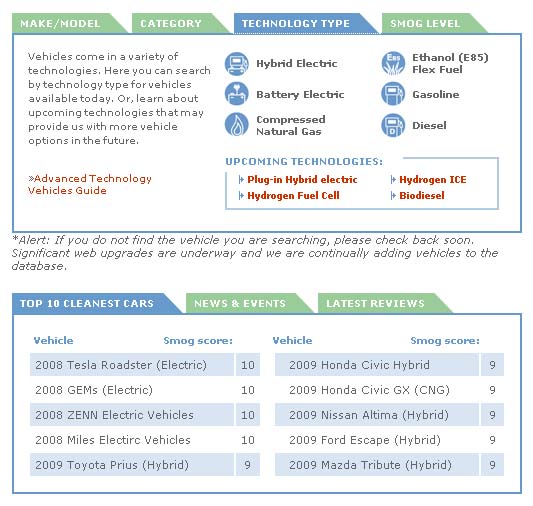
Detail of the DriveClean site
Detail of the DriveClean site
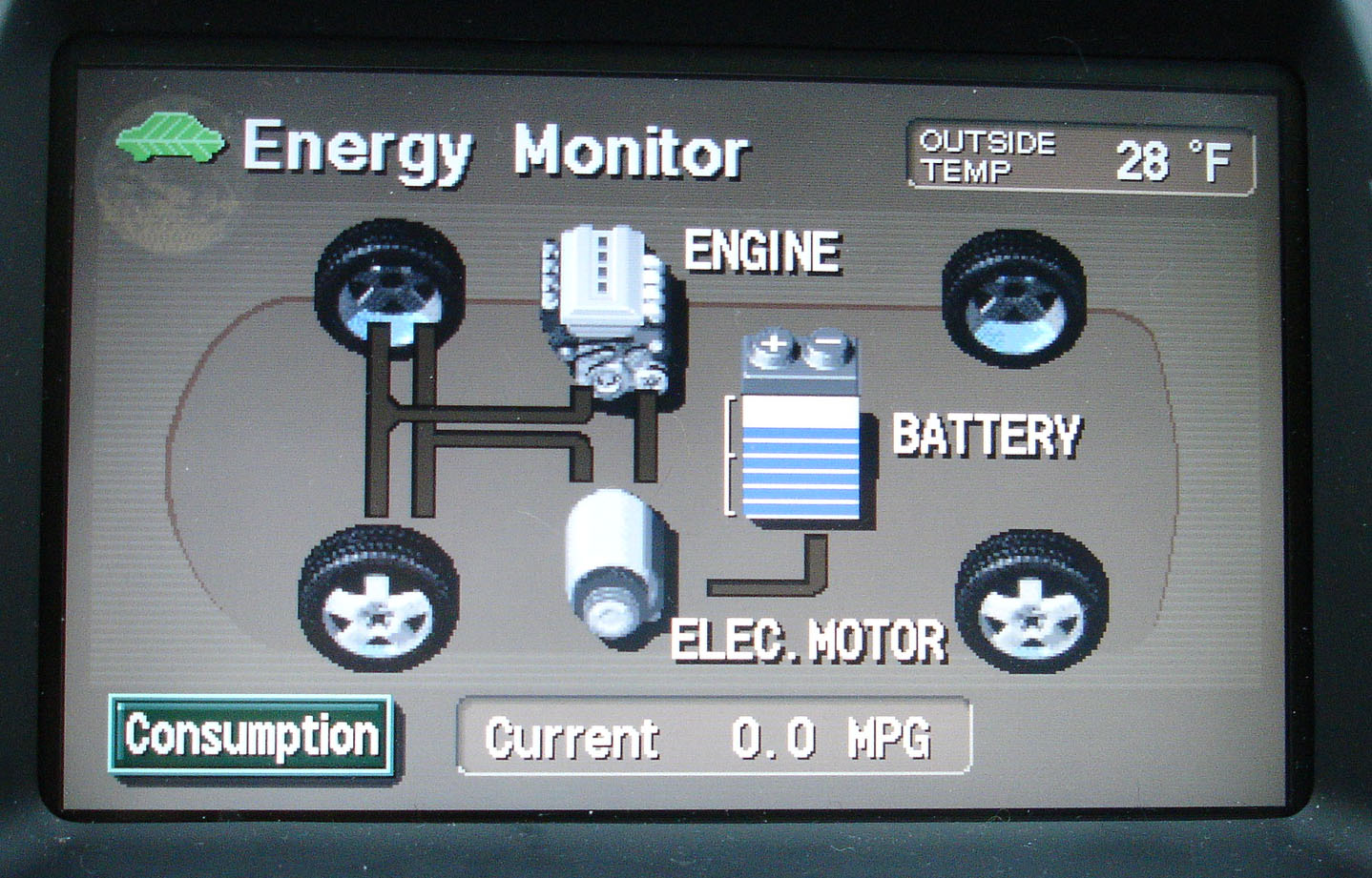
Prius console monitors the product’s energy

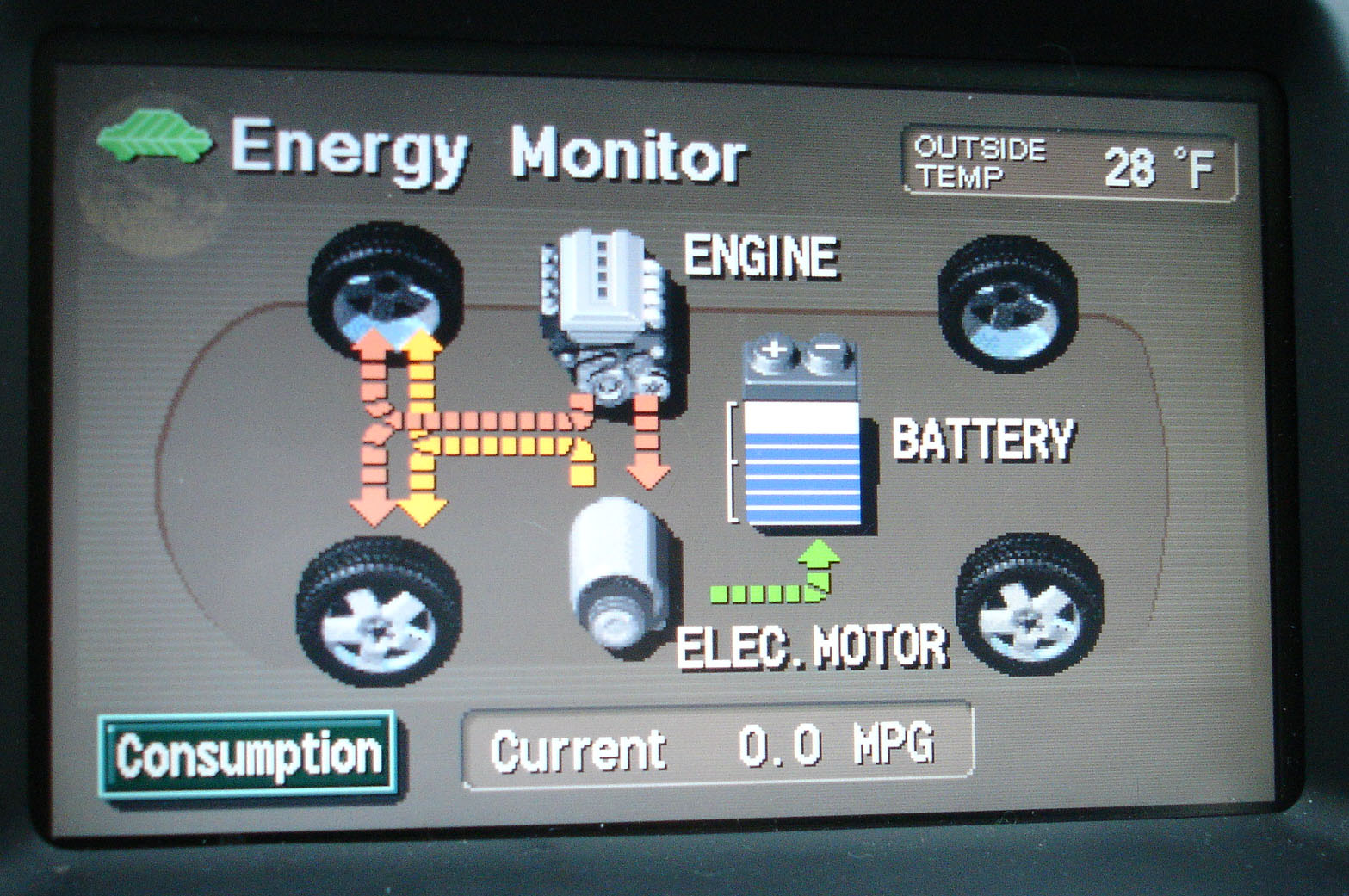
Prius’ console allow users (and passengers) to see what happens under the hood. The console sports an energy monitor (among other controls) that transparently provides information to the user (and passengers) so they can understand how the ups-and-downs of gas and break pedals impact the hybrid’s fuel usage and battery charging.

Prius Energy Transfer map

Prius Energy Transfer map

Using simple visuals and motion graphics, the console maps how energy is used, and shows how the battery gets recharged.  What results is the ultimate in immediate user-feedback.

Map of Prius Energy Usage in motion

Map of Prius Energy Usage in motion

In addition to helping the riders to understand what exactly a hybrid is, and how it works, this system helps users drive more eco-efficient because they get immediate feedback. As a driver, you can start to understand what’s going on, and how your driving techniques impact the fuel-efficiency of the vehicle. This model integrates enough feedback loops so a driver can learn to adjust their own driving to help the system optimize how it runs.

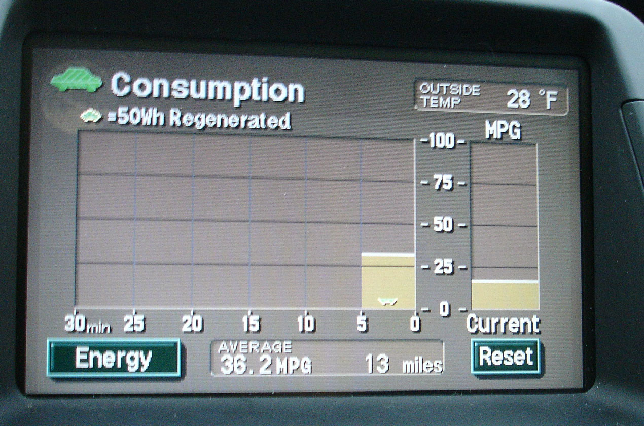
An added layer of feedback on newer Prius models is a chart that records energy consumption over the last 30 minutes of use – enabling the user to compete against themselves for improvement.

Graph charts energy consumption

Graph charts energy consumption

Products should be designed to showcase some level of their inner-workings. Even if the vehicle was not a hybrid, it’s a great step toward product transparency. Just imagine if more of our energy-devouring equipment incorporated similar feedback mechanisms.

Showing the Full Story

First: show it all. Then let people zoom into the pieces of information that interest them. A visual story can be overwhelming if it doesn’t provide some context.

A good background story makes it clear what information is found in what part of a product’s background.

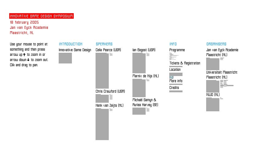
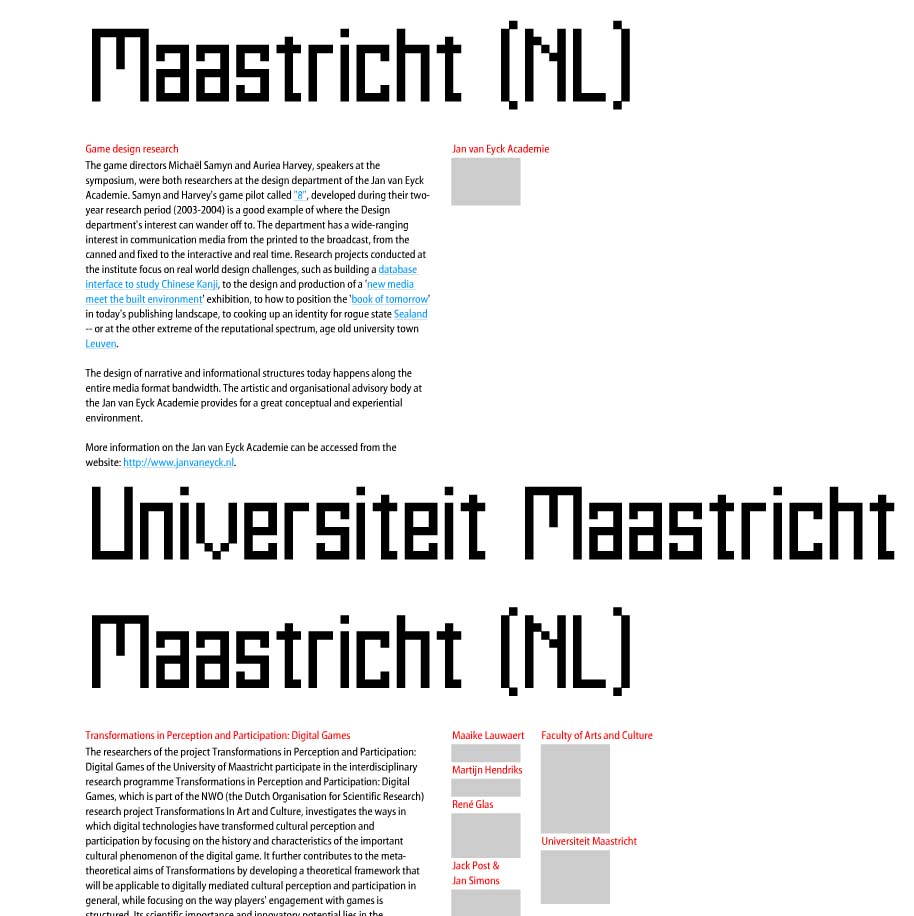
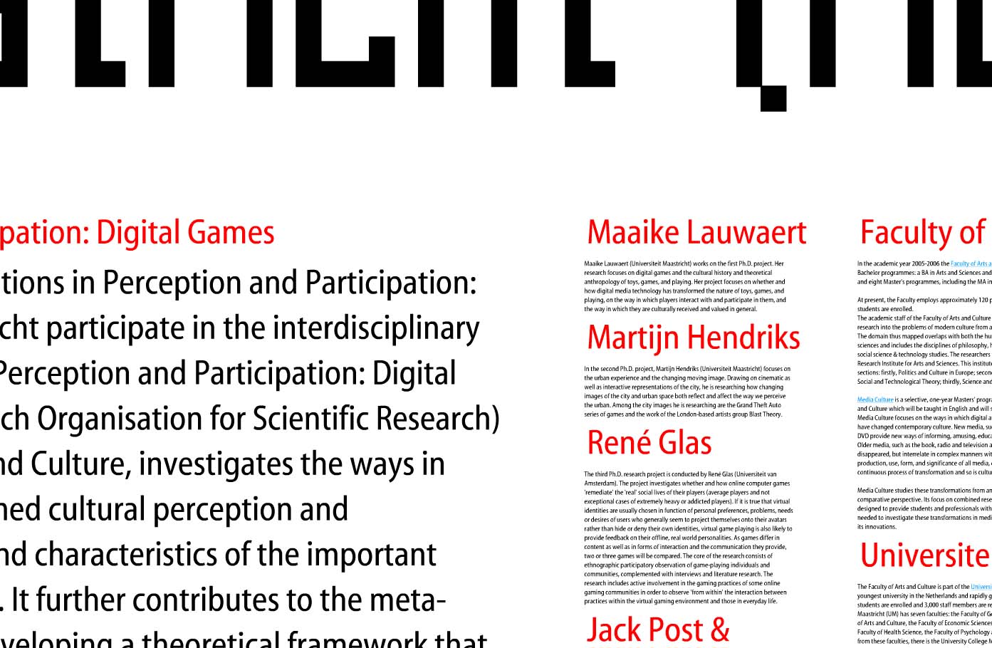
This example makes excellent use of spacial relationships to put increasingly detailed information in context: and help the viewer understand that context in a visual way. Shown are 3 levels of zoom into a site for a symposium at the Jan Van Eyck Academie in the Netherlands. The keystrokes needed to zoom in and out of the information are a bit clunky, but the overall concept is an intriguing way to communicate layers of information.

overview of all information zoom level 2 zoom level 3

Such is the concept of transparency – a viewer should be able to access even the most minute details of data: It’s all part of the big picture.

Timberland

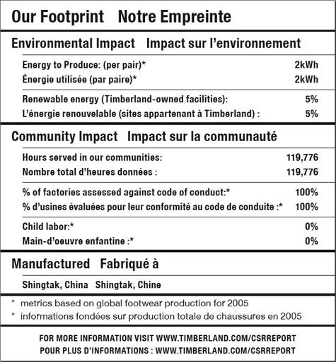
Timberland footprint label

This much-hailed label from Timberland was one of the first to label a product with details on the social and sustainability footprint of the product. It was a good start, but not nearly the level of detail that is possible – nor the level that consumers are clamoring for.

It’s a laudable first effort — in theory, at least. In real life, it’s not very helpful. Simply put: there’s less going on here than meets the eye. –Timberland Reveals Its “Nutritional” Footprint, Worldchanging

Though approachable because the label is created in the format of a nutrition label, beyond that, it’s not very visually satisfying. More depth and emotion could have been portrayed had they gone more into infographics.

CNN BackStory

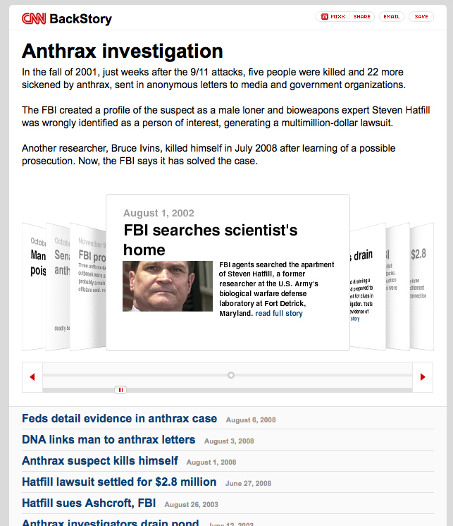
CNN BackStory screengrab

CNN has launched a new application to show how a story has developed over time. This is basically a collection of all CNN-posted stories associated with a particular event. The example they give is the Anthrax case. http://behindthescenes.blogs.cnn.com/

This allows readers to easily dig into the recent history of a story. The impact of a news service that offered such a view into history -AND incorporated stories from other key news media (CNN, BBC, and New York Times for example)- could be extremely powerful piece of online media to showcase varying perspectives. It will be interesting to see if partnerships emerge in this area – also incorporate other online media (video in addition to text-based stories).

Patagonia’s Footprint Map

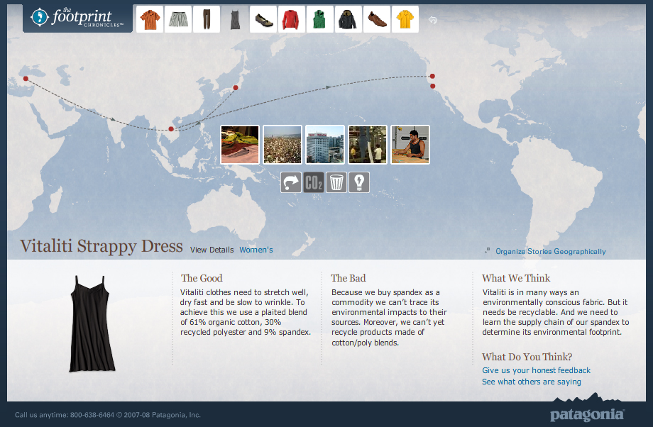
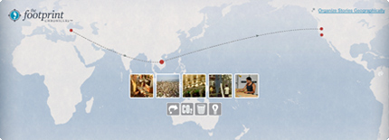
Footprint ChroniclesTravels of a Patagonia Dress - Footprint Chronicles

Companies are increasingly able to track the life of their products through their supply chains and trace the origins of even the smallest notion.

Patagonia’s Footprint Chronicles outlines the potential for a company to unveil its transparency in the name of promoting sustainability (and hence, appearing as a sustainable company). From an information standpoint, Patagonia is open about “The Good” and “The Bad” – admitting that, like any human, they’re not yet perfect, but they know where they need to improve.

The online tool carries the viewer through design, materials, manufacture, distribution (among others) of a handful of the company’s products, allowing the user to explore info both sequentially or geographically. Based on google-esque maps, the tool is well-designed as both a piece of information design and as an interactive tool.

Though included are a handful of data and other numbers, I’d like to see these numbers presented in a more visual way – nice parallels are drawn to perceivable concepts to make abstract quantities real. For example: where they say the CO2 generated from a specific shirt is equal to 100x the weight of the shirt, it would be nice to have a more standard reference: such as how many miles average driving…or how many trees need to be planted to counteract this release of CO2. This reference could in-turn, be illustrated in a more graphic format that would enable more direct comparison between various products.

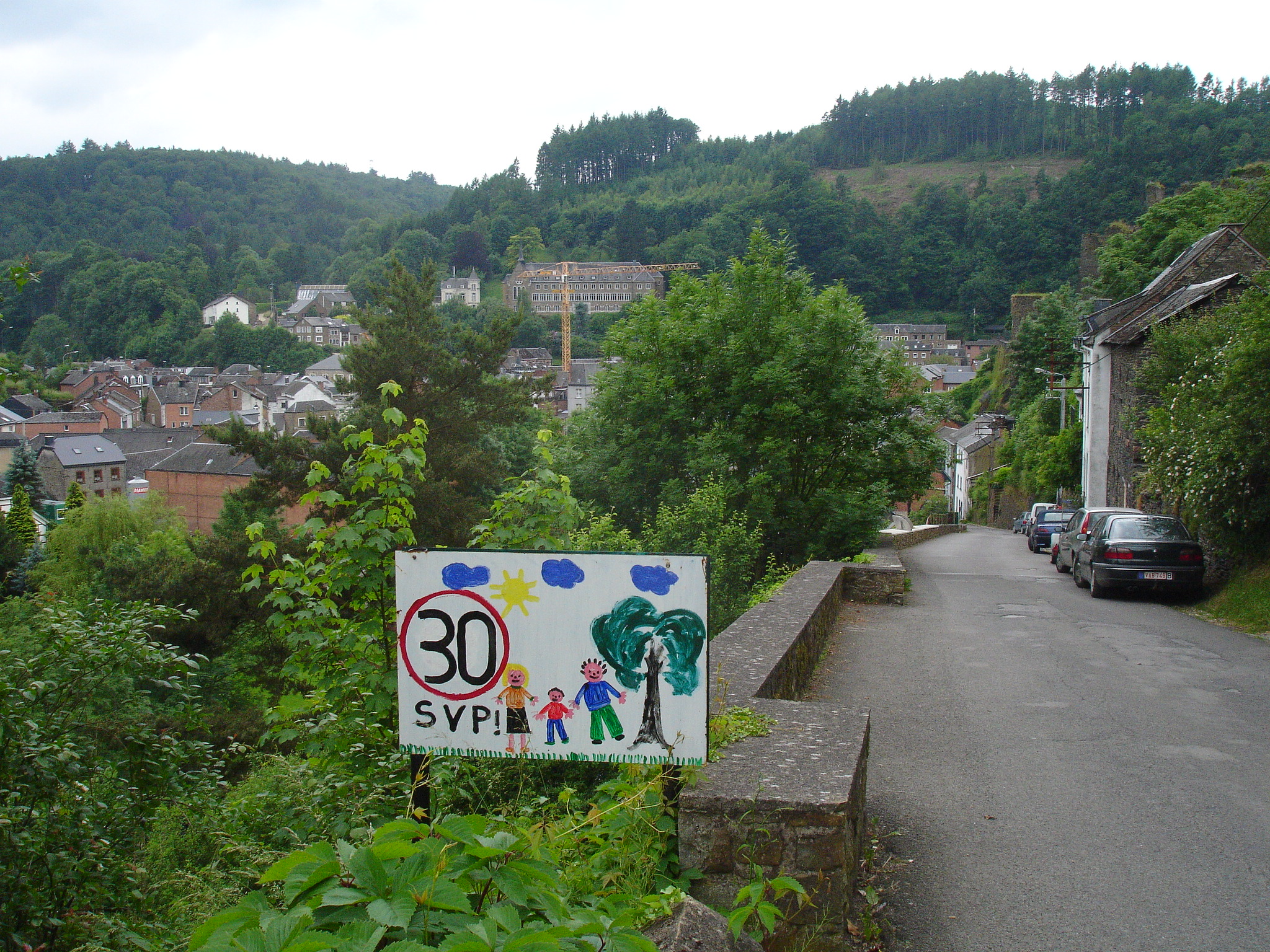
Slow down for the children

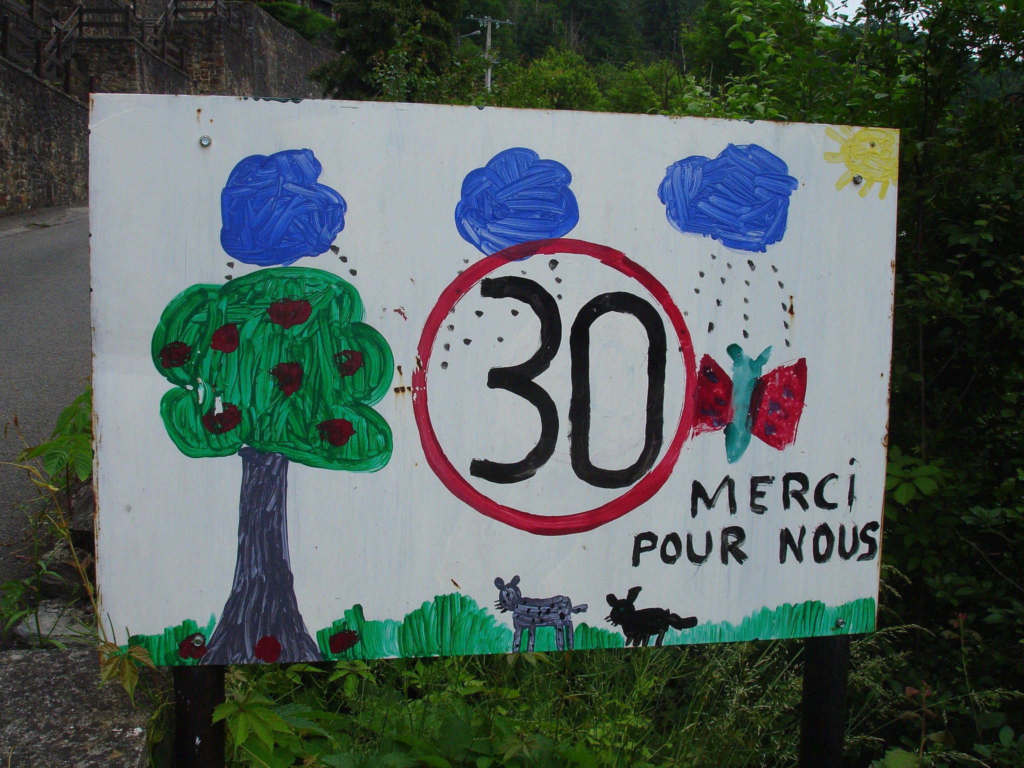
30km/hour Thanks. It\'s for us. 30km/hour Please!

We came upon several of child-designed ‘slow down’ in a neighborhood area of this picturesque Southern Belgian village.

Not only do these signs get you to slow down to enjoy the art, they also are strong reminders of the reason one should reduce speed:as one sign distinctly puts it “for us”.

The circled ’30’ (the European symbol for speed limit) is consistent on sign. Painted on the white board surrounding this ‘slow down’ symbol are the happy indications of childhood in the area: sunshine, trees, swings, families, dogs, cats, and a myriad of other animals. Personalized, these tell the story of neighborhood life from kid-view.

Such a request for speed reduction is more effective and easier to obey when it comes direct from the pint-sized residents of the street than from the typical sterile government-issued signs. These factory-stamped signs only serve to remind a driver that there are staunch rules to conform to. Sure, the objective of each style of sign is the same, but by including an indication of the reason ‘why’ behind a request for conformity, drivers are more likely to adopt the concept as their own and ride the breaks.

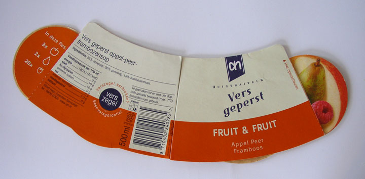
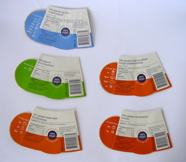
Fruit and Juicy Quantities

Albert Heijn juiceReverse side: fruit juice labels

I don’t know if Albert Heijn grocery stores in the Netherlands still use this style of label for the juice, but I was instantly intrigued by the way they present the ingredients using cute little fruit icons on the back side of the labels. The front of the label also sports photographs of the main fruits. Without reading text, the icons on the back tell what quantity of which fruits are found in each juice. In addition to providing information, these graphics re-enforce marketing messages that the juice is 100% fruit. Lekker!