Audience First: Behavior Change and Values-Based Climate Communication

Connecting with audiences based on the values that are behind a desired activity/behavior can be more powerful than highlighting benefits to the audience. This values-driven approach has been shown to have more impact than ‘saving the environment’ or even ‘cost savings’ messages, according to the founder of Climate Outreach, George Marshall, who presented at Behavior, Energy and Climate Change conference (BECC). (See a synopsis of Arlene’s ‘Public Engagement through Art’ presentation on our previous newsletter.)


For example, instead of touting the cost-savings and environmental benefits of home insulation, consider:

“Your home is great. It’s where you bring up your family. It’s where you share some of the best moments of your life. You want to keep it cozy. Insulation is a good way to do that.”

This ‘audience first’ approach closely resembles ‘Start with Why’ and the design and communication processes that I use in practice, and with my students.

In our communication work, we orient every aspect of a message around the intended recipient: story structure, visual style, and language used. So, I can relate to focusing on an audience’s need.

Marshall’s presentation made the point that prioritizing the audiences’ values (even above the benefits of a product/service) throughout this messaging, can create impact on sustainability-related behavior change. 
 

Pollinator-Friendly Solar at the Fair

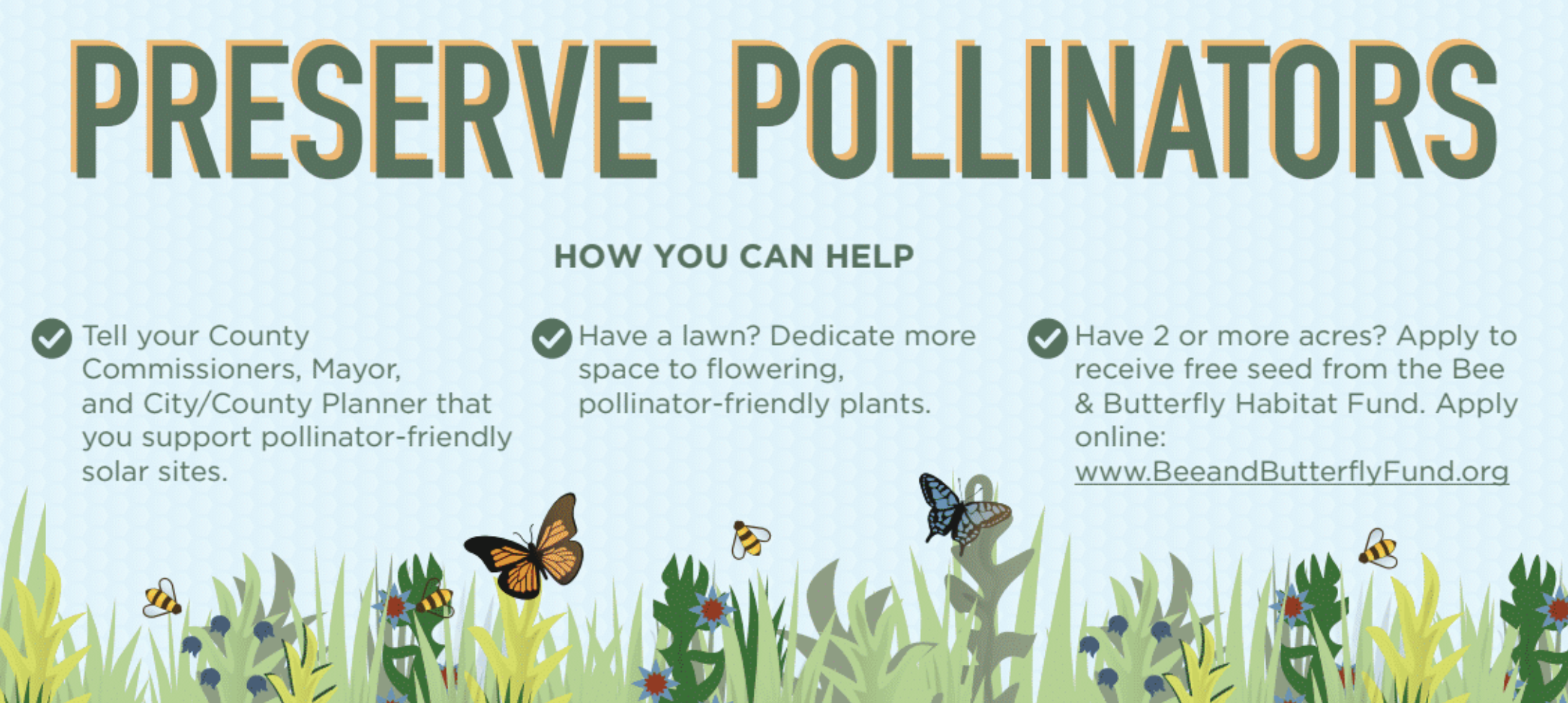
For this year’s Minnesota State Fair, we’ve teamed up with Fresh Energy and Connexus Energy to create a three-dimensional display to draw attention to a new way of thinking about renewable energy: Pollinator-friendly solar.

Preserve Pollinators

Infographic poster from the Minnesota State Fair display.

Our display, part of “The Common Table: Minnesota Eats” exhibit in the Agriculture Horticulture Building, highlights how our region is leading the way in policymaking and on-farm efforts to bring more pollinator habitat to otherwise underutilized land. You can see the exhibit in-person from August 23 through September 3, along with nearly two million other fair-goers (who famously flock to the event for all kinds of foods and creations “on a stick”). Of course, our sticks — a series of cutout landscape elements and hide-and-seek pollinators for you to find — will be glued down, but you’re sure to learn a lot about the powerful partnership of pollinators and solar energy!

Selecting the Right Graph

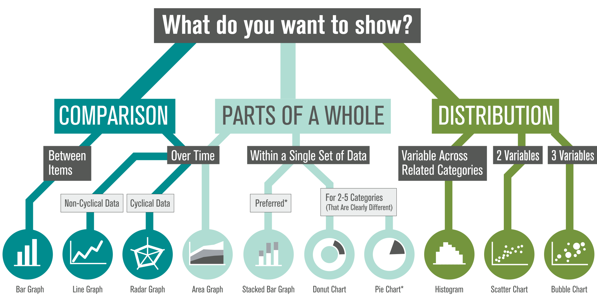
We’re often asked, “What type of graph should I use for this data?” We also see a lot of variety in how similar data sets are visualized (some working better than others). There’s plenty of debate out there, so how do you decide?

Selecting The Right Graph

*Stacked bar graphs show comparison most clearly — and are preferred over pie charts (which do not allow easy comparison). Donut charts are slightly better than pies. Hungry yet?

We’ve created this visual guide to recommend best practices, which starts with a clear understanding of your content — what are you trying to show? There are options within each category based on the type of data in your set (and ironically, many of the standard graph types tend to share food-based titles… by the time you decide between Pies, Bars, and Donuts, you might be tempted to hit the bakery!). Which graph will you apply to your next datavis project?

Collaboration at the National Council for Science and the Environment Conference

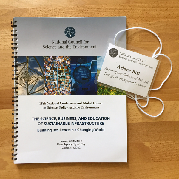
“We need more multi-disciplinary… communication… social science… storytelling.” I was struck by the reoccurring mention of these terms while attending the National Council for Science and the Environment (NCSE) annual conference in Washington, D.C. in late January.

NCSE is a conference of scientists (primarily earth & physical scientists) who do highly specialized research related to environment and climate. At this year’s event, I presented as part of a MN-based symposium on “Artists as Partners in Infrastructure Education.” (More details on our symposium here.) It was refreshing to hear the desire for collaboration coming from both scientists and the worlds I inhabit — communication and creativity.

NCSE Conference

For research findings to be accepted and acted upon by communities, scientists and policymakers need to draw more personal ties between policies and how individuals interact with them. An important step in this is helping the public understand a bit more of the system (and the ‘why’) behind a particular policy. Because 65% of people are visual learners, and because graphics are an important method of showing complex systems, visuals are an excellent tool to help audiences relate to and connect with content. It’s why at science conferences, you’ll find me advocating for design, creativity and the arts. At design conferences, I’m the advocate for science, data and content!

Our symposium group hopes to continue the dialogue of how artists can contribute to the great work these scientists are already doing — and help give their findings a relevant and emotional hold on communities around the world.

– Arlene